The internet is full of thousands of web design portfolios, and getting a potential employer’s attention in this overcrowded job marketplace can be quite a challenge.
To stand out in this tough market, it's important to make your online portfolio as impressive as you can . Today, we’re highlighting those who don’t need any help creating amazing portfolios. In this article, you’ll find 20 outstanding examples of portfolio sites from both individual designers and creative studios worldwide — each one incorporating a feature that makes it special. Let’s take a look at what makes them inspiring.
If you're ready to start designing your own web design portfolio, check out our article on how prototyping and rapid prototyping can help the design process, and some great prototyping tools. Or, learn how to craft a standout design brief.
20 Web Design Portfolio Examples
1. Robby Leonardi

Portfolio: rleonardi.com
Why it’s special: Robby incorporates an interactive experience into his portfolio.
What it’s about: If you associate portfolios with a dry list of facts, this portfolio might surprise you. Robby found a novel way of displaying what was otherwise dry information — he laid out his portfolio site as a videogame that the visitor can actually play. This incredibly fun interactive design portfolio will make you scroll with joy.
2. Yul Moreau

Portfolio: y78.fr
Why it’s special: Yul creates a truly unique atmosphere on his site.
What it’s about: Yul Moreau's site is a great example of using visuals to drive user engagement. He takes his inspiration from the 1980s, and in fact dedicates his portfolio to the era. A single page layout with embedded videos, images, and clever scroll effects show all his experience and skills off nicely.
You might also like: Website Security: 13 Ways to Improve Front End Security and Not Get Hacked.
3. Daniel Spatzek
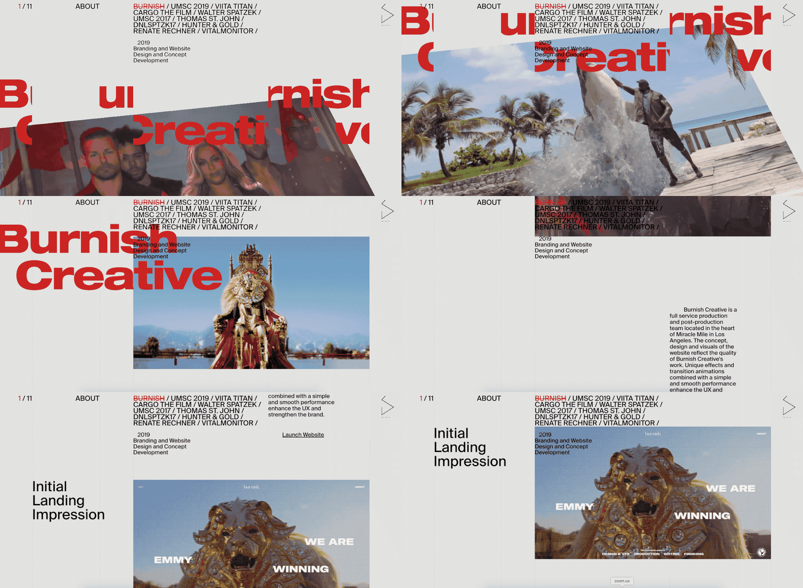
Portfolio: danielspatzek.com
Why it’s special: Daniel shows off both his graphic and web design skills.
What it’s about: Being both graphic and web designer, Daniel demonstrates his skills beautifully in his portfolio. By using a plenty of CSS tricks and animation, he brings everything to life and creates a truly dynamic experience.
4. ToyFight

Portfolio: toyfight.co
Why it’s special: ToyFight uses an eye-catching color scheme that immediately grabs visitor attention.
What it’s about: This beautifully minimal and easy to navigate portfolio from ToyFight is a feast for the eyes. A combination of minimal design together with vibrant colors creates an atmosphere of creativity, and engages visitors to spend more time on the site.
5. Studio Schurk

Portfolio: studioschurk.nl
Why it’s special: Studio Schurk uses illustration and humor to engage visitors.
What it’s about: Animation duo Studio Schurk shows off their sense of humour in their portfolio website. As you scroll down, you’ll see interesting and fun animations that highlight the duo's talent.
6. Rezo Zero
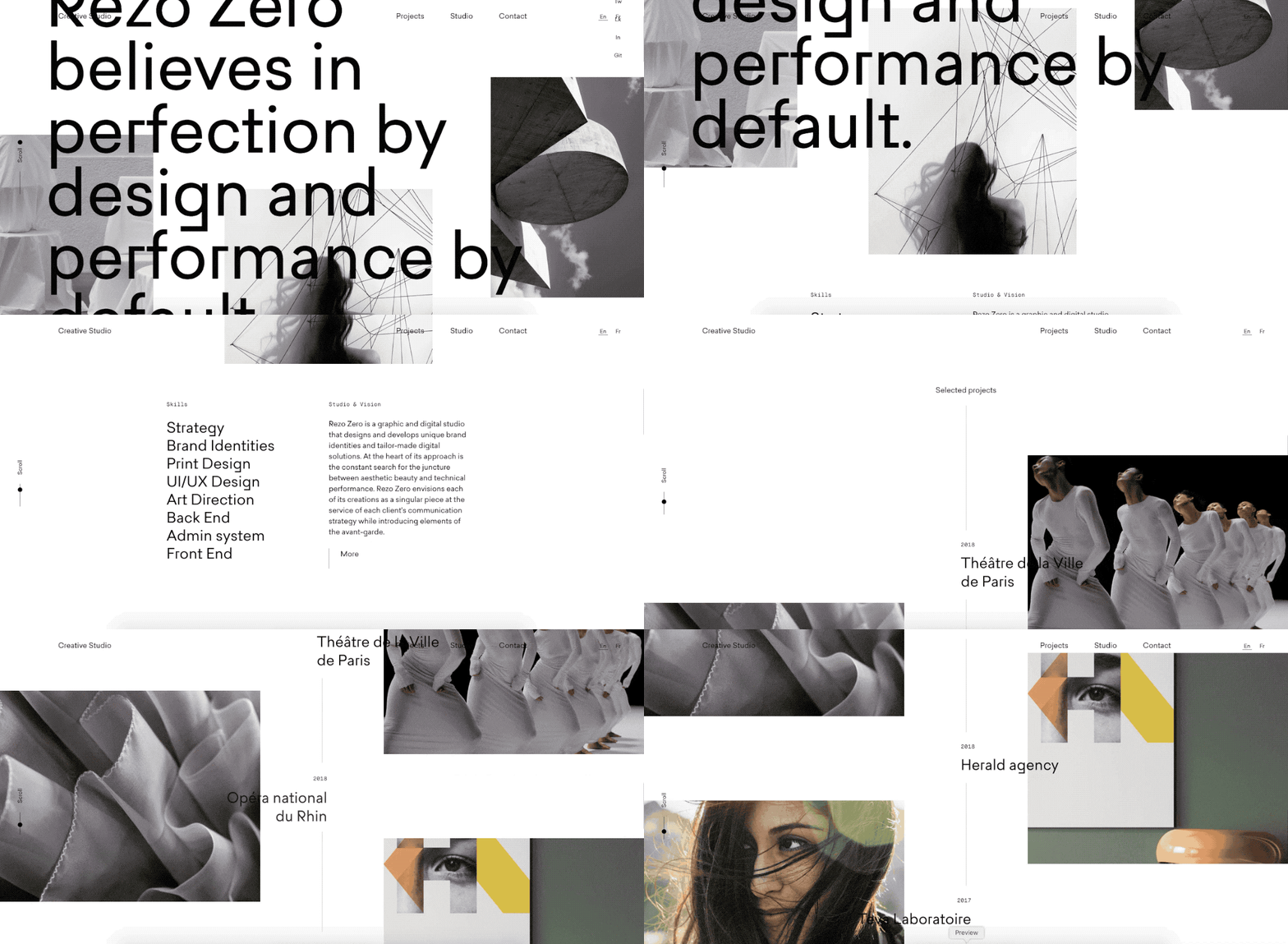
Portfolio: rezo-zero.com
Why it’s special: Rezo Zero provides complete case studies for various projects.
What it’s about: Rezo Zero is a creative studio that specializes in brand strategy and digital creation. The portfolio feels like a digital magazine — it’s full of beautiful images and nicely selected typefaces. But what makes it even better is a detailed and thoughtfully put together case study for each project.
You might also like: Canonical URL: What Are They and Why Are They Important?.
7. Wokine
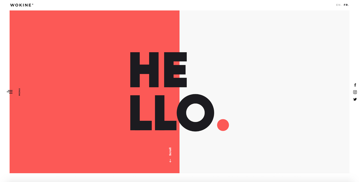
Portfolio: wokine.com
Why it’s special: Wokine follows the latest visual design trends.
What it’s about: Split screen — one screen divided into two — is the latest visual design trend. Wokine flawlessly incorporates this technique in its homepage design. The portfolio itself is ultra-minimalistic, with a lot of spacing and simple color schemes. This creates a good visual hierarchy, and makes it possible to understand what’s important at a glance.
8. Legwork Studio

Portfolio: legworkstudio.com
Why it’s special: Animated cartoons help Legwork stand out.
What it’s about: Legwork is an independent studio based in Denver, CO. They create animation and interactive experiences. A majority of first-time visitors will be impressed by the unique animation on the homepage — it’s not like anything you’ve ever seen before.
9. Hannah Purmort
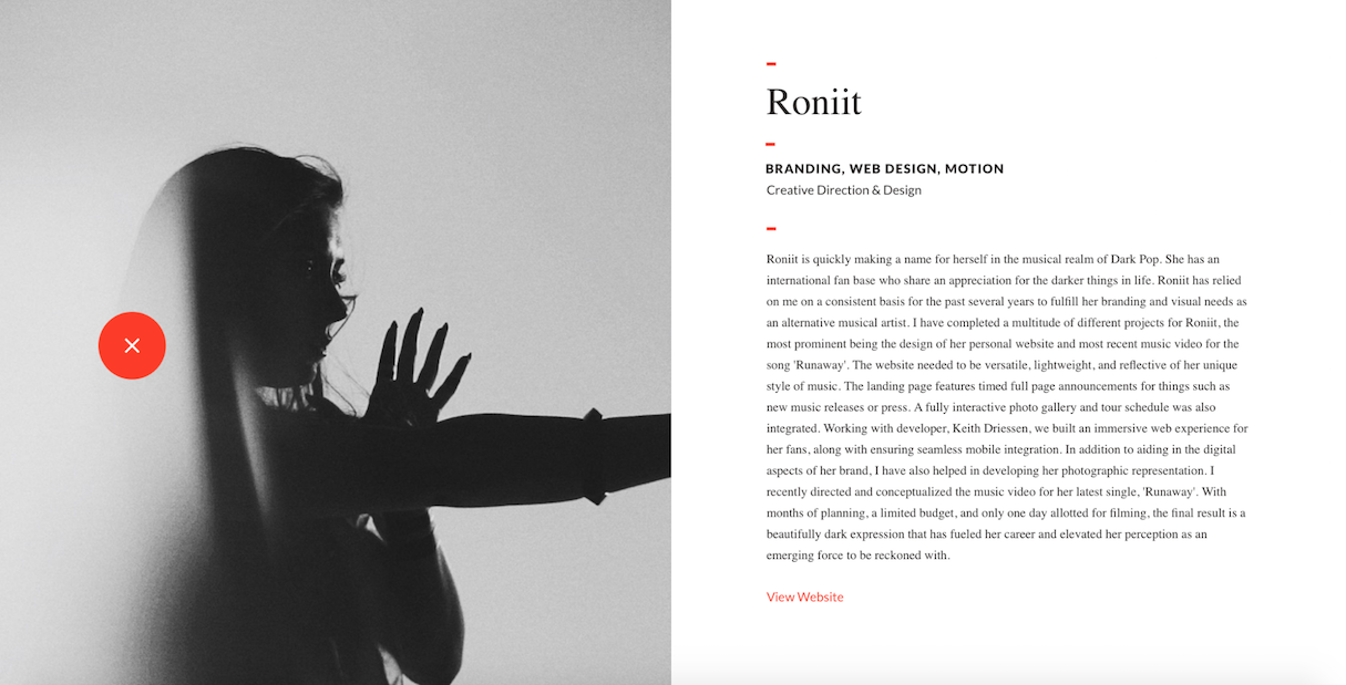
Portfolio: hannahpurmort.com
Why it’s special: Hannah uses powerful imagery and color combinations to drive a visitor’s attention.
What it’s about: Hannah Purmort is a designer who believes in design that connects people. Her site is a great example of how to communicate using images and color — she uses the color red for the wayfinding experience and for navigation.
You might also like: 3 Design Tips for Reducing Your Online Store's Bounce Rate.
10. Werkstatt Wundersite

Portfolio: werkstatt.fr
Why it’s special: Werkstatt Wundersite found a perfect balance between functionality and aesthetics for their portfolio.
What it’s about: Just because a portfolio site needs to be well designed doesn’t mean it needs to be extravagant. In fact, many effective portfolio sites take more of a minimalist approach to the design of the site itself. Werkstatt Wundersite is a great example of this. The site is classically minimalist, with lots of white space and large type. A strong attention to detail within this portfolio is what really makes it stand out.
11. Tim Smith

Portfolio: mypoorbrain.com
Why it’s special: Tim created an easy to scan, card-based layout.
What it’s about: London-based designer and artist Tim Smith presents his portfolio in a simple yet stunning way. Card-based layout with subtle animation effects immediately engage users. Tim uses interesting animated effects, such as the cut-out titles for each piece, which disappear as you mouse over.
You might also like: 12 Beautiful Portfolio Websites to Inspire Your Own Design.
12. Lounge Lizard
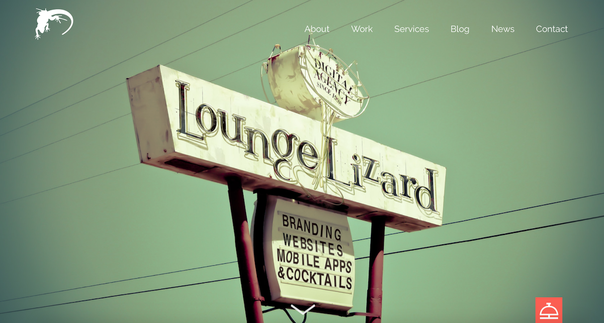
Portfolio: loungelizard.com
Why it’s special: Lounge Lizard's portfolio creates a relaxed atmosphere.
What it’s about: It’s hard to make a site look professional and playful at the same time, without it looking tacky. Lounge Lizard manages this balance with ease. This team describes themselves as 'brand tenders,' and this bar-themed portfolio fits their work and style perfectly. The portfolio is full of detailed case studies and information, presented in a friendly way.
13. STRV

Portfolio: strv.com
Why it’s special: STRV uses videos to give visitors a taste of how the agency works.
What it’s about: STRV is a digital product agency focused on creating mobile experiences. The team introduces itself using videos — a background video provides an idea of how the team works, and a full-screen video that appears on screen after you click a play button, describes the process in full detail.
14. Femme Fatale
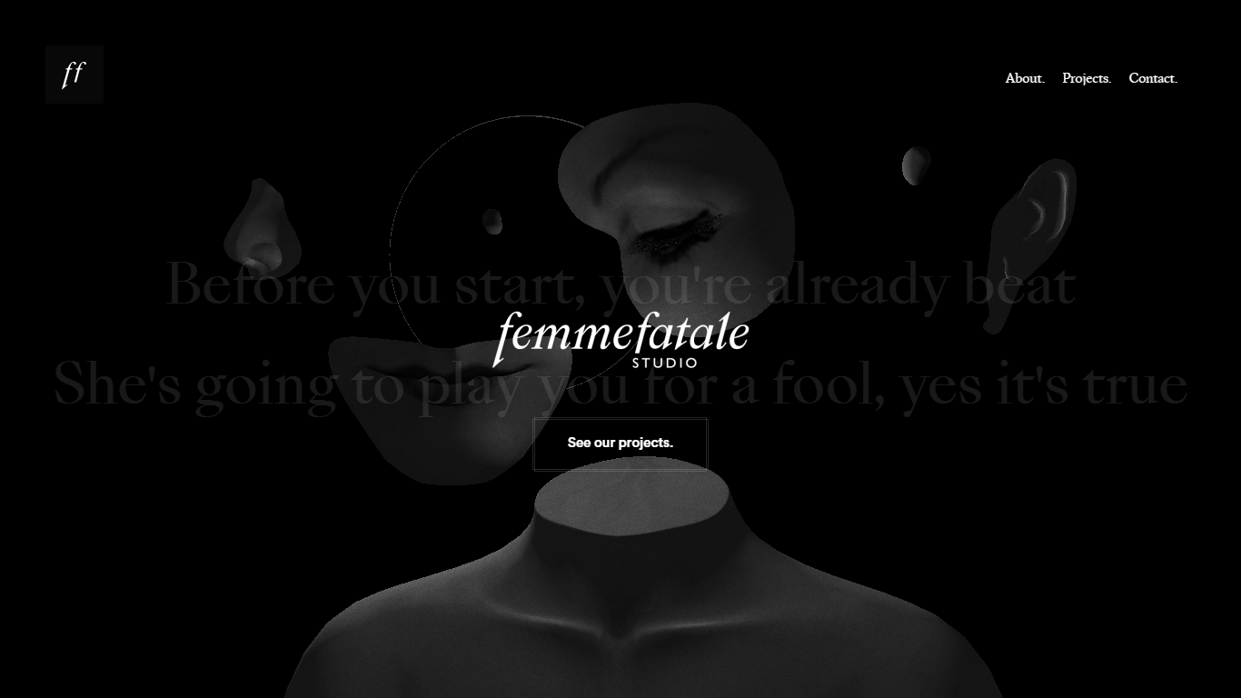
Portfolio: femmefatale.paris
Why it’s special: This portfolio site creates a sense of luxury.
What it’s about: Femme Fatale is a creative studio focused on creating works of art. The team describes itself as being “somewhere between sophistication and simplicity,” and its portfolio excellently reflects this tone: bold imagery, black color schemes, and crisp typefaces create a sophisticated look.
15. Tobias Ahlin

Portfolio: tobiasahlin.com
Why it’s special: Tobias let’s his work speak for itself.
What it’s about: Tobias Ahlin gets straight to the point in his portfolio, “I design and build digital products.” He uses a minimalistic, card-based layout and animations to present his work. Each case study links directly to the final product.
16. Stink Studio
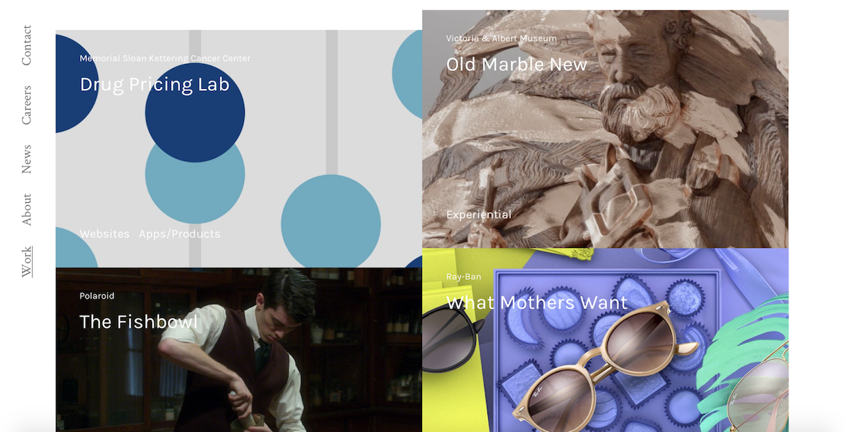
Portfolio: stinkstudios.com
Why it’s special: Stink Studio demonstrates a wide variety of projects.
What it’s about: Stink Studio is focused on helping forward-thinking clients succeed in digital culture. The studio puts their work front and center in a masonry layout. A list of projects include websites, promo campaign, and even VR/360 experiences.
You might also like: The Benefits of Adding a Shopify Landing Page to Your Portfolio Site (and How to Make One).
17. Sean Halpin
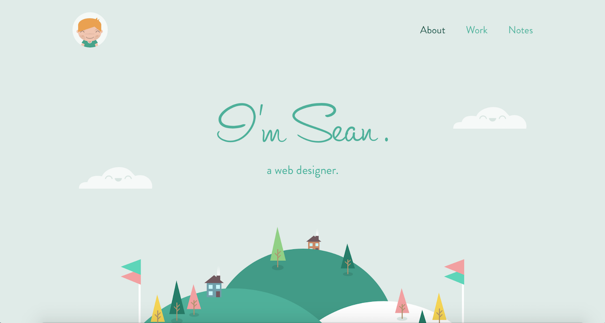
Portfolio: seanhalpin.io
Why it’s special: Sean packs his portfolio with personality.
What it’s about: A portfolio is more than a list of work — it’s a chance to show off your individual skills and personality as a creative person. Sean Halpin’s website is an excellent example of this. Sean creates not just a portfolio, but a little green world in which you can discover how he can help you build the perfect site.
18. Patrick David
Portfolio: bepatrickdavid.com
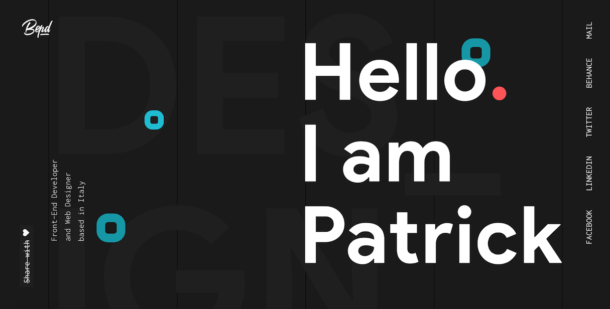
Why it’s special: Patrick manages to fit his entire portfolio into a single page.
What it’s about: Patrick’s portfolio is a great example of a one-page, long-scroll website. Visitors scroll down past the beautiful hero section to a number of example projects that he's worked on, followed by a link to direct communication. Simple, yet very effective.
19. Stereo
Portfolio: stereocreative.com
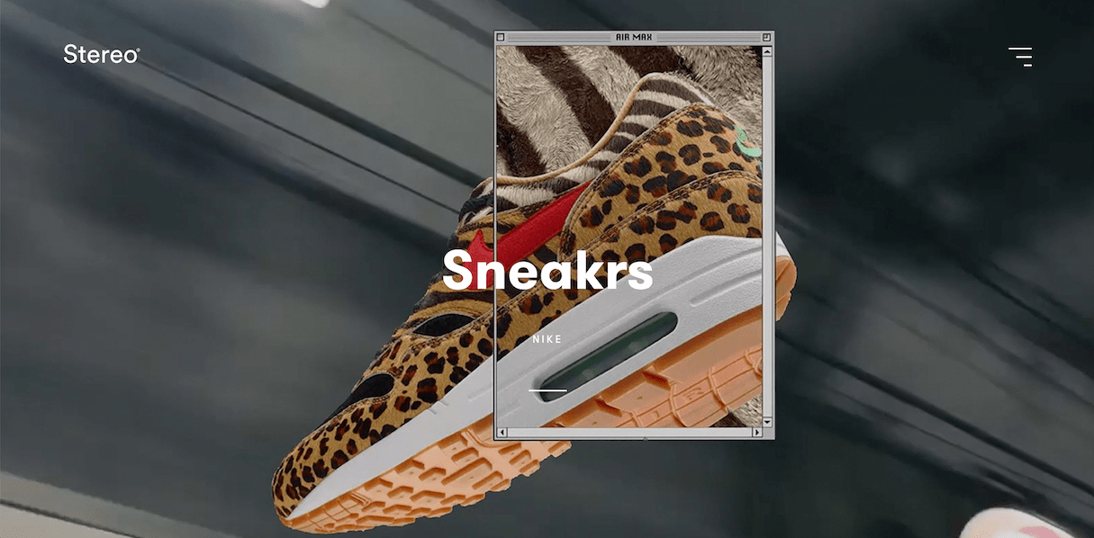
Why it’s special: Stereo is focused on understanding a consumer’s emotional relationship with a brand.
What it’s about: London-based agency Stereo Creative has created this simple yet striking portfolio site. The agency's work takes centre stage on its website, with plenty of colorful, full-width images, and videos showing off what they can do. Stereo aims to create a deeper emotional connection with visitors.
You might also like: 14 Agencies and Freelancers You Should Follow on Instagram.
20. Steven Mengin
Portfolio: stevenmengin.com
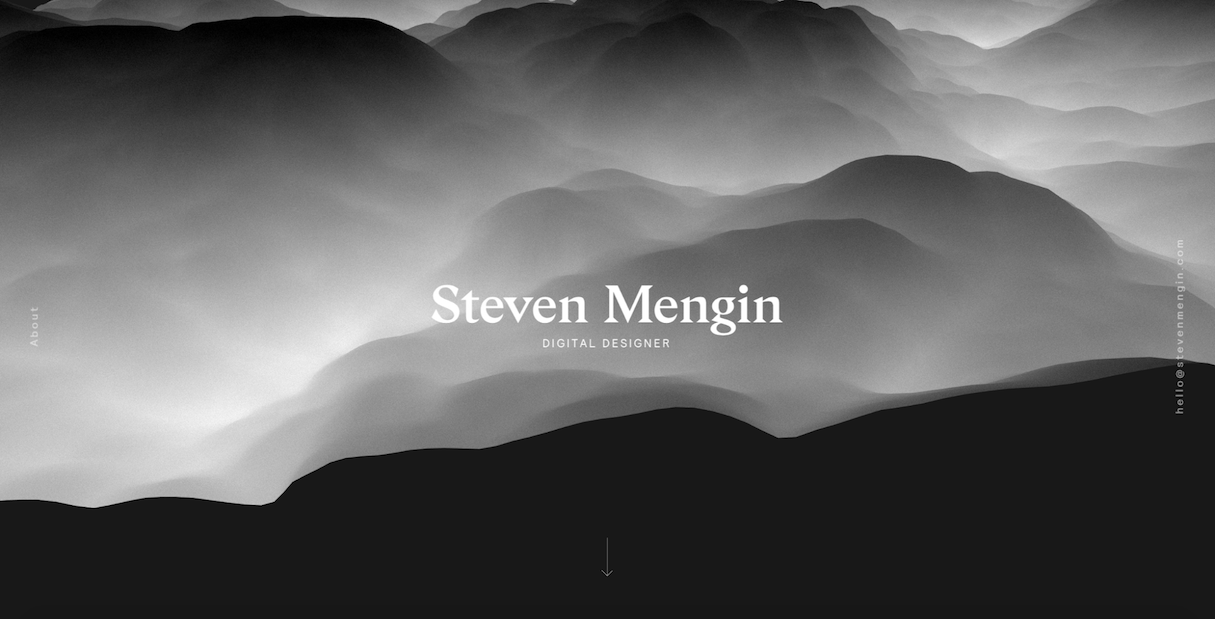
Why it’s special: Steven creates a perfect intro for his portfolio.
What it’s about: Steven makes use of strong visuals to provide an idea of his abilities at a glance. When visitors enter Steven’s website, the first thing they see is a beautifully animated cloudscape effect. It’s a pure joy just to sit and watch this undulate.
4 bonus portfolio websites
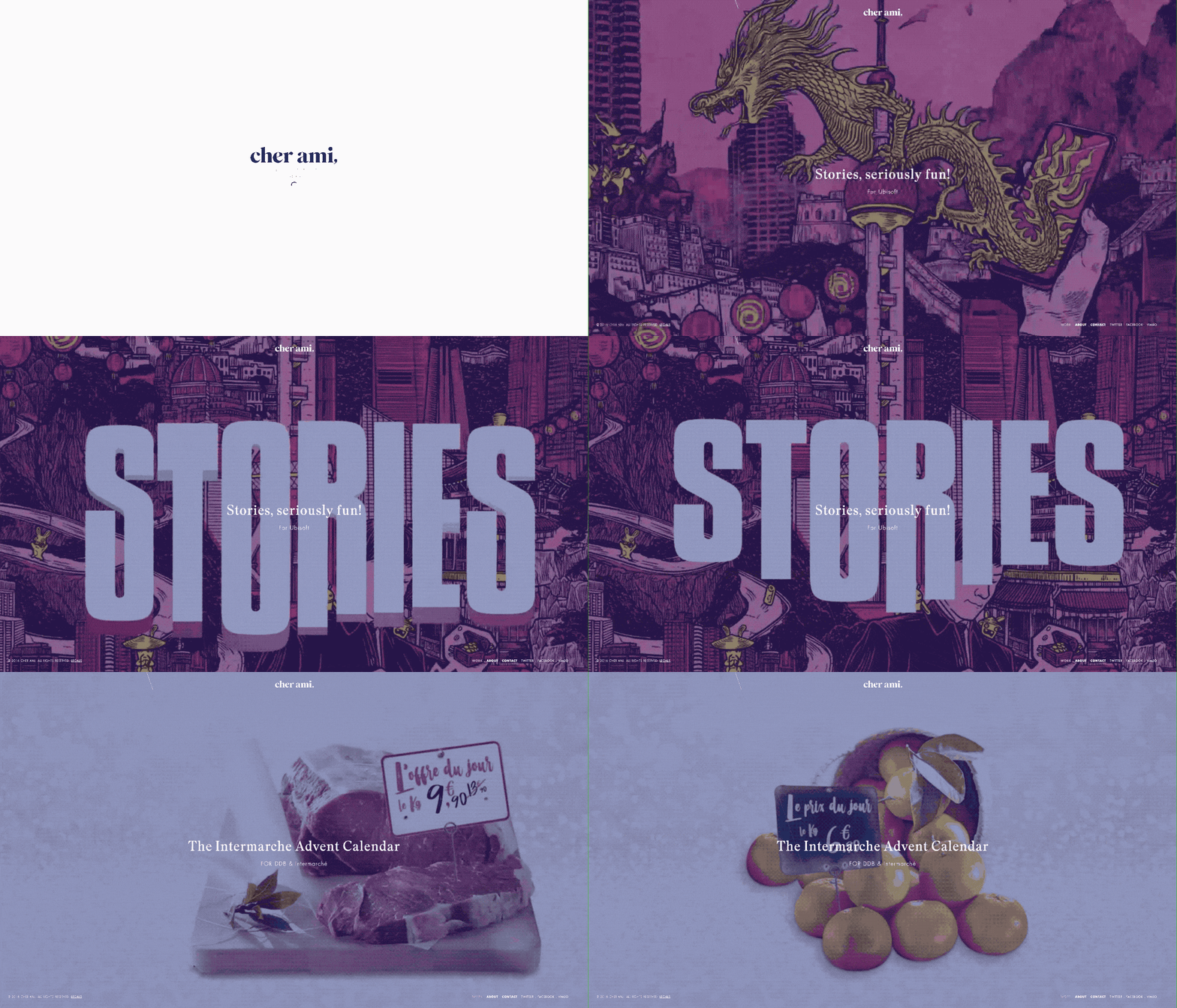
With so many great web design portfolios out there, we decided to share 4 more that caught our eye.
Cher Ami
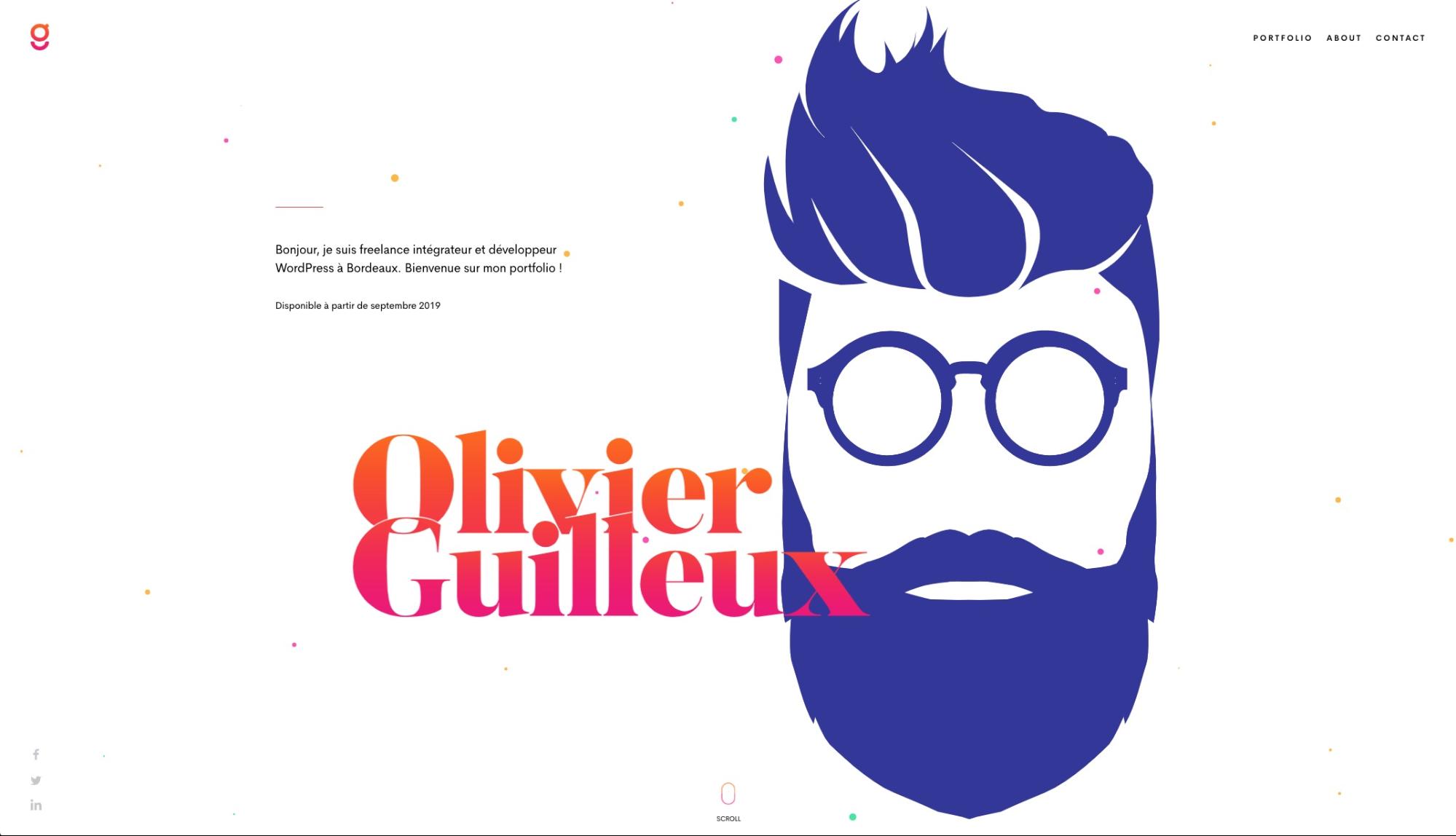
Olivier Guilleux
Xavier Cussó

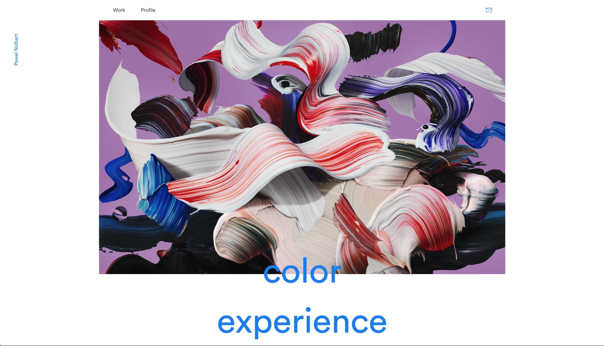
Pawel Nolbert
Demonstrate your depth with your web design portfolio
Creating a great web design portfolio is a journey that involves a lot of effort (time, learning, and iteration) — but it’s definitely worth it. If you succeed, your portfolio will demonstrate the depth of your abilities as a creative professional, showcase your thought process, and give potential employers or clients insight into what it might be like to work with you. I hope that some portfolio examples listed in this article will inspire you to level up your design portfolio.
Learn more at: Shopify Partners
Read more
- How to Build a Great Design Portfolio — Shopify Designers Weigh In
- How to Use Liquid to Create Custom Landing Page Templates
- Prove Yourself: 4 Ways to Demonstrate Your Expertise
- Inclusive Design: 12 Ways to Design for Everyone
- The Power of the Dark Side: Dark User Interfaces
- Shopify Development Stores: How to Generate Recurring Revenue from Merchant Referrals
- How to Create a Compelling Web Design Portfolio
- 10 Places to Find Design Inspiration Online
- 8 Development Trends You Need to Know to Successfully Build for Shopify in 2022
- Friday Inspiration: 9 Visually Compelling Ways to Feature Products
Web Design FAQ
What are 5 areas of web design?
- Layout Design
- Interface Design
- User Experience Design
- Visual Design
- Content Strategy
What does web design include?
What are 4 stages of web design?
- Planning: Identifying the project goals and objectives, researching the target audience, defining scope, and creating a timeline.
- Design: Developing the site structure, designing the interface, and creating the content.
- Development: Writing the code, integrating the functionality, and testing the site.
- Maintenance: Updating the content, monitoring analytics, and responding to feedback.

