We’ve said it before and we’ll say it again: your portfolio site is one of the most important promotional assets you have in your marketing toolbox, as a freelancer or agency.
It not only provides you with a place to showcase your creative work to potential clients, but it also gives these leads an opportunity to discover your brand, assess your service offerings, and contact you while in the midst of their purchasing journey.
But what I love most about portfolio sites is that they are one of the only digital channels you have full ownership over. As opposed to social media pages, like Facebook or LinkedIn, you have absolute control of the visual layout, style, and content that’s presented on your site. This simple fact is what makes the potential of your portfolio so powerful, as it opens the doors to a variety of unique promotional tactics for positioning your business.
One such tactic, that many of our partners have found useful for marketing their services, is the creation of a Shopify-focused landing page. This article will walk through some of the benefits this style of page can offer your business, as well as what content we’ve found to be most important to include when building a Shopify landing page.
How a Shopify landing page can benefit your business
Many of our partners use landing pages on their portfolio sites to promote their Shopify development services to leads, but these pages are also valuable in other ways. Adding a Shopify-focused landing page to your website can provide your business with several benefits :
:
It can help add content to your portfolio — If you’re just starting out or have a relatively small clientbase, it can be difficult to find content to populate your portfolio site with. A Shopify landing page can add a little more substance to an otherwise bleak portfolio, and be a useful place to drive traffic to when running targeted digital marketing campaigns.
It can help establish your thought leadership within the Shopify community — You should also leverage your landing page to promote your alignment to Shopify. By telling your site visitors of your partner status, and by including any relevant badges you may have access to, you’ll show you are an authority on Shopify, which in turn can help build your business’ online clout throughout the larger ecommerce community.
It can help show your expertise to the world — Whether you’re a Shopify-only development studio, or you offer it as one of your many services, a Shopify landing page can help clearly communicate your specialization, expertise, and service offering to site visitors. Merchants are looking for agencies or freelancers who know how to work with Shopify, so including a dedicated page that communicates you are competent at developing with Shopify can help establish trust during their decision-making process. It can also offer them an opportunity to provide their contact information when reaching out.
It can help you drive traffic and acquire new leads — Interest in Shopify as an ecommerce solution is growing (see the chart from Google Trends below if you don’t believe me), and — as mentioned above — merchants seeking development or design support want to be certain that the consultants they reach out to are experienced with the platform. Creating a landing page on your portfolio site that is specific to Shopify, using SEO best practices, will increase the odds that leads will find your business when searching online for a Shopify development agency. While a lot of this traffic may bounce from your site without reaching out, some visitors may leave their contact information to learn more — if you’ve positioned your services right (more on that below).

It can help educate and upgrade your existing clients — Many of our existing Shopify Partners and Experts use this tactic to promote Shopify Plus, as a way to educate their existing high-growth clients on the benefits of upgrading. With a Shopify Plus-focused page, you can help align your agency’s brand to enterprise services, upsell existing clients, and potentially increase your access to larger-sized prospects who are looking for a consultant with high-volume ecommerce experience.
You might also like: 7 Content Ideas That Will Drive Revenue for Your Agency.
What to include on your Shopify landing page
Convinced about the value of a Shopify landing page and ready to build your own? To help you get started on the right foot, here are some of the content elements we’ve most commonly seen on effective landing pages:
1. High-level details about the product in relation to your service offering
Many prospective leads who navigate through your portfolio are likely seeking an ecommerce solution, but may have never heard of Shopify or Shopify Plus before. Even if these visitors have some degree of knowledge about either solution, they may not have enough context to make an informed business decision to choose Shopify or to work with your firm.
Because of this, your landing page should aim to educate your visitors on the technical features of Shopify, as well as the benefits it can provide their businesses.
Many merchants are looking for very specific functionality in their ecommerce solution, and communicating that functionality through feature descriptions can be quite effective in building that initial interest. But it’s when you reinforce product functionality with “bottom line” benefits, aka the potential impact the product can have on their business, that the value of hiring your firm becomes much more obvious.
So how can you do this?
One great example is shown below. Shopify Plus Partner Lumia includes several content sections on their Shopify Plus landing page that speak directly to the platform’s functionality. But what’s great about the way Lumia has positioned these sections is that they’ve been written in a way that focuses on the benefits a merchant would receive, which are then backed up by the specific product features that align to that benefit. This approach speaks to both the emotional and rational sides of the decision-maker, which can help alleviate any concerns when choosing a new business solution.

While this educational component is a critical aspect of a solid landing page, it’s also important that you communicate your alignment to Shopify. As a partner or Plus Partner, you have access to resources and support from Shopify that other agencies do not — which in certain cases can be leveraged as a selling point for establishing trust with uncertain merchants.
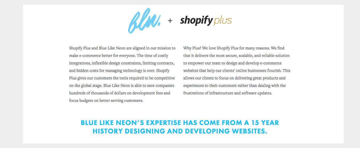
Don’t bury this information in a footer or on another page. Instead, you should present it as the first message a visitor sees on your landing page to remove any doubt of your capabilities. Shopify Plus Partner Blue Like Neon has a beautifully written example of this sort of statement, front and center on their Shopify Plus landing page.

2. Samples of your existing Shopify work
You are probably already relying on your portfolio site to showcase your previous work through detailed case studies, but you should also leverage these documents to elevate the impact of your Shopify landing page.
By showing off the best of your Shopify work, you’ll help make a business case for your value as a consultant, and persuade even the most skeptical prospect that you’re right for the job. This potential impact can be heightened even further if you incorporate your case studies as relevant examples, alongside the features and benefits you’ve explained in the previous section.
I wouldn’t recommend including full-length case studies on this page, but rather abbreviated versions that consist of the following:
- One to three visual samples of the final store
- A brief description of the project and any impressive results
- A testimonial from your client to add social proof
Shopify Plus Partner Pointer Creative uses case studies in this way perfectly. Their landing page includes three samples of their previous work, each from unique merchants and industries, that tell their site visitors they not only have experience working with Shopify, but that they achieve results and should be trusted.

You might also like: The Ultimate Guide to Getting Powerful Client Testimonials (With 6 Simple Questions).
3. A call-to-action accompanied by a contact form
While your portfolio site can be used to build awareness for your firm by driving traffic, its primary purpose should be to capture a portion of that traffic as leads for your pipeline. We’ve written before about how your “Contact Us” page is prime real estate for lead capturing, but the same tactics should be applied to other pages on your site, including your Shopify landing page.
By incorporating a contact form within your landing page, you’re well positioned to capitalize on any initial interest your site visitors may have, after they’ve read through the content sections mentioned above. Otherwise, any potential leads who may interested in connecting with you will be forced to navigate around your site, until they find a way to get in touch. Even if it’s just an extra click or two, this adds friction to their experience and will increase the likelihood of them exiting. Plus, as a potential consultant for their business, that experience won’t say anything good about your approach to web design.
It’s up to you how detailed you want your form to be. Some of our partners opt for shorter forms, while others prefer lengthier ones — whatever you choose, know that there are benefits for either option.
After scrolling through Lumia’s beautifully designed Shopify Plus landing page, the user is presented with a simple contact form that prompts them to get in touch. This minimal four-field form lowers the barrier to completion, and makes it extremely easy for an interested visitor to become a lead.

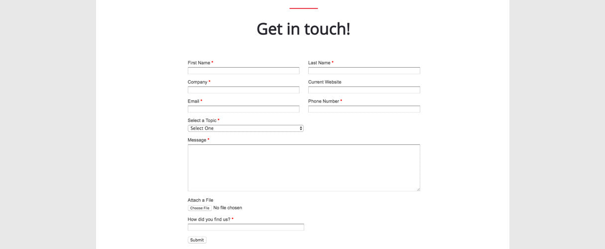
On the other hand, Shopify Plus Expert Minion Made uses a slightly lengthier form on their landing page. This allows them to qualify their leads to a greater extent, which allows them to streamline their assessment of project fit and their client onboarding process.

Whether you go short or long, it’s crucial that you implement some mechanism for visitors to contact you directly from the landing page. Otherwise, you’ll miss out on potential new business.
You might also like: How to Create a Client Intake Process That Saves You Time and Headaches.
4. A retargeting tracking pixel
Even with an optimized contact form, a portion of your landing page visitors will exit your site without leaving their contact information. If you are investing marketing dollars to drive traffic to this page, any visitor who leaves is an immediate expense — unless you employ a way to re-engage them after their initial visit.
That’s where remarketing can help.
Remarketing is a digital tactic that allows you to serve ads to people who have already visited your website through third party channels, like display networks such as GDN, social media networks such as Facebook, or search engines such as Google via Adwords.
Going into the nuances of setting up a remarketing campaign is worthy of another article entirely, so I won’t dive into those details here (but please comment below if you’d like me to write something about that topic).
Instead, here are some comprehensive resources I recommend you read if you want to learn more about remarketing:
- Remarketing 101: A Beginner’s Guide
- The Beginner’s Guide to the New Facebook Pixel
- How to Create Your First Remarketing Campaign in Google Adwords
If your firm offers marketing services to your ecommerce clients, you’ve probably installed remarketing pixels and cookies on their stores, as well as set up remarketing campaigns before. While this tactic can work wonders for ecommerce brands pursuing higher customer retention and loyalty, it can also be applied to your portfolio site to keep your brand top of mind among prospective leads and help plug any leaks in your sales funnel.
It’s ultimately up to you what sort of messaging and content you want to focus your remarketing campaigns around, but here’s my two cents.
You should try to ensure your remarketing efforts include hyper relevant messaging that pertains to the visitor and the content they were initially presented with on your landing page. This level of personalization in remarketing is known to help increase the likelihood of ad clicks and conversions.
If you have a unique tracking cookie or pixel on your Shopify page, at the very least you’ll know with a high degree of certainty that those visitors are:
- An existing or prospective online store owner
- Do not have design or development skills in-house or are looking for extra support
- Already within the purchasing process and are vetting potential suppliers
Armed with that knowledge, you can craft unique messaging and content for your remarketing ad that feels tailored to your visitors’ needs. I also recommend driving your remarketing traffic to either a useful Shopify-focused blog post, a Shopify case study, or a specialized landing page tailormade for remarketing traffic that offers some sort of opt-in bribe (maybe an ebook or free consult).
5. Your Shopify Partner affiliate link
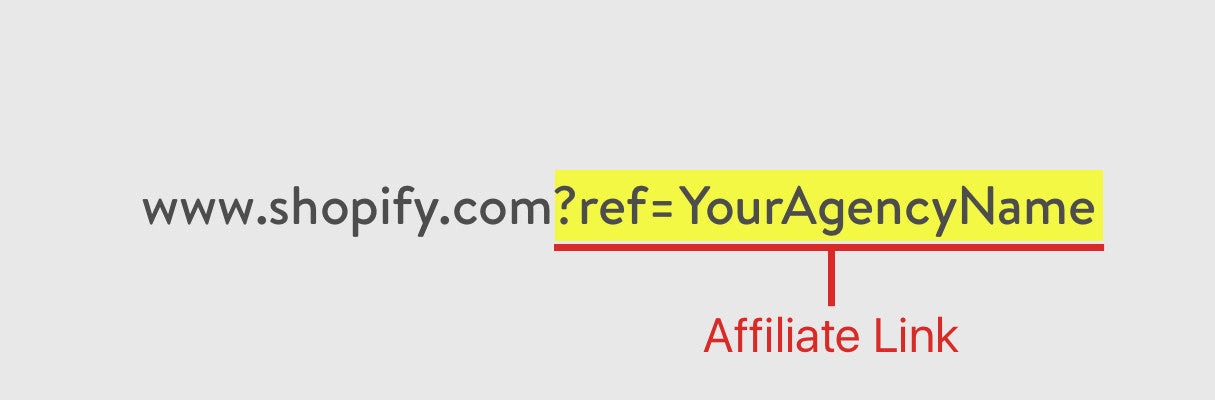
 Every Shopify Partner receives a unique affiliate link after being accepted for an affiliate account. This URL allows Shopify to properly track any traffic you may be referring to our site. An affiliate link typically looks something like this:
As a freelance web designer or agency, you might not be using your affiliate link to its full potential. If you append your unique partner identifier (i.e. ref=YourAgencyName) to the end of any outbound URL pointing to Shopify, rather than just using the standard structure without a handle, it will tie your partner account to any merchant who signs up for Shopify after clicking that specific link.
If the merchant completes their free trial, chooses a plan, and is successfully billed as a customer, you can earn some extra income from that referral — ultimately, opening another opportunity for your business to generate extra revenue through your partner account. Plus, this gives you an opportunity to connect with the newly referred merchant to inquire about any additional design or development services they might need with their new store.
Many Shopify Partners and Plus Partners incorporate their affiliate links into their Shopify landing pages, as a means to affiliate themselves to any potential referral traffic that signs up for Shopify, without directly contacting their agency. This is often found in the form of hyperlinking logos, banner ads, “Learn more” calls to action, and even within outbound links pointing to your Experts Marketplace/App Store listing page.
Pro tip: Admittedly, unless your portfolio is receiving a significant volume of regular traffic, you probably won’t see too many affiliated stores from this tactic. But given that adding your unique partner identifier on outbound links takes barely any time at all, it’s something you should still consider doing.
Grow your Shopify clientbase through your portfolio
Shopify landing pages can be a great way to let your prospective leads know that you are comfortable and competent working with Shopify or Shopify Plus. They communicate that you have experience with ecommerce, offer a service offering that is tailored to their needs, and have achieved impactful results for other merchants before. Ultimately, this cumulates together as another means for building trust with prospective leads.
Many of our partners have found success through this style of landing page. Hopefully the tips we’ve shared above can help improve your Shopify client funnel too.
Read more
- How to Get Web Design Clients Fast
- Prove Yourself: 4 Ways to Demonstrate Your Expertise
- 3 Simple Ways Your Agency Can Use Content Marketing to Build a Better Brand and Find New Clients
- Why You Should Stop Responding to RFPs and Do This Instead
- The Profitable Ecommerce Designer
- How to Host a Webinar That Attracts Clients
- How You Can Maximize Your Marketing With Any Budget
- Freelancing 101: How to Market a Small Business
- The Importance of Investing in Your Own Website
- Web Design Experts Share Their Advice for Attracting Your Next Client

