In order to create web pages that actually make a difference in terms of conversion, web designers need to understand how their designs can motivate a user to take action, rather than browse and bounce.
Subtle and often unseen features can play a huge role in helping users come to the desired conclusion. That’s where psychology comes in.
Psychology affects everyone without us even knowing, and this is incredibly important for designers whose web pages have less than a second to make an impact.
Here are five psychological concepts that every designer needs to know in order to maximize conversion results.
1. The Golden Ratio
To create beautiful web pages, you need to rely on principles that involve much more than just color theory and compelling photography. While you do not want to omit these elements, there is an even more important concept that can make or break your web page design, before you even start. It's called the Golden Ratio.
Using the Golden Ratio as a foundational step in web design, is based on the fact that it’s often used to create beautiful objects of art, including paintings, architecture, and music. It has been recognized for millennia (even the Egyptians may have used it when building the pyramids) as being essential in art and design, so much so that it has also been called the "Divine Ratio,” and the “Divine Proportion." It is related to the Fibonacci Sequence, which is found naturally in seashells, hurricanes, and even in the way galaxies spiral.
The Fibonacci Sequence is something you probably have inadvertently come across at school, when you were doing those math logic puzzles. This particular sequence comes from adding the last two numbers to get the next, e.g. 0, 1, 1, 2, 3, 5, 8, 13, 21, 34. Using the Fibonacci numbers as dimensions of squares, and drawing quarter circles within them, you end up with the aforementioned spiral.
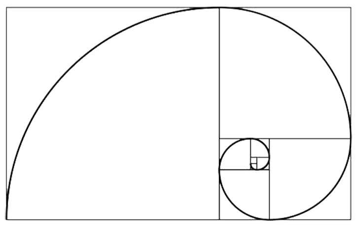
You need to add this concept to your web page design because it is incredibly appealing to the human eye. As you probably know, page load speed is important to keep page visitors from bouncing, and the Golden Ratio helps with this. Academics believe that we find the Golden Ratio appealing because we have adapted to scanning images faster when they have been shaped using it.
Here is how you can add this basic element to your web page design. The number of the Golden Ratio is 1.61. As an example, if you intend to create a web page that is 900 pixels wide, then you simply divide that number by 1.61. That will give you 559.0. This number, or 560, will give you the width you need for your text in the main box. Your right side column (or left), will be the difference of 900 minus 560, which equals 340. This same ratio also applies to vertical objects, such as the height of your graphics within your heading.

Perhaps you don’t want such a wide sidebar. No problem, just use the inside of the spiral to define where your sidebar starts, as seen in the example below. The overall effect will still be visually appealing, as it follows the Golden Ratio.
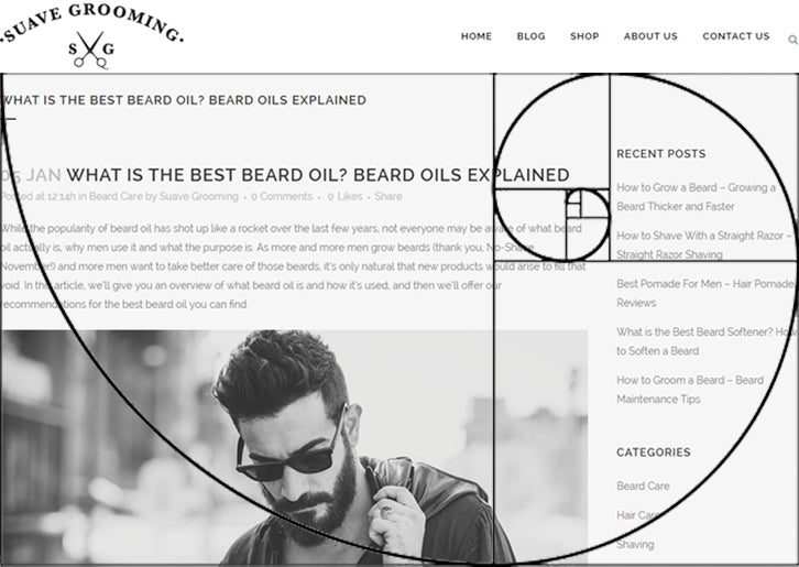
Another way to determine the size would be to lay out a grid with nine squares over the projected web page. Following the squares will be close enough to creating the impact you want. Use a two-to-one ratio: two squares for the main column, and one for the right hand column. You can see this in many websites where the content area is 600px, and the sidebar is 300px wide.
You might also like: 3 Design Tips for Reducing Your Online Store's Bounce Rate.
2. The psychology of color
The colors you choose to use in your web design will influence how your visitors respond to your site and brand. It is not random, and you do not want to go for "pretty," without considering the impact your choice of colors will have on visitors. Colors alone can either help people buy from you, or cause them to go elsewhere.
Color has such a large impact, that one study revealed people often make a decision to buy based on color alone. It also revealed that purchasing decisions are made by the majority of people within just 90 seconds. I thought I made snap decisions, but it turns out everyone does!
Even the names of colors have an impact on sales. In the cosmetics industry, a lot of effort goes into selecting names for products, because they know how much this can affect its success. In an experiment, participants were given swatches, with either generic names or “fancy” names. Fancy color names significantly impacted how favorably a color was perceived. Would you rather have the brown lipstick or the nutmeg one?
Other research demonstrates this effect with regards to different products, like crayons and ice cream. When marketing messages, like the name of a product flavor or color, are unusual, shoppers will look for the meaning behind the deviation, which can lead to a better opinion on the product.
So how should you use color psychology in your marketing? If you’re creating a website for a new brand, colors evoke different emotions and stir various actions. This color chart is a great place to start your research.
If you’re working with an established brand, you’ll have to stick somewhat to the color palette that has already been created. However, this isn’t to say these are always the colors you should use. The answer to what colors convert best comes down to A/B testing. It’s about finding the balance between what fits with the brand, and also what converts well. You wouldn’t see Ferrari with a bright pink button on its website would you?
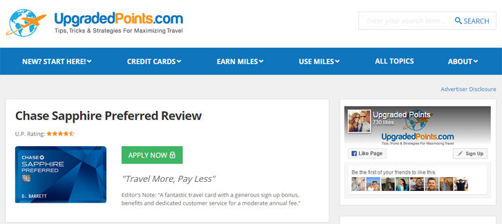
In the example below, a travel hacking website has various cards you can apply for. Originally, the “Apply Now” button was orange, to match the logo. They ran a split test against a green button, and the result was a nine per cent increase in click-throughs. It’s a huge win when all it took was changing the color of a button. Until you have a 100 per cent click-through rate, there will always be an A/B test you can run. Just make sure that you only make one change at a time, and also that the results are statistically significant.
You might also like: 10 Beautiful Ecommerce Website Color Schemes.
3. Applying Fitts' Law to human-computer interaction
You should also take Fitts' Law into consideration when designing a web page. This law was created before modern computers, yet it can still help you get higher conversion rates.
Fitts’ Law dealt with the ease with which a target could be hit at a distance, by moving your hand from one point to another. It noted that the smaller the target and the farther the distance, the harder it would to accurately hit the target with your hand.
The importance of Fitts’ Law in web design, can be seen when you consider how far the mouse cursor needs to be moved toward the positive button (e.g. “Buy Now” button) you want your visitor to interact with. The further the distance and the smaller the button you want a user to click, the less accuracy they will have.
In the example below on the left, you’ll see the quantity dropdown and “Buy Now” button are close together, and the button is also the dominant feature. In the example on the right, there is an increased distance between both elements and the button (the target) is significantly reduced in size. According to Fitts’ Law, the example on the left would convert at a higher rate.

This small design decision can play an important part in driving more sales, because it’s just as easy to hit the wrong button as hitting the right button. You can expect this to happen in your interface if your buttons are small, and the positive button is close to the negative one (e.g. “Go Back” or “Close”). Ideally, you want there to be a comfortable distance between them, so that buttons are not hit accidentally.
There may also be a problem caused by various devices and how they are held, such as trackballs. A user might miss a button or link, if it’s placed on the top curve of a web page, or if you use another method like pop-up menus that fly across the page.
It’s also important to consider Fitts’ Law when you are creating a web page for a mobile device. You want to keep the desired button easy to reach, and keep the undesired button, such as “Unsubscribe,” in a place where it is less likely to be hit by accident. Both orientations need to be considered.
You might also like: How to Create a Sticky Add to Cart Button On Scroll.
4. The psychology of choice
It can be tempting to throw all your products on a page, and expect customers to make their choice. It would be simple if it worked that way. Unfortunately, it’s not that easy.
Research shows that customers refuse to make a decision when there are too many choices available. Too much choice can create “choice paralysis,” and can even cause dissatisfaction once a decision has been made, even if it was a good one. There appears to be some truth to the phrase “the grass is always greener.”
Instead of offering more, it is better to offer less. This makes the choice easier for your visitors, and you will discover that more people will want to purchase.
This means you need to keep it simple when building your website. Make sure that you do not have an overwhelming amount of calls to action, or a lot of options and places your users need to click. This will only confuse them, rather than help you sell more. Make what you want your visitor to do clear, and it will be easier for them to choose. Simply put, less choice means more sales.

Not to toot Shopify’s horn, but take their homepage as a good example. There’s a few options available, but rather than reducing them further, the action that visitors are urged to take is highlighted, not only with the use of color, but also in size and prominence.
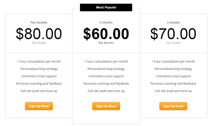
Above is another example of various pricing plans. There are unlimited options that could be offered but this keeps it simple with three, and the offer that will ultimately generate the most revenue is center stage.
You might also like: Designing With the User's Context in Mind.
5. Social proof will influence customers to act
Humans are hardwired to believe some things, and psychology plays a large part in that. This is known as cognitive biases, and there is a whole host of them that we are susceptible to. Understanding how these biases influence the behavior of your site visitors is essential when trying to convince people to buy.
One of the most prevalent cognitive biases used in marketing is social proof. Social proof, sometimes called informational social influence, is where individuals will assume that the actions of others is the correct course to take.
When many people have bought a product, liked it, and shared that positive experience, it is proof of the quality of a product, and as a result more people are apt to buy. This is social proof at its finest. The fact that one person tried a product and liked it, is a good reason for another to try it, too.
There are several ways to show social proof on your website. You can provide testimonials, and including a picture of the happy buyer is even better. Video testimonials are even more likely to be believed. You can also show how many people are following your client’s web page or company on social media with a social share bar.
Another option is to show prominent publications, which have featured your client, or brands they have partnered with. All of this creates social proof that will help create trust between a website and a visitor. Below are some examples of social proof in action.
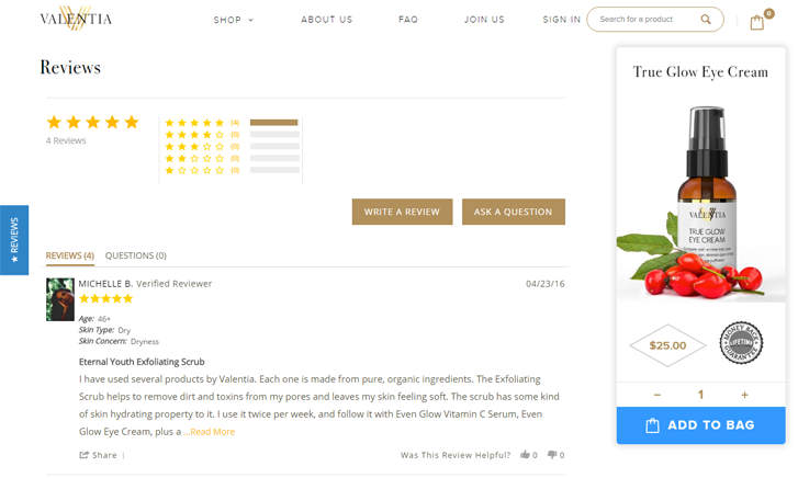
Like many ecommerce websites, this Shopify store has a review section with each product, so you can see ratings and feedback from other shoppers. What makes these reviews particularly effective is not only the user’s image, but also their specific details, like age and skin concerns. This adds an extra layer of authenticity to the social proof.

This blog operates by collaborating with major brands. Displayed prominently on the homepage are previous brand partnerships, which lends weight and credibility to the blogger.
You might also like: Social Proof: 5 Ways You Can Leverage Customer Feedback.
Use these 5 psychological concepts to maximize results
Increasing conversions will take a little thought—but by leveraging these five psychological concepts you can enhance your user experience and your bottom line. Your visitors won’t know the difference, but you’ll be glad you took the time to add these concepts to your online store.
Read more
- What to Consider When Planning a Website Redesign
- How Theme Developers Can Learn From Brutalist Web Design
- 6 Principles of Effective Interaction Design
- 8 Things My Mom Taught Me About UX
- The Use of Color Contrast in Mobile Ecommerce Design
- Typography in UI Design
- 5 Common Digital Content Problems and How to Avoid Them
- How to Use Eye Tracking in Usability Tests
- Content Strategy: The Principles we Followed to Build the New Shopify App CLI

