Consider this: a customer is shopping on your client’s page and scrolling through a product’s awesome description. The customer is getting excited to buy the product, but as they scroll further, they don’t see a buy button.
They soon realize they have to scroll all the way back to the top to look for it, and in this moment, their excitement to buy the product is overshadowed by their need to search for the ‘add to cart’ button. Once this happens, your client might lose the customer’s interest and could potentially miss out on a sale.
Any moment of purchasing hesitation – even short ones like this – can have a big impact on conversion. In this article, I will go over a couple of methods you can use to implement a sticky ‘add to cart’ call to action button that will stay with customers as they scroll down through a product’s description.
As a source of inspiration, I have selected Frank Body and Code & Quill, two of our 2014–2015 Ecommerce Design Award winners. (Side note: we’re accepting submissions for this year's Ecommerce Design Awards right now – you could win a trip to NYC!)
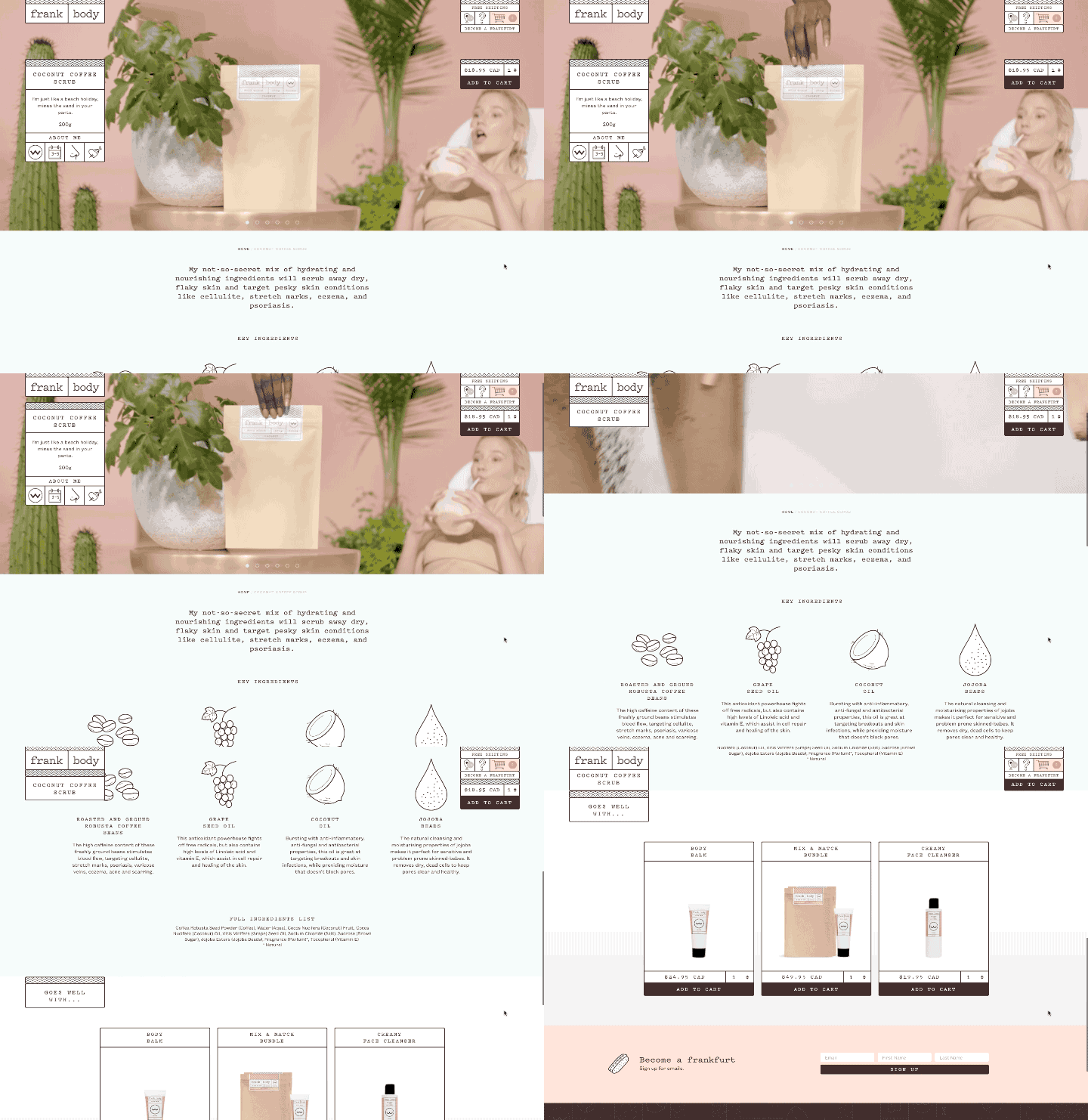
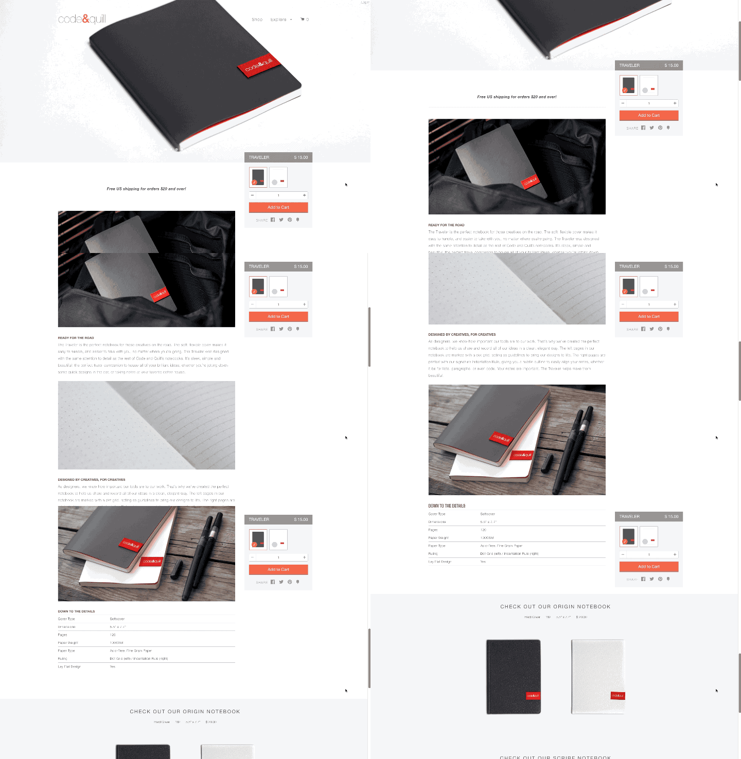
On Frank Body's site, the product’s description is detailed and interesting, which invites the customer to scroll through the product details. On the right hand side, we can see the sticky 'add to cart’ panel, which contains the product’s price, quantity box, and the ‘add to cart’ button. This is a clever implementation because the customer does not have to search for the price, and can add multiple quantities without having to navigate or scroll anywhere else on the page. Code & Quill also uses the sticky ‘add to cart’ panel in their ecommerce store. What’s particularly interesting about their implementation is that they allow customers to select different product variants directly within the panel itself. In this case, customers can choose between a dark grey or white book cover. They also include a price, quantity box, and sharing option. Making these details enticing could lead to purchase, or to customers checking out related products.
You might also like: Ways to Customise the img element in Shopify Themes
Method 1: CSS3
CSS3 introduced position: sticky; which is a hybrid of relative and fixed positioning. Under Mozilla Developer Network’s documentation, they explain that the “element is treated as relative positioned until it crosses a specified threshold, at which point it is treated as fixed positioned."
For instance, #one { position: sticky; top: 10px; } will behave just like a relatively positioned element, until the viewport scrolls such that the element would be less than 10px from the top. Then, it will be fixed to 10px from the top until the viewport is scrolled back past this threshold.”
Here’s a working Codepen example that shows this technique in action: (Don’t see the sticky functionality below? Try using Safari instead of Chrome)
See the Pen Sticky positioning by Shopify Partners (@ShopifyPartners) on CodePen.
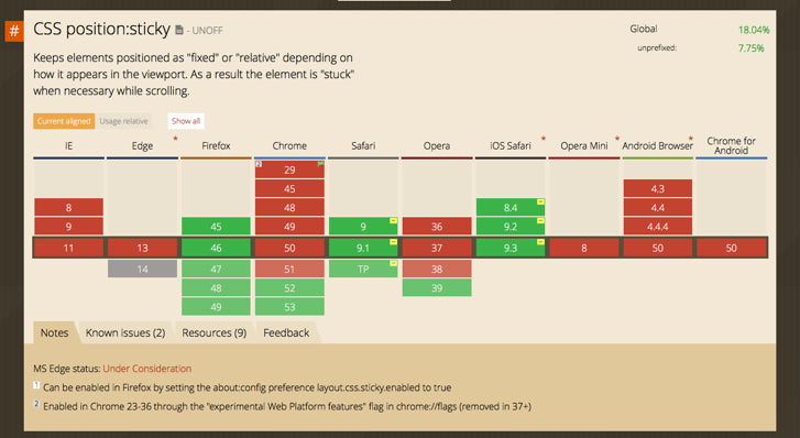
It’s important to note that while this is easy to implement through CSS, it’s not supported on all major browsers (including Chrome, believe it or not). Can I Use provides us with the following support chart for position: sticky;. If you would like to use position: sticky; but need to support other browsers, check out this CSS polyfill by Filament Group.
Method 2: jQuery Plugin
One thing is certain, we want our sticky ‘add to cart’ panel to work on all modern browsers, because we want all of our clients’ customers to have the same quality shopping experience. To do this, we can use a cross-platform jQuery Plugin. There are many jQuery plugins that perform the same functionality such as Sticky-kit and Waypoints, but for this example I will use Sticky.
If you’re new to front-end development, jQuery plugins are resources you should take advantage of. For the most part, this is because they are relatively easy to implement and can provide you with quality functionality. To add sticky elements to our product pages, we will need to include jQuery and Sticky, and call Sticky to our ‘add-to-cart’ panel:
The above code implementation will set our ‘add to cart’ panel 50 pixels from the top of the browser window, when it has been scrolled to. There are plenty of other calls we can add using Sticky to create even more interesting interactions; for more details, check out Sticky’s Github page.
Here’s Codepen with a working example:
See the Pen Sticky Add To Cart Panel by Shopify Partners (@ShopifyPartners) on CodePen.
You might also like: The Essential List of Resources for Shopify Theme Development
Scrolling and its opportunities
As a side bonus, I wanted to mention Scroll Magic and share a Codepen demo. Scroll Magic is a javascript library for magical scroll interactions.
- ScrollMagic helps you easily react to the user’s current scroll position.
- It’s the perfect library for you, if you want to:
- Animate based on scroll position – either trigger an animation or synchronize it to the scrollbar movement (like a playback scrub control).
- Pin an element starting at a specific scroll position – either indefinitely or for a limited amount of scroll progress (sticky elements).
- Toggle CSS classes of elements on and off, based on scroll position.
- Effortlessly add parallax effects to your website.
- Create an infinitely scrolling page (ajax load of additional content).
- Add callbacks at specific scroll positions or while scrolling past a specific section, passing a progress parameter.
Check out the demo page, browse the examples, or read the documentation to get started.
This Codepen example uses sticky elements for titles to simulate the contact page on iPhones:
See the Pen Multiple Sticky Titles with CSS and JS by Shopify Partners (@ShopifyPartners) on CodePen.
Sticky calls to action: a lot for a little
Your clients want to deliver amazing shopping experiences to their customers, and you can help them do just that. Furthermore, your clients do not want to lose sales due to moments of hesitation. Adding a sticky ‘add to cart’ button that follows the customer as they scroll is a clever way of eliminating possible hesitation, by avoiding the need to scroll all the way back up a page to buy a product.
As we saw in this article, it’s just a matter of adding a jQuery plugin and one line of code to make this happen. Also, explore the possibilities of Scroll Magic — you never know when the perfect situation could arise where you want to trigger new interactions on scroll.
What do you think of using sticky 'add to cart' buttons on a client's ecommerce site? Tell us in the comments section below.
Read more
- How to find your next brick and mortar client
- How to Customize Content by Country with Shopify
- An Overview of Liquid: Shopify's Templating Language
- How to work with Metafields when building Shopify themes
- Working with Product Variants When Building a Shopify Theme
- How to Use Shopify’s New font_picker Settings
- Creating Useful CSS Hooks in Liquid
- How to Use Math Filters with Liquid
- How to Work With Shopify Theme Blocks
- 8 Development Tips for Building Better Custom Shopify Sites

