Here is a depressing thought for you: You can create compelling content, presented within a stunning design yet still disappoint users.
You see, design and content are not enough if we do not also consider the user’s context. In fact, you cannot create a great design or appropriate content without understanding the context the user is in.
Now you might be thinking that I’m overstating the point. But that is probably because most of us have a narrow view of what the user’s context actually is.
You might also like: The Top UX Elements to Optimize Your Clients’ Product Page Design
What exactly is context?
The problem is that when we think of context, we are often thinking about location. We are thinking about a user who is accessing your website on a train, versus somebody sitting on a couch at home.

It is true that location is an important part of the user’s context. Location affects the kind of content users are likely to consume.
Location also affects how we see and interact with design. If we are walking down the street filling in a form, it will be a challenge. We'll be consuming design in an environment that is noisy, most likely surrounded by children, pets, or other distractions, not to mention that we will struggle with screen glare, too.
When we are thinking about location, we often find ourselves considering other devices too. In fact, it is almost completely impossible to ignore the context of the user’s device these days. After all, the device affects how the user interacts with your site and how they perceive your user interface. For example, using a touchscreen on a mobile phone is a different interaction than using an Apple TV with the Siri Remote.

But if our thinking stops at location and device, we are missing out on a large number of contextual factors that influence the user's behaviour.
Have you considered how comfortable your users are when they are interacting with your site? A user may be uncomfortable because they are using a mobile device while standing. Or what if they have some form of disability? If so, you will find them less patient with your interface and dwell time will decrease as a result.
In fact, the users emotional state is an important part of his or her context. Our stress levels and temperament will also affect how patient we are with the user interface and how much time we are willing to give it.
For many people, time is one of their most valuable commodities. How much time somebody has is a big consideration when thinking about context. If you waste the users time, they will abandon your site and move on to the competition.
Of course the amount of time somebody spends on a task is dependent on the level of commitment they feel. This, in turn, can influence their location in the sales process — another element of context we need to consider. We need to ensure we're thinking about the entire customer journey and where the user currently is on that journey.

The final element of context to consider are the people who influence the user. We are all influenced by a huge number of sources that include our friends, families, and social networks. But influencers aren't limited to personal connections alone — we can also be swayed by review sites, celebrities, and mavens within a particular area.
For example, consider your site sells engagement rings. These significant items are often bought by one partner. But you would be mad to ignore the influence of the other partner in the final purchasing decision.
Discovering the user's context
With so many elements affecting the user’s context, we must take the necessary steps to truly understand our users. Despite their value, we cannot simply rely on usability testing because that doesn’t tell us much about the context our users operate within.
Instead we need to spend time with users. We need to visit them in their homes so we can see the context of their interactions. We need to talk to them about their lives, their families, and their jobs. We need to focus as much on their emotional state as we do with the specific tasks they’re trying to complete. And we also need to understand the journey that they pass through.

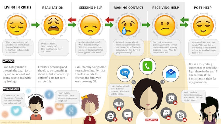
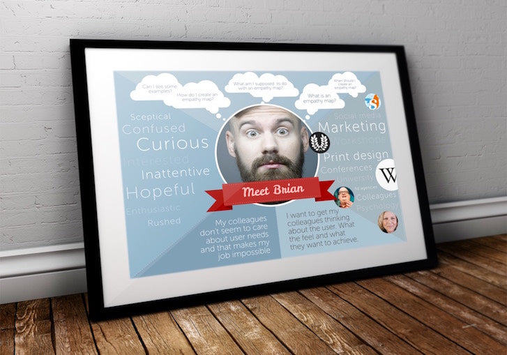
This is why tools such as empathy maps and customer journey mapping have become so important in user experience design. But these tools, and their resulting insight, cannot be our best guess of user behaviour. We need to support them with proper research. If we are going to design with context in mind, we cannot play lip-service to user research. You can check context with a user test called a contextual inquiry.
Customizing around context
Once we understand our users, we can start to customize their experience based on what we know of their context. There is obvious customization we can do around the device they are using, but that is just the tip of the iceberg. Here are three areas of customization you should consider:
1. Customize based on the user journey
If we understand the user journey, we can craft messaging around where they are in that journey.
Let’s say we know that a user has decided to buy our product or service because of previous interactions they have had with us. This is not the time to ask them to complete secondary calls to action, such as following us on Twitter, or signing up for a newsletter. We need to hide these calls to action so that the user can focus on placing an order.
2. Customize based on user actions
In our attempt at customization, we can go as far as triggering certain events based on user actions. For example, if a user abandons the shopping basket we could send a follow-up email. Equally, if they visit our website at a particular time of year, month, or day, that tells us something about their context. We should use this knowledge to customize their experience.
Our focus should be on customizing the content to reflect the user's context. This ensures that our content is as relevant as possible. One example of this customization would be to alter a generic “follow us on Twitter” call to action, in favor of a tailored message unique to the user’s context.
Let’s say the user has just purchased a camera on an ecommerce site. We can reword that “follow us” call to action to something like “for tips and tricks on using your new camera follow us on Twitter.” This becomes a much more compelling call to action because we have incorporated our understanding of the user’s context in a relevant and meaningful way.
3. Customize based on user experience
We can also use context to inform design as well as messaging. For example, we should be able to treat new users differently from those who return to our site on a regular basis.
Interacting with a new website can be a confusing experience, but a lot of explanatory text can be an annoying distraction for a regular user. We should be customizing the experience of these two groups differently. We can start to remove instructions, and introduce more advanced features, as people return over time.
Regardless of how we attempt to customize our user's experience, we must be careful. It is easy to think we understand the user context, when in fact we do not.
You might also like: The Seven Deadly Sins of User Experience Design
Avoiding assumptions
It's so easy to make assumptions when it comes to context. This can be dangerous because it can lead to inappropriate design and content.
A perfect example of these assumptions can be found with regards to device usage. It is easy to assume that because somebody is using a mobile device, they are out and about. We may think that because of their location, we can de-emphasize or remove some content from their experience. We may presume that users will be more interested in contact information because they are 'on the move'.

Just because people are on the phone doesn't mean they are 'out and about'.
In reality, it is just as likely that somebody will be using a mobile device while sitting on a sofa at home as sitting on a train. We cannot assume what people are trying to do by the device they are using.
Neither can we make too many assumptions about users based on their demographic. For example, many assume that the elderly are more likely to struggle completing tasks on digital interfaces. But, this is not always the case. Younger audiences tend to muddle through, ignoring instructions, and guessing what to do next. An older audience often lacks confidence, and so, takes the time to look at all the options and read the instructions. The result is that they may be slower, but tend to make less mistakes.
You might also like: The User Experience Delusion
The contextual design will improve experience
Understanding context is a powerful way of customizing the user experience. Yet we cannot use it to remove content or completely transform the interaction. We cannot be sure enough that we understand context to do so.
But even so, designing with context in mind can improve the experience of users. It can lead to an easier-to-use interface, more relevant content, and a personalized experience — exactly the kind of things that separate you from the competition.
Want to read more on UX design? Check out some of our other user experience articles.
Read more
- How to Use Eye Tracking in Usability Tests
- 5 Common Digital Content Problems and How to Avoid Them
- Content Strategy: The Principles we Followed to Build the New Shopify App CLI
- Free Webinar] How to Convert Visitors Through Persuasive Design
- The Benefits of Using a UI Kit
- How to Use an Empathy Map in the Design Process
- The Top 4 Reasons Users Abandon Their Carts and What to Do About it
- Shopify's Mobile Device Testing Lab Gets Wheels

