When asked, customers make their reasons clear as to why they abandon shopping carts. But fixing those problems is hard. In this post, UX designer, Paul Boag points you in the right direction.
It feels like every few months some company releases survey results outlining the top reasons users abandon their shopping carts. Every time, these reports list the same old issues. Issues such as:
- Being forced to create an account.
- Struggling with complicated checkout processes.
- Unexpected delivery costs.
- Concerns over security.
Why then do these issues keep coming back? In this post, we look at four of the biggest issues, ask why they exist, and discuss some possible solutions.
Let’s begin with forcing users to create an account.
Being forced to create an account
Clients know that if users create an account they are more likely to place a repeat order, making it easier to maintain a relationship with them. Let's be honest; those are two good reasons. So how can we give clients what they want, without damaging the user experience, growing the bounce rate, and increasing cart abandonment?
1. Pick your moment
Users didn’t come to your site to create an account. They came to buy something. If you let them buy first, they will be happier, less likely to give up, and more open to creating an account. So wait until they have finalized their order, and at that point ask them if they want to create an account. But when you do ask, make it easy.
2. Make account creation simple
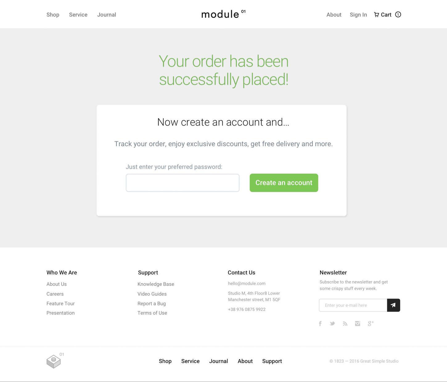
Creating an account should require nothing more than picking a password once the user has finished making a purchase. After all, you have collected their email, shipping address, and other details.
Creating an account should require nothing more than picking a password once the user has finished making a purchase.
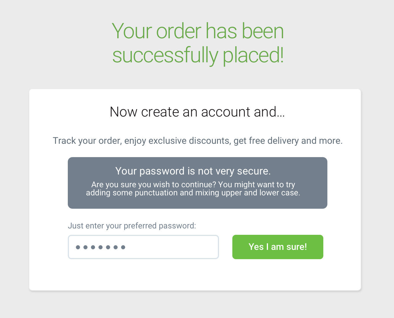
But don’t require users to provide some convoluted password . Instead, let them go with any password they want. If the password they pick is insecure, don’t stop them. Instead, warn them and offer advice on how to improve it.
3. Give people a reason to create an account
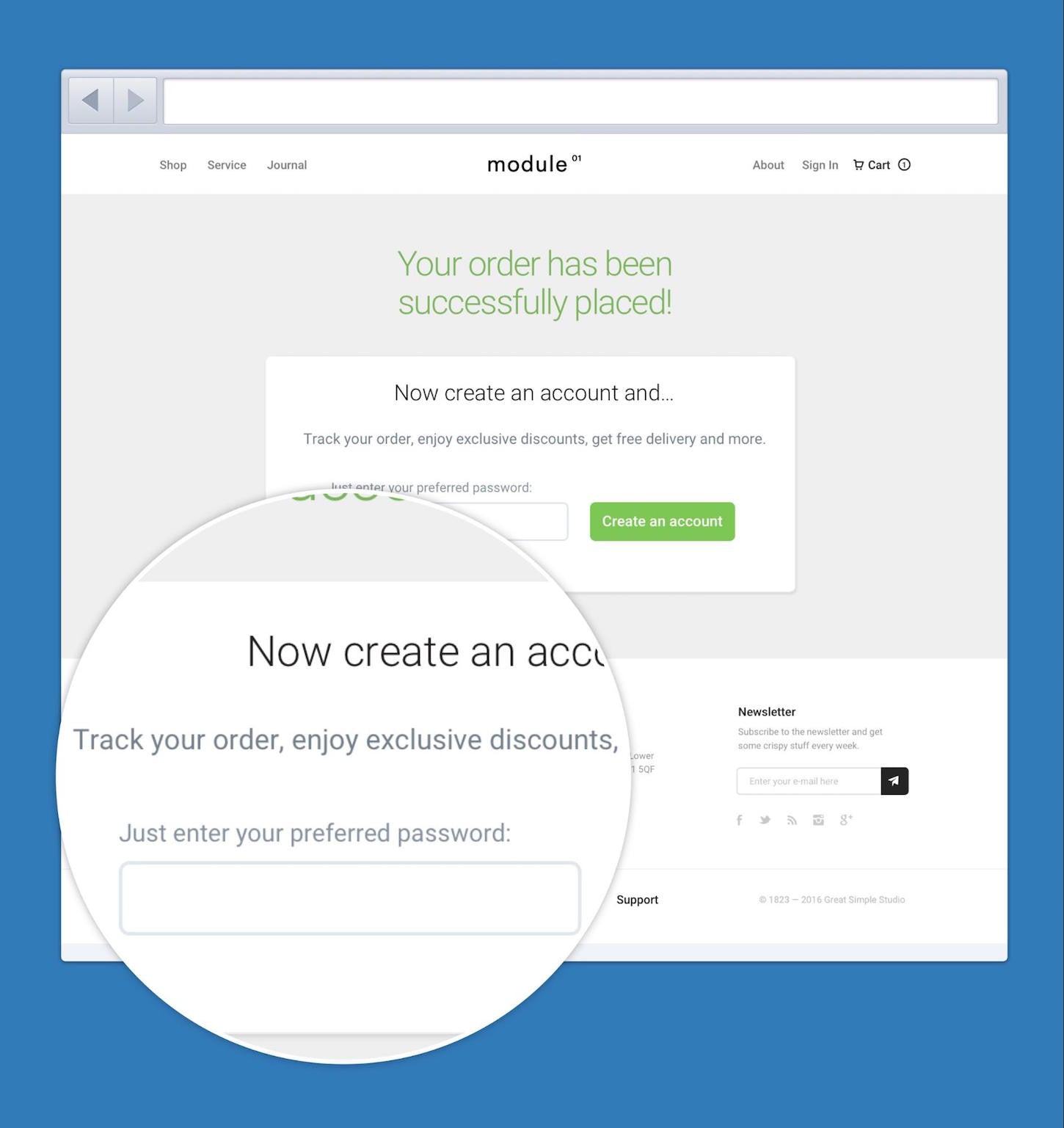
If you aren’t going to force users to create an account (and let's be clear, you shouldn’t), then you need to give them a good reason to do so. What value does creating an account offer them? Does it let them track their order, get a discount, or access exclusive information? Make sure you make these benefits apparent.
Another example of clients making poor decisions that ultimately increases cart abandonment is adding additional fields.
You might also like: 3 Strategies for Improving User Experience in Your Ecommerce Designs.
Struggling with complex checkout processes
Clients love to add fields to their checkout process. After all — they reason — the more they know about users, the easier it is to persuade them. What’s more, they’re right! But what they fail to consider is the cost of adding ‘one more field’. So how should we respond?
1. Ask the client how they are going to use the data
Let’s be honest, adding one field to a form doesn’t have a huge impact on abandonment. But it will have a small impact and that becomes an issue at scale. Even a tiny percentage of users giving up because of too many fields can cost a lot of money when you have a lot of users!
That might be a price worth paying if the client makes good use of that extra data and attracts more users. But are they? There is a huge difference between gathering data that they will use daily and data that is ‘nice to have’.
There is a huge difference between gathering data that they will use daily and data that is ‘nice to have’.
That is why I recommend sitting down with the client and discussing the issue. Ask them how they intend to use the data and how that will help lead to more sales. If he or she is confident that it will offset any abandonment, then it might not be a bad idea.
2. Validate your hypothesis
Once you have discussed adding the field, make sure you test your decision. Consider split testing a version of the checkout with and without the extra field. If you don’t have the traffic for that, try some usability testing and track the time to complete the task.
Even if you do roll out the extra field, remember to revisit the issue further down the line. Did the client make use of the data as they said they would? Did it create the desired returns?
You might also like: How to Build Usability Testing Into Everything You Do.
3. Pick your moment (again)
If you do add the extra field, consider adding it to the end of the checkout process just as I suggested for account creation. That means it will not impact cart abandonment, while the client still gets the data they want.

The key is to realize that the site owner isn't stupid when they ask for an additional field. They have their reasons, just as they have reasons for hiding delivery costs. A decision that always leads to abandonment.
Unexpected delivery costs
Let’s be honest; we tend to presume a site is being manipulative when it hides the delivery cost before checkout . We think it wants to make the product appear cheaper than it is. However, that is often not the case. Often it is because it’s hard to show delivery until the user has selected a product and provided an address.
1. Consider offering ‘free’ delivery
Of course, one option is to provide free delivery by rolling the cost into the price of the item. That or have a universal delivery charge. A free or standard delivery charge is more user-friendly. But many retailers are reluctant to do this because it tends to raise prices that make the site appear less competitive. So if that is not an option, what should we do?
The answer is in knowing what users are after. Sure, they want a delivery cost. But what they are after is clear, open communication. But how do we do that?
2. Show a clear estimate
It is so easy to get hung up on edge cases. We tell ourselves we cannot show delivery prices because if the user lives in some obscure place, it won’t be accurate. As a result, the majority of users get incomplete information for the sake of a handful.
As a result, the majority of users get incomplete information for the sake of a handful.
Instead, give people an estimated delivery cost next to each item . Obviously, this price won’t be 100% accurate depending on where people live and how many things people buy. But it will be a guide. You could even show a “delivery from” price and display the minimum delivery cost it might be.
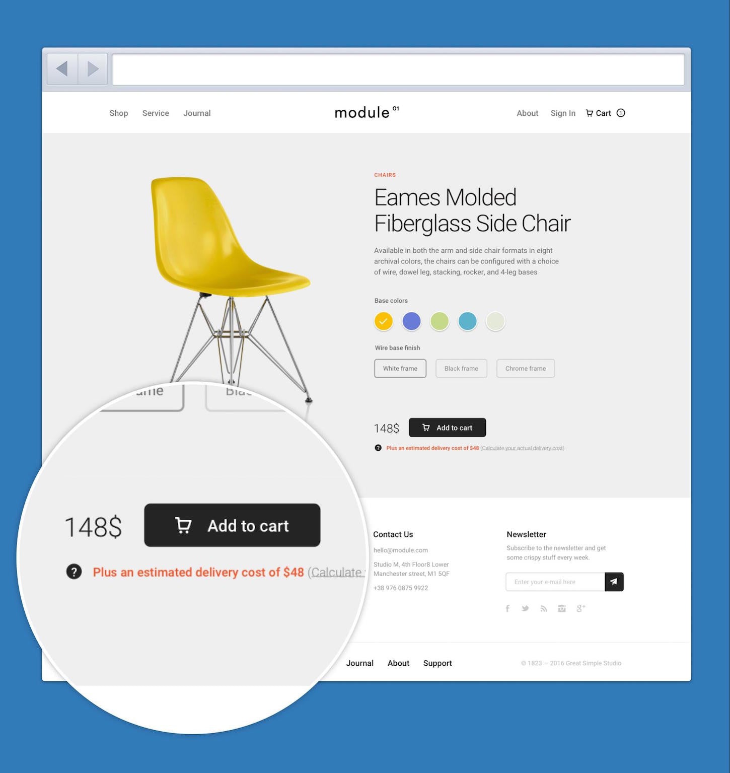
Whatever approach you take the key is to display that it is an estimate clearly.
3. Provide a delivery calculator
But why stop there? Users could click on an estimate to launch a delivery calculator. By entering their zip code, the user could get a more accurate quote for delivery of that product. What is more, once you know the user's zip code, you can provide updated quotes for all items. That quote could even automatically update as the user adds more items to their shopping basket.
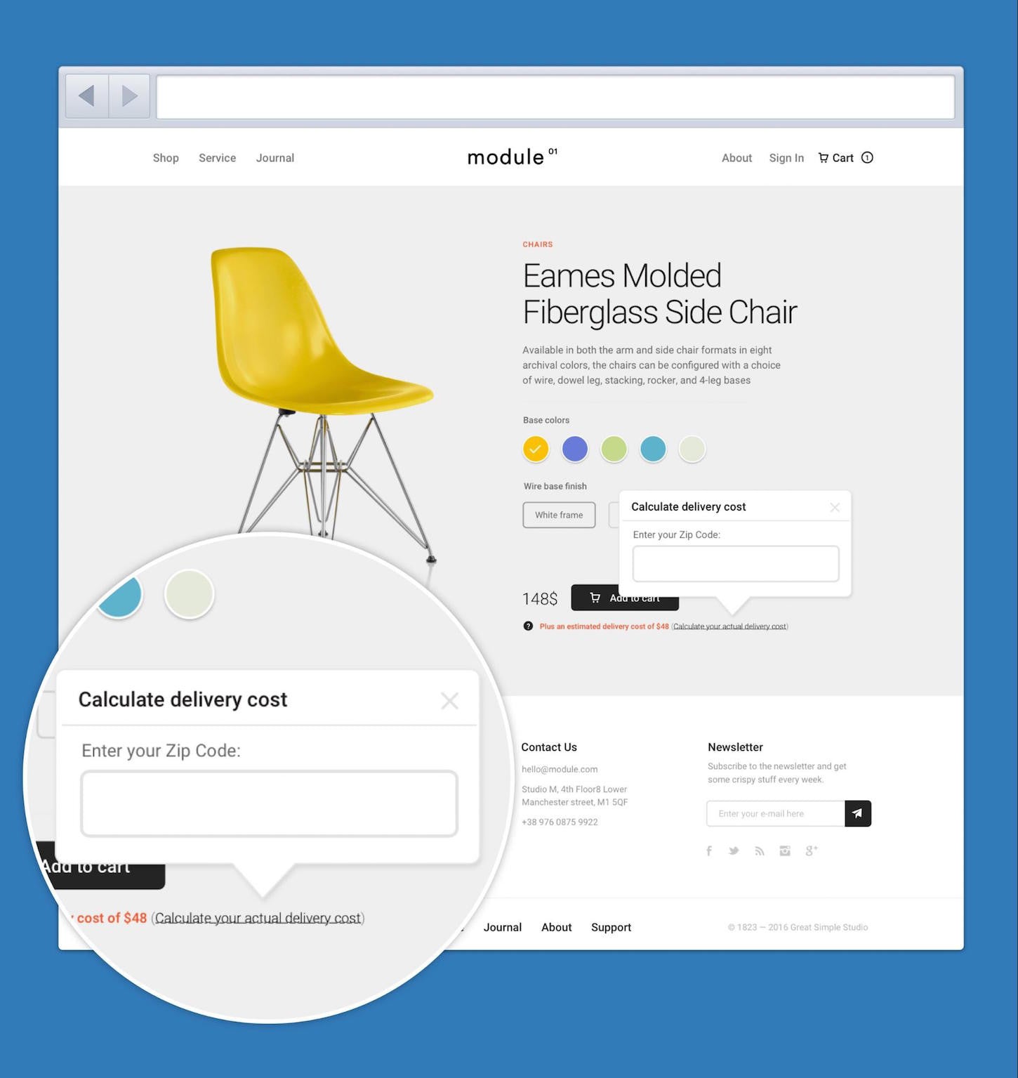
Is this approach perfect? The short answer is no. But it is an improvement when working within the constraints imposed by the client. Not that we can blame the client for all our woes.
Concerns over security
So far, we’ve blamed the client for all the reasons users abandon their shopping baskets. But when it comes to security we’re our own worst enemy . That’s because we’re so comfortable with digital that we forget others are not.
When it comes to security we’re our own worst enemy.
To us, it might seem like madness, but there are still many people out there who are hesitant about buying online. They have read about the rise of credit card fraud and online scams, and it’s left them nervous. So how can we reassure them?
1. Provide clear, simple messaging
Reassuring users all comes down to clear communication. We try to reassure users by adding things like VeriSign logos to our site, but these are meaningless to the average person. I once worked on an e-commerce site that saw a 6% jump in conversion simply by replacing the VeriSign logo with a padlock and a short statement that said the site was secure.
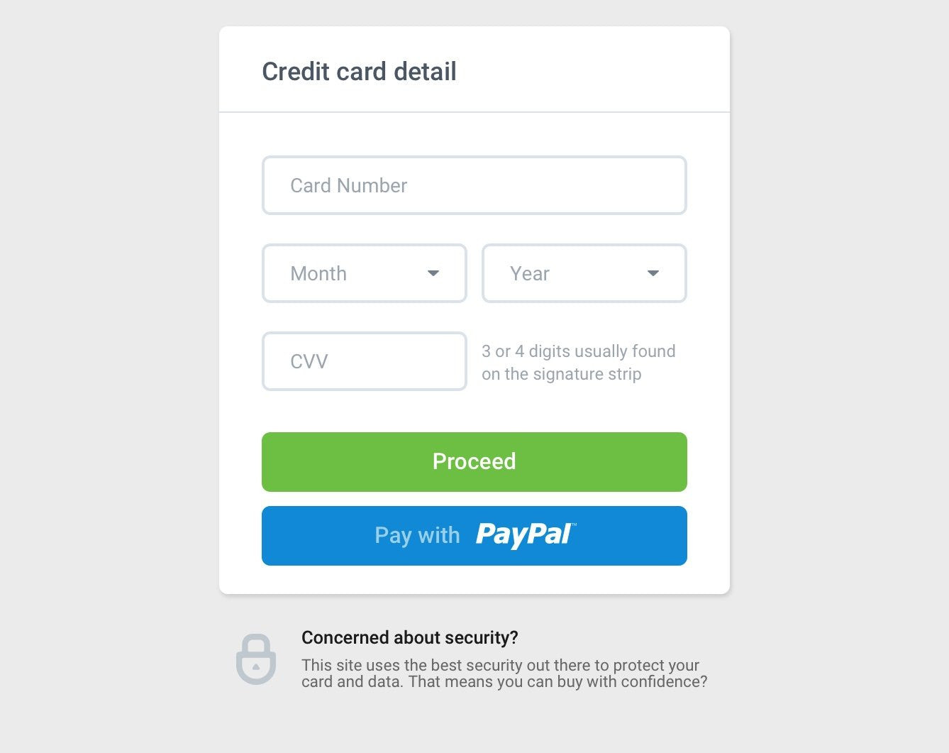
2. Add independent and recognized credibility
In some ways, the inclusion of a VeriSign logo makes a lot of sense. External validation helps a lot, but only if people recognise the source.
One way to reassure users about the ‘credibility’ of your site is to link to popular publications that have written about you. Failing that you can link to general advice about buying online from reputable sources like the BBC.
3. Make sure that padlock is in the address bar
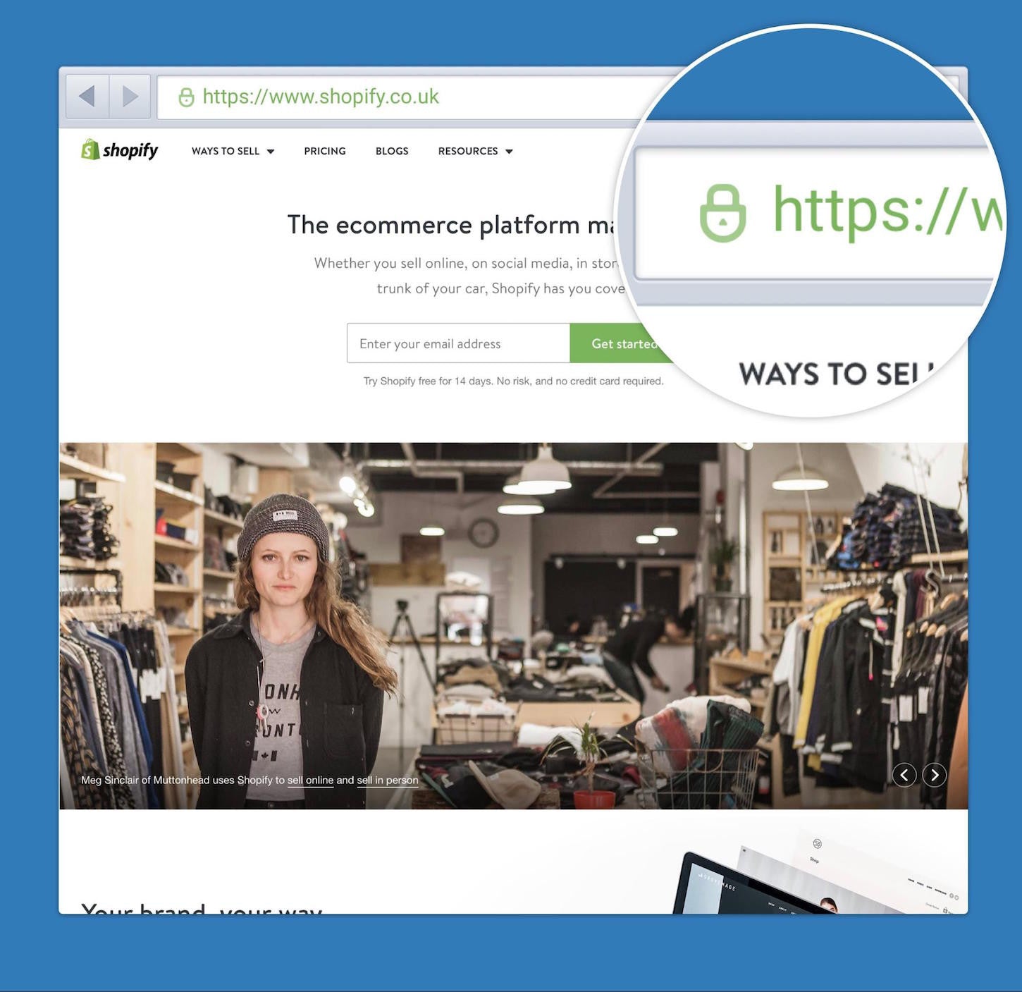
Obviously, the most important thing you can do is ensure that the site is secure! But from a user's perspective that often boils down to one thing; does the address bar include a padlock. If it isn’t there for whatever reason (even a good one), you will see a spike in cart abandonment.
You might also like: 5 Ways to Help Your Clients Build a Trustworthy Online Store (Without Ever Leaving the Shopify App Store).
The truth about cart abandonment
In truth, even if you follow all the advice in this article, you’ll never stop all users from abandoning their basket. There are many other reasons not covered here. Some as out of your control as the doorbell going mid-purchase, or not being able to find a payment card.
But I still see so many ecommerce sites making fundamental mistakes when it comes to their checkout process. Problems that we can fix with a little bit of consideration of the user experience.
Read more
- How to Build an Abandoned Cart Email Sequence
- Internationalization: Practical Tips to Build for a Global Audience
- How to Use Eye Tracking in Usability Tests
- 5 Common Digital Content Problems and How to Avoid Them
- Typography in UI Design
- Forget User Experience. Start Thinking About Client Experience.
- Why and How to Improve Ecommerce Website Accessibility
- The Key Aspects to Consider When Building Multilingual Websites
- The Pivotal Role of User Experience Design in Brand Building
- Content Strategy: The Principles we Followed to Build the New Shopify App CLI
How do you help your clients overcome cart abandonment? Tell us in the comments below.

