Mobile usage is steadily rising. The number of mobile phone users in the world will pass the five billion mark by 2019, and more than ever, people are engaging with their phones in crucial moments. The average U.S. user spends five hours per day on mobile, and the vast majority of that time is spent on apps and websites—making mobile an extremely valuable medium for app developers.
What makes a good app and what makes a bad app? The difference often comes down to the quality of its user experience, which is why product teams spend countless hours perfecting their mobile UX.
But like many disciplines, mobile design suffers from misconceptions and myths that can prevent designers from creating efficient products.
In this article, we’ll look at 15 common mobile misperceptions, and dispel them with a dose of reality.
You might also like: 5 of the Best Prototyping Tools to Test Out Your Web and Mobile Designs.
Myth 1: Mobile users are always on the run
When thinking of mobile users, many of us have a stereotypical image of a person who is always rushed. We assume that this person has a short attention span and is surrounded by distractions, not paying full attention to their mobile experience.
Reality: Mobile doesn’t just mean ‘on the go’
Yes, there are times when people use mobile phones while on the go; for example, when they are going to work and play with their phones while waiting for the train or bus. But it’s absolutely incorrect to assume that most of the interactions with mobile apps happen in such circumstances.
In reality, people use their phones in a variety of contexts. In 2012, Google conducted a multi-screen word study and found that 60 percent of smartphone usage takes place at home. According to another study from comScore, peak hours of mobile usage are from 6:00pm to 10:00pm—a time when many users are playing with their mobile phone while chilling on the couch at home. And interestingly enough, 75 percent of mobile users admit to using phones in the bathroom.
So instead of picturing mobile users as people waiting for a train to come, we should also imagine people using their phones while they are at home, where their experience is relatively distraction-free.
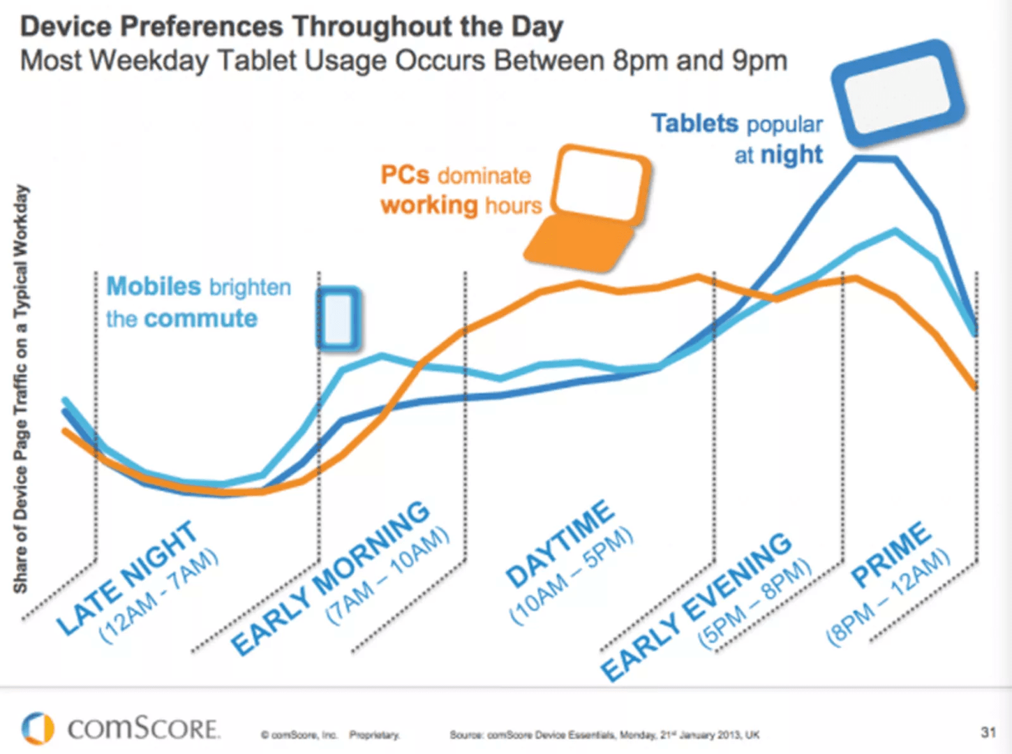
Knowing then that more than half of mobile usage takes place in the home, we can also assume that depending on your app’s user experience, users will wait until they are in the right environment to use it. If your app requires them to pay attention, then users will use it in a context that allows them to pay attention to what they’re doing—as long as the app matters to them.
As general advice, even before you start designing an app, you should get to know your real users. Find out who your target audience is, and when and how they will use your app. Creating user personas and user journey maps will help you build this understanding. As soon as you have this knowledge, you’ll be able to optimize the product experience accordingly.
You might also like: Designing With the User's Context in Mind.
Myth 2: The best designs are invisible
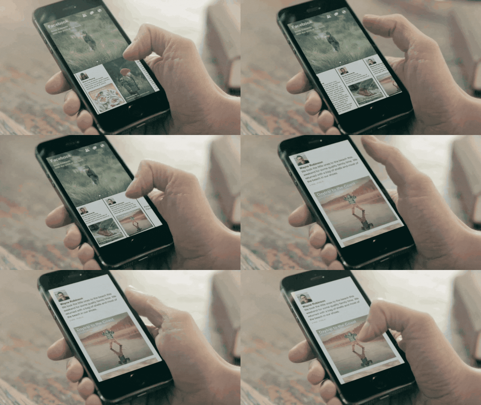
One of the most persistent myths in design is that the best designs are invisible. Designers claim that the best UI is no UI. Some designers understand this literally and try to create ultra-minimalistic layouts for their products.
But what makes an ultra-minimalistic design so appealing in the first place? A popular belief is that it’s the desire for simplicity that has made minimalism so trendy. Prevailing wisdom suggests that simplicity is achieved via reductionism—by removing objects.
Reality: Minimalism doesn’t equal simplicity
Too much focus on creating an interface that is as close to zero-UI as possible can actually lead to a UI that creates more friction for users. The key problem is that designers often confuse simplicity (aka, a lack of complexity) with minimalism. But less visual elements don’t make a user interface simple—in fact, a design can be minimal but still hard to work with.
Simple things are straightforward and easily understood. One of the best ways to achieve this simplicity is through clarity. Unfortunately, designers often overvalue minimalism at the cost of clarity. As a result, the reduction of meaningful information leads to confusion, and in the end, a bad mobile UX. If removing a button in the name of minimalism leads to an increased learning curve for users, it doesn't make the interface easier—it just introduces complexity.
"If removing a button in the name of minimalism leads to an increased learning curve for users, it doesn't make the interface easier—it just introduces complexity."
Sometimes, making things invisible is downright harmful. Here are a few examples when hiding elements can introduce bad friction in mobile UX:
- Hiding key information and controls . The hamburger menu is a classic example of bad mobile UI design. The hamburger menu hides context and makes the navigation less glanceable.
- Losing labels from icons. Uncommon icons without text labels are difficult to understand for the majority of users.
- Using gestures as a primary way of interaction. Non-standard gestures provide no obvious affordance and increase cognitive load on users. As a result, users have a hard time figure out how to use a product.
When working on an interface, it is worth remembering this quote from French writer Antoine De Saint-Exupery: “Perfection is achieved, not when there is nothing more to add, but when there is nothing left to take away.”
Myth 3: The designer and the user think the same
The foundational rule of user-centered design sounds simple: “You are not your user.” And while most designers are familiar with this rule, they still often fall into the trap of thinking that they know what works best for their users.
Reality: It’s incorrect to project your behaviors and reactions onto users
It’s tempting to think that everybody thinks just like you. But the problem with this is that designers lose sight of who they’re designing products for—the user. To create a genuinely user-centered product, designers need to look at design not from their own perspective, but from the perspective of the people who will be using it.
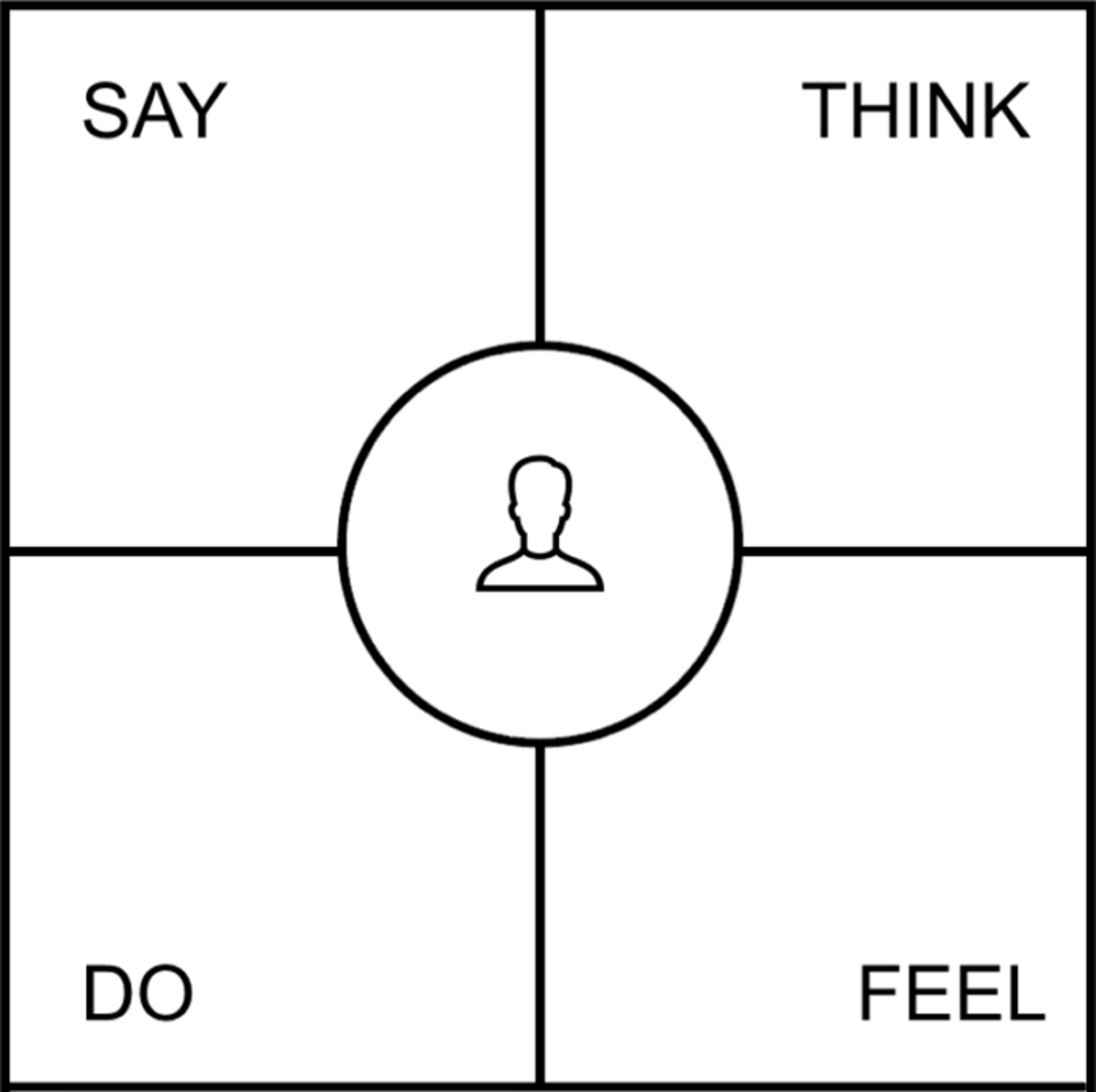
For example, when planning a new feature, designers should ask themselves what problem the feature is solving, instead of whether they themselves would like the feature. A tool called an empathy map can help you formulate the question and find the answer.
Myth 4: Designers should always try to find original solutions
The idea of rethinking core parts of user experience is popular in the design world. Many product designers believe that if they rethink core mobile UI design conventions, they will create a truly memorable experience for their users, and will be remembered as innovators. The desire to become an innovator is so strong that designers would rather try to reinvent the wheel than adapt to conventional design patterns.
"The desire to become an innovator is so strong that designers would rather try to reinvent the wheel than adapt to conventional design patterns."
Reality: Familiar experience is better for your users
It’s essential to remember that for most design problems, proper solutions already exist. When designers come across a problem that has already been solved by other, it’s important to consider that existing solution first. Not taking this existing solution into account, and continuing to design just to be original, is a huge mistake. Designing solely for the sake of originality is a signifier that the designer is distracted from the main reason they started designing in the first place—to create effective solutions for real people.
In most cases, breaking design conventions results in a frustrating user experience, not necessarily because the solution itself is bad, but because it’s new and unfamiliar to the users. This means users will have to adapt to the new behavior (i.e. learn how to use your app). Since users spend most of their time in other apps (see Jakob Nielsen’s law), it’s essential to create an experience that matches those other experiences. Not surprisingly. the most successful products available on the market follow certain set conventions that people have come to expect.
Many designers think that following conventions can be restrictive and lead to a boring design. That’s not true. Following specific rules when designing has nothing in common with uniformity. Conventions are just building blocks, and it’s up to the designer to create something beautiful with those blocks.
Myth 5: Aesthetic isn’t important if a product has good usability
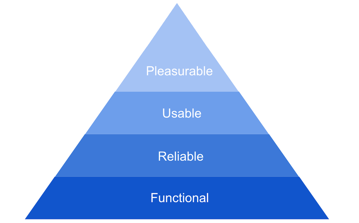
Usability is about how easy the product is to use. Good usability allows people to accomplish their goals with effectiveness, efficiency, and satisfaction.
Some experts believe that good usability automatically creates good experiences. They cite Steve Jobs—“Design is not just what it looks like and feels like. Design is how it works.”—and provide a few unattractive but popular products like Reddit or Craigslist, all to tell you that it’s ugly, but it works.
Reality: Attractive things work better
Aesthetics do have a function. In his book The Design of Everyday Things, Don Norman describes the role emotions play in the user experience. If a product has a pleasant visual design, users tend to find it more credible.
Aesthetics also play a crucial role during the first-time experience. A positive first impression determines whether a user continues using an app or not. And this impression is usually based on visual appearance rather than interaction—first impressions are 94 percent design related.
Designing for the user experience has a lot more to it than making a product usable. After all, user experience is about how users feel when they interact with a product. By focusing on creating good aesthetics, designers show users that they care.
Myth 6: User interface and user experience are the same things
Many product teams believe that user experience and user interface are the same thing. As a result, product teams put maximum effort into creating a great mobile UI design. Often, this attention to detail results in pixel-perfect layouts. At the same time, product teams neglect to pay as much attention to other parts of the app.
Reality: User interface is just one piece of the puzzle
It’s not uncommon to confuse user experience with user interface—after all, the interface is a big part of what users interact with while experiencing digital products. But even though UI is obviously an important part of the user experience, it’s just a component of the overall experience.
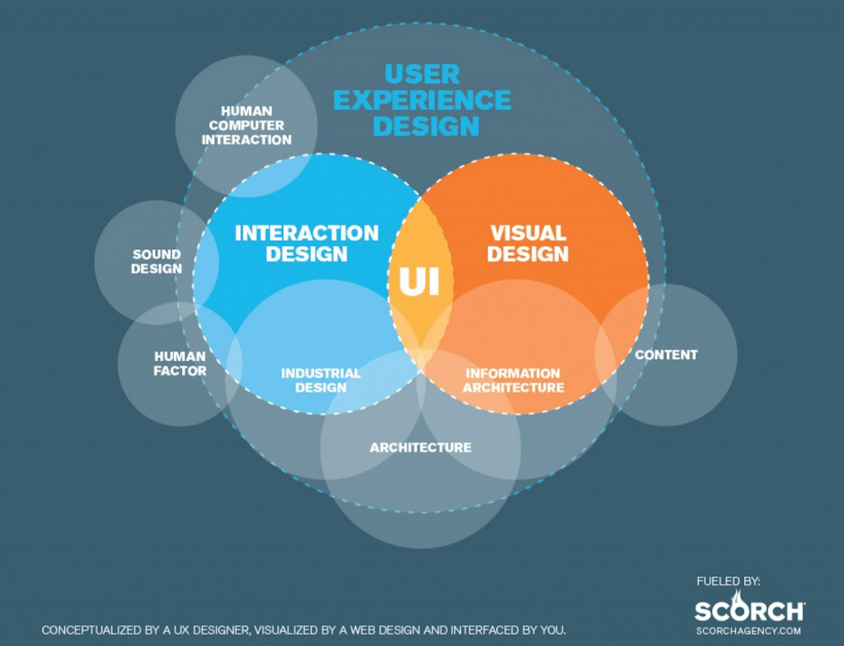
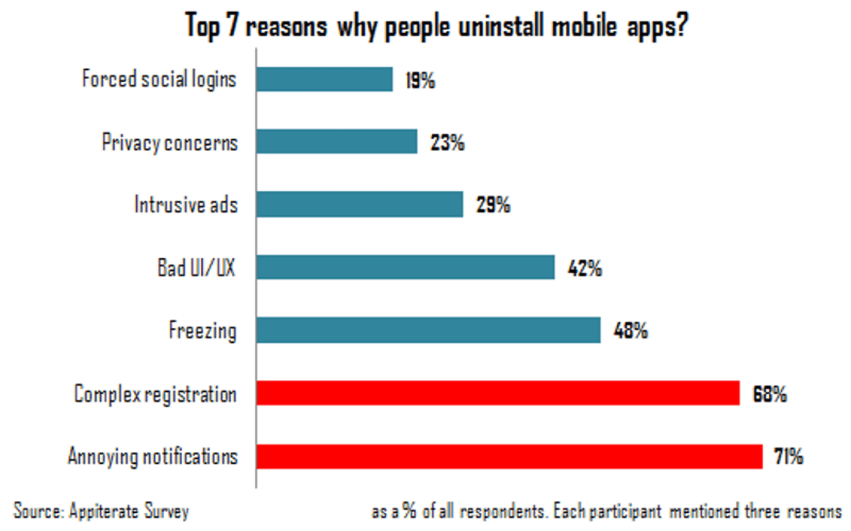
When designers don’t consider the other components of mobile user experience, the chances of creating a good product decrease significantly. For example, one of the most critical parts of the mobile experience are the notifications. Users often evaluate user experience based on the quality of notifications they receive, and annoying notifications are the number one reason why people delete apps. But product teams rarely spend enough time figuring out the perfect system to send out timely, useful, and not-annoying notifications—and they’re losing valuable users because of it.
Myth 7: Mobile apps are isolated experiences
Many developers believe that mobile apps are stand-alone experiences and don’t need to be integrated with other channels.
Reality: Users expect to have a seamless experience across all channels
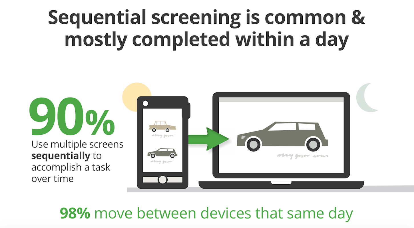
It’s important not to think of your mobile app as an isolated experience. Mobile is just part of a bigger picture in which other types of devices (desktops, tablets, smartwatches, etc.) are mediums through which the experience is delivered. People often start the journey on mobile because it’s the nearest device in reach, but they should be able to switch between mediums to continue the journey. Thus, synchronization of user progress across devices is a key priority for creating a seamless experience.
Here is just one example. According to Appticles, 37 percent of users do research on mobile but switch to desktop to complete a purchase. If you’re designing an ecommerce app, mobile users should therefore be able to switch to their desktop or laptop to continue the buying journey.
A study by Google found that 90 percent of users use multiple screens sequentially to accomplish a task over time. So your user experience should allow the user to travel seamlessly through screens and devices over the course of their journey.
If you want to kickstart crafting seamless experiences, checkout our tutorial on mobile logo images, and how offering a visual experience specific to smaller screens can mitigate layout issues.
Myth 8: White space is wasted space
White space (also known as negative space) refers to the empty space around elements of a page layout. Elements of white space are space around images, margins and paddings, line-spacing, and letter-spacing within text content. Some designers think of white space as the leftover bit of a design that they didn't create content for. As a result, they try to add more content to fill the empty canvas.
Reality: White space is an essential element in UI design
What happens when a mobile UI doesn’t have enough white space? Usually, it becomes harder for the users to comprehend the content.
, because it supports the visual integrity of a layout.
- White space responsible for readability and content prioritization. It helps designers reduce the amount of text users see all at once and makes reading much easier.
- White space plays a vital role in how users comprehend content. A cluttered page is unattractive, and doesn’t make users want to read the content. On the contrary, a page with ample white space creates a feeling of sophistication.

Remember, white space is never wasted space. Treat it as a functional tool, not as a void.
"Remember, white space is never wasted space."
Myth 9: Users are always connected to the internet
When designing a product, it’s easy to assume that users are always online. Since the majority of mobile apps require a regular content update, designers focus on creating an experience for users who are connected.

Reality: A large percentage of mobile users don’t have a regular network connection
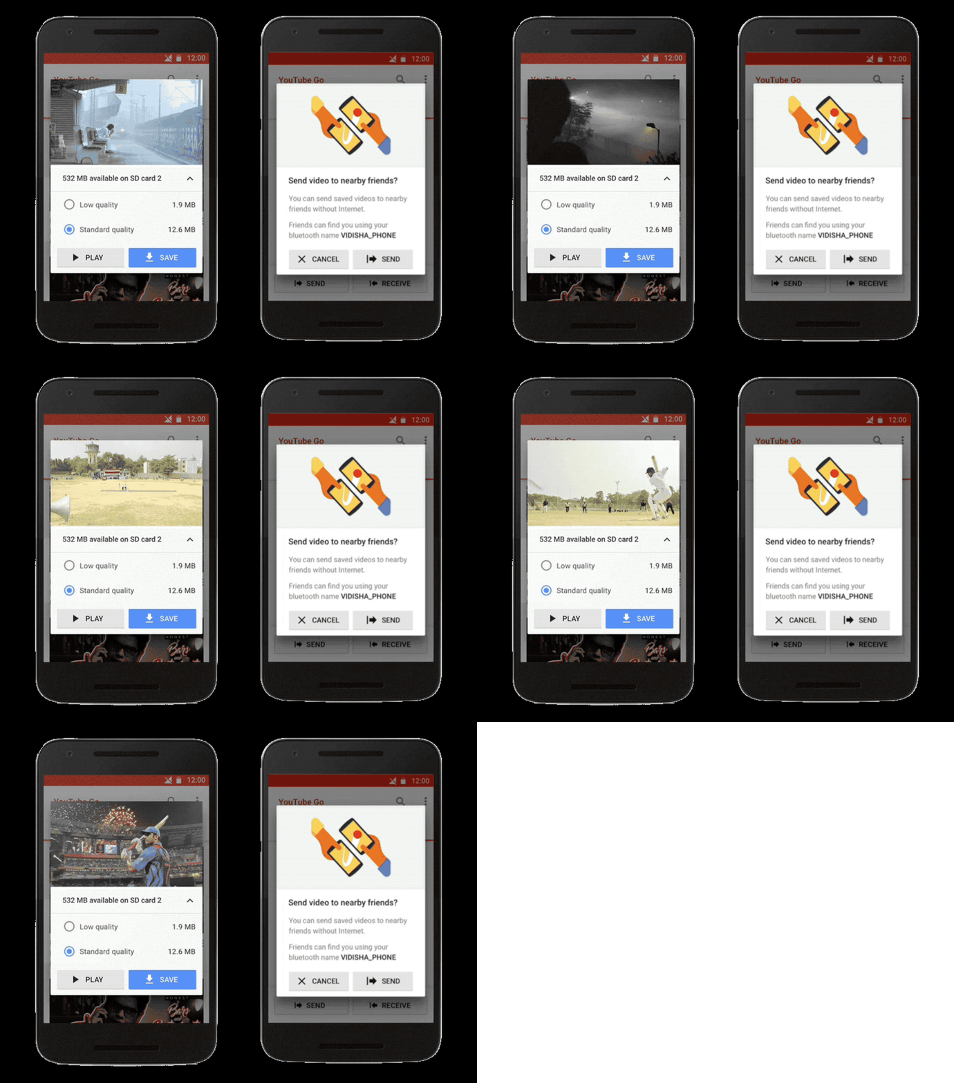
In the US and Europe, users are accustomed to ubiquitous connectivity. But that certainly isn’t true worldwide. Products in emerging markets have to be able to perform over slow or intermittent connectivity. If you plan to design for such market, make sure your product works when it isn’t connected to the Internet at all (allow caching of data), and optimize your product for fast loading (minimize page size by keeping images and other weighty content to a minimum). By designing for a spotty connection, you’re likely producing a design that works better in any environment.
Myth 10: Mobile users need fewer features than desktop users
Despite the fact that modern mobile phones are powerful computers, many product developers still think that mobile devices are nothing more than constrained desktops. The roots of this thinking are in the small screen real estate—since there’s less screen space to work with, many product teams think it’s okay to cut down on the overall experience.
Reality: Mobile is not less. Mobile is not light.
When it comes to the mobile user experience, it’s clear that the experience might be different from the one users have on desktops. But different doesn’t mean limited. It is absolutely incorrect to assume that mobile users need fewer features, simply because they use a product on mobile. Generally, anything that a user can do on mobile, they will do on mobile—since mobile is usually the closest screen to them.
Therefore, don’t limit functionality based on screen size alone. Instead, strive to create a more focused experience—think about what users need when they are on mobile, and design to satisfy this need.
Myth 11: The more the features you add to your app, the better it will be
“The more features we add in our app, the more valuable it’ll be for our users.” This is a prevalent way of thinking in the world of mobile development. Product creators believe that more options and features automatically result in higher satisfaction.
Reality: More features don’t equal more value for users
There are a few strong reasons why having too many features in your app can be bad for your users.
- The more choices your app offers, the harder it is to understand the interface. Hick’s law states that the time it takes to make a decision increases with the number and complexity of choices. Studies confirm that having too many options often leads to decision paralysis. Barry Schwartz discusses this problem in his book The Paradox of Choice: Why More Is Less.
- Putting too many features in your product affects the quality of your product. It’s really hard to deliver plenty of features without compromising the mobile user experience. As a result, adding too many features in a product often leads to a situation known as feature creep— when an app tries to be a Swiss Army Knife and provide a universal solution to all problems, it usually ends up being overly complicated and completely unusable.

- Putting too many features in your product can increase your time-to-market. The product loses focus and becomes really hard to manage.
- Features are a one-way street—it’s really hard to get rid of a feature once it has been released. As soon as you release your feature, users will start using it, and it’ll be hard to get rid of it without negatively impacting those users. Netflix tried to cut a profile feature that they thought was useless, but users strongly objected. As a result, Netflix had to restore it.
Mobile experiences should be sharp and focused—but creating sharp and focused experiences doesn’t mean that you should strip out features and content. Instead, you should organize and prioritize the features you want to add in your app.
"Mobile experiences should be sharp and focused."
It’s possible to prevent feature creep by conducting user research. Proper user research helps product teams to distinguish between the user’s needs and wants, and prioritize feature requests.
Myth 12: You don’t need the content to design an app
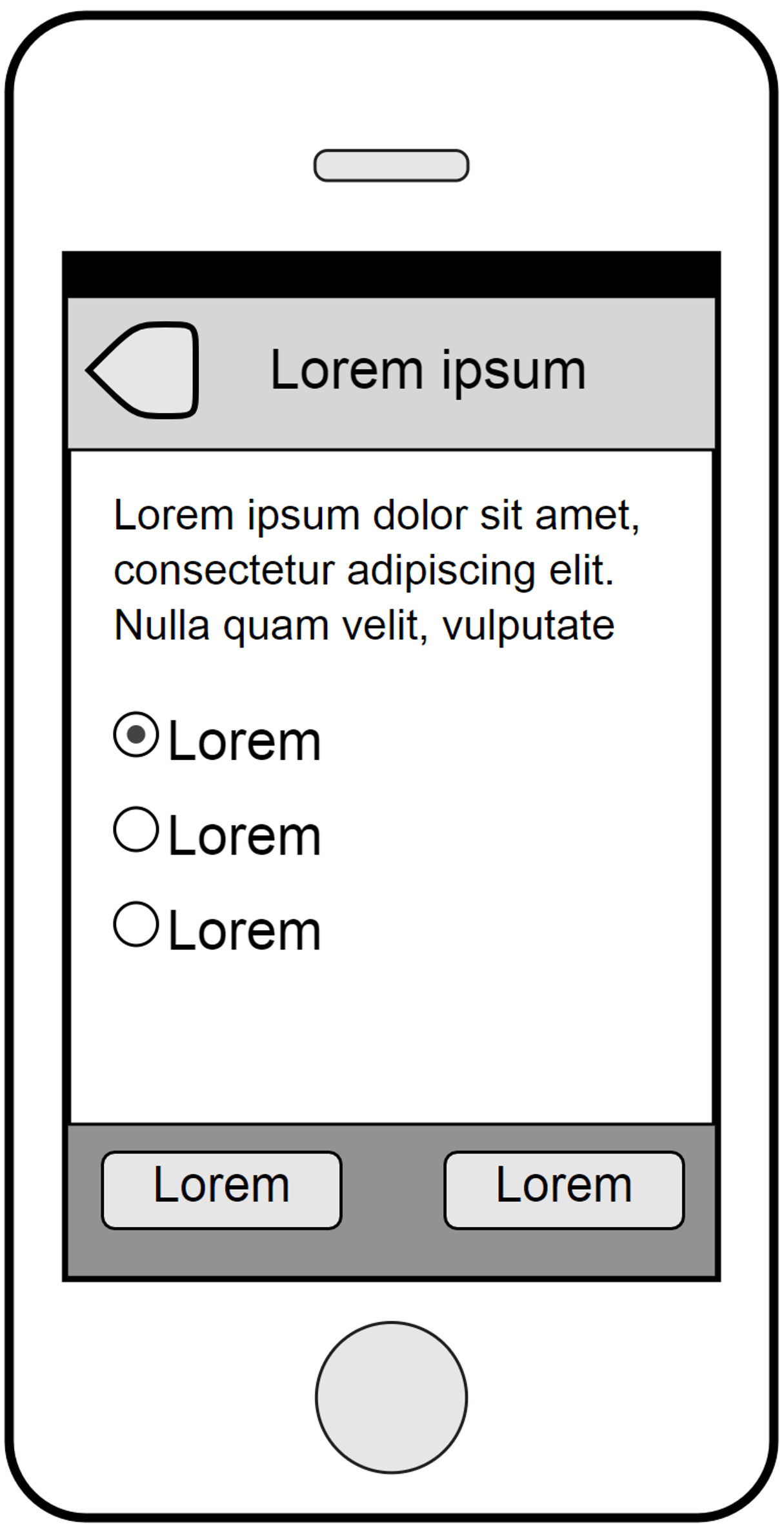
Creating mockups or prototypes with lorem ipsum instead of real text or images seems to be normal among many product teams. Using dummy text in mobile UI allows designers to create an aesthetically pleasing design and get client approval.
Reality: Design decisions should be driven by the content, not the other way around
Lorem ipsum does have its uses. It comes in handy when you want to test visual hierarchy of your layout, since it keeps readers focused on the layout instead of the content.
However, using dummy text in all prototyping cases might be harmful, because it can lead to an unrealistic design. While such design can be aesthetically pleasing, it can fail when the real content is added—often because the space set aside for the dummy text ends up being too small to fit the real content.
But there’s another, more severe problem—designing with dummy content creates the illusion that content is secondary. In reality, content is by far the most crucial element in user interface design.
Content is the reason why people download an app in the first place. The content should drive design decisions, and the app’s layout should be created to support the content. As Jeffrey Zeldman puts it,“Content precedes design. Design in the absence of content is not design, it’s decoration.”
Content precedes design. Design in the absence of content is not design, it’s decoration.
If you don’t have the real content yet, you can use content similar to the final product you will end up with. For example, you can borrow content from the existing products in your niche.
Myth 13: Prototyping is an extra step in product development
Many product teams believe that it’s possible to skip the prototyping phase and jump straight to coding the final product. This is because the primary goal of many product teams is to reduce the time required to create a product. This is why as soon as they have an idea that they believe is right, they start building a product.
Reality: Prototyping is a mandatory step of the product development process
Skipping prototyping can save time in the short-term, but it often leads to significant problems down the road.
Mobile app development is a complex activity. It requires you to focus on different aspects of design—information architecture, visual design, interaction design, and many others. And the reality is that it’s impossible to consider all product requirements without prototyping. You need to have a tangible model of your product to play with. This is the only way to understand what design decisions work and don’t work for your product.
Below, you can see a model of the design thinking process. The process can be broken into five phases: empathize, define, ideate, prototype, and test. Each phase is essential for a product’s success.
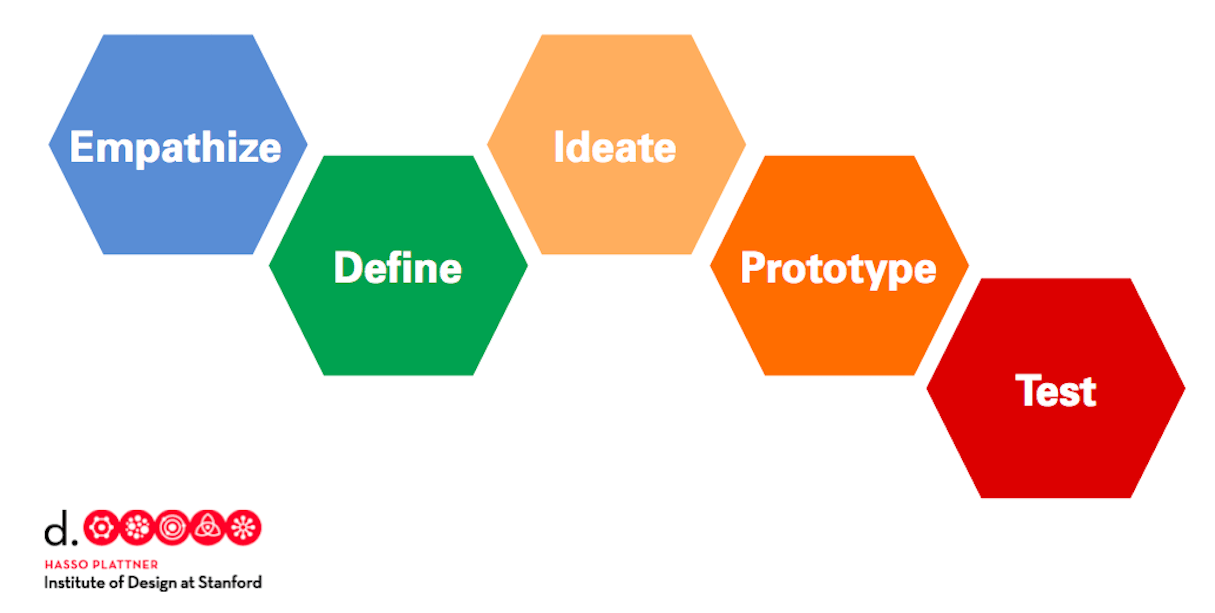
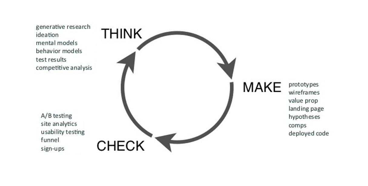
To create an excellent experience for our users, we need to keep iterating and testing. One way of visualizing this process is with the Design Squiggle. The video below digs into this concept, showing how research and prototyping help move the design process from the abstract to the final design.
Always create prototypes, have users test them, and iterate the design until it’s good enough.
Myth 14: Testing can be postponed until the market release
Testing is a time-consuming activity, and it might be tempting to postpone it until your app is ready to be available for real users. Users will test a product and get back to you with their feedback.
Reality: You cannot afford to not test products
It’s very dangerous to assume that users will be happy to test your app and report all issues. First, when users face problems, they become frustrated by the negative experience, and this increases the amount of app abandonment. Second, it’ll be hard to rework some parts of your product, because it will require both design and development effort. It’s also hard to estimate how much of that effort will be required, since you don’t know what will go wrong.
Thus, it doesn’t make any sense to leave testing right until the very end. The best practice is to follow the TETO approach—test early, test often. Moreover, testing with real users can reveal much more than how usable an app is—it can also help to reveal the users’ emotional response to the design.
You might also like: Selling a UX Design Process That Ensures Results.
Myth 15: You need to periodically redesign your app
Many product designers believe that a periodic redesign can increase their app’s conversions and attract new users. ‘All we need is a fresh look’ is a common phrase, often followed by countless hours spent creating a new design.
Reality: Users hate change
Typically, a fresh design will be a worse design for your users, simply because it's new. It's a well-known fact that users hate change, and they'll complain every time designers introduce changes in products—especially when a change reduces their ability to do what they want to do. Users prefer familiar designs, as they want to get things done as fast as possible.
Designers should approach redesigns very carefully. It’s essential to consider both the business reasons and the switching cost for existing users. If the business value isn’t significant, and users will have to spend extra time adapting to the new UI, then t’s maybe better to avoid a redesign.
If you decide to do a redesign, it's usually best to stay with a familiar design and evolve it gradually. Google, Amazon, and many other big companies follow the strategy of gradual evolution with great success: users hardly ever see significant changes in their products, though these companies are constantly polishing their design.
Evolving design
Mobile design is evolving. New technologies emerge every day and change the way we design mobile apps. With these rapid changes, we have endless opportunities for learning and trying new approaches.
But no matter what product we design, it’s vital remembering the most important rule—always design for people. By focusing on needs of our users, we can create a truly relevant and exciting experience for them.
Read more
- 5 Common Digital Content Problems and How to Avoid Them
- What Makes or Breaks an Ecommerce Shopping Experience? This Survey has the Answers
- Content Strategy: The Principles we Followed to Build the New Shopify App CLI
- Creating User Centered Flows in Ecommerce Design
- Building a VR Shopping Experience for the Web: Tips and Takeaways
- How to Use Eye Tracking in Usability Tests
- Free Webinar] How to Convert Visitors Through Persuasive Design
What are your tools to build strong mobile UX? Share in the comments below!

