The landscape of user experience is continuously changing—new advancements emerge all the time. Mobile design is one of the most changing industries of digital product design, influencing many other areas of digital design and transforming the world around us.
A year ago, we published Top 10 Trends in Mobile Design, predicting what 2018 had in store. With half of 2019 already over, we’re looking again at how mobile design trends have changed in the past year. Here are 14 trends that are having a substantial impact on mobile UX design, to help reduce the bounce rate and increase conversions on mobile.
Learn how to optimize your design process by crafting a standout design brief.
1. Buttonless design
Modern mobile devices are bezel-less—they no longer have physical buttons on the front face and are instead all screen. Device makers are freeing up screen real estate, in turn allowing product designers to provide more information on the screen.
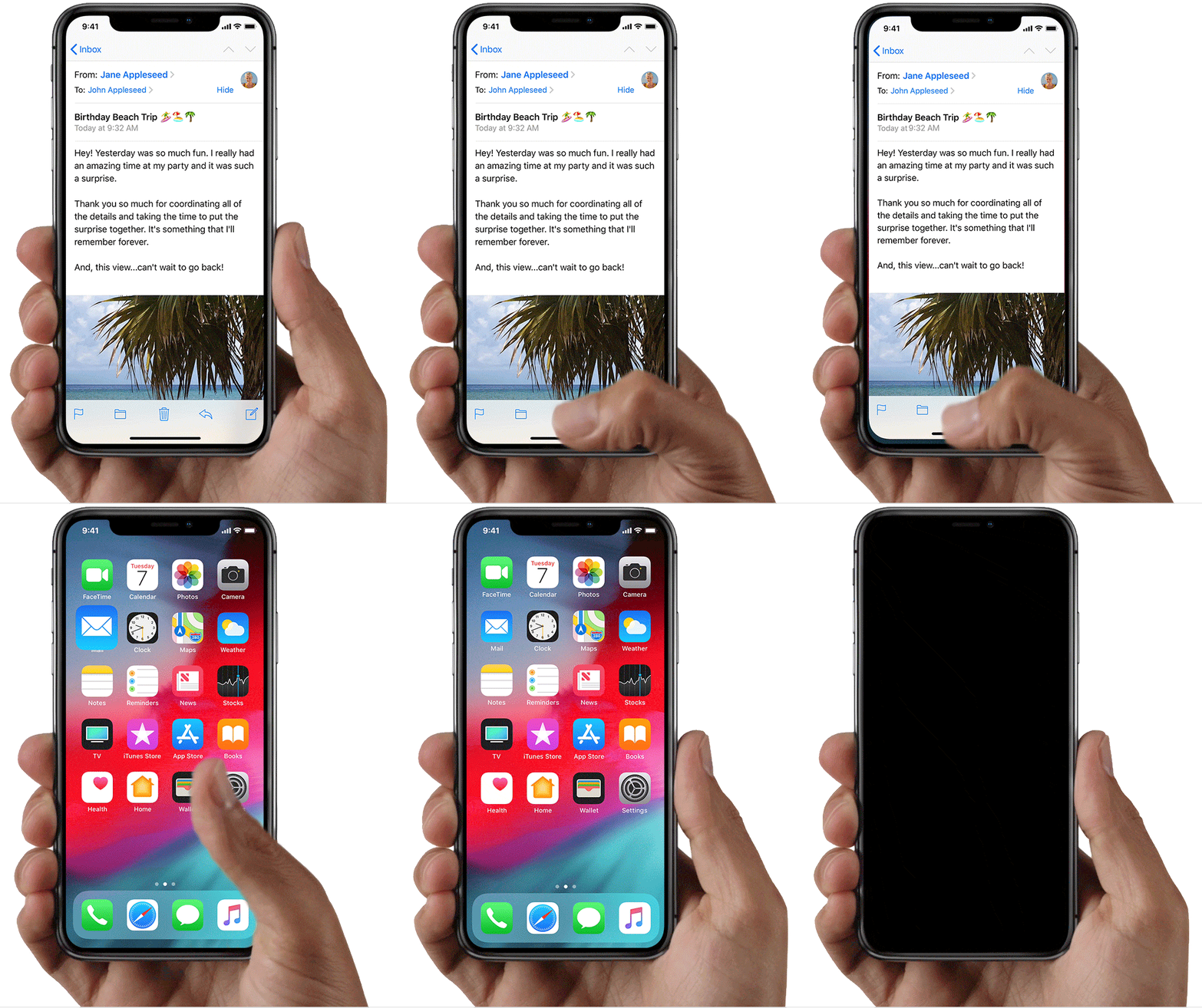
This trend also influences the way product designers create mobile apps, as they now strive to create buttonless designs. In a buttonless design, digital buttons are replaced with gestures, putting content at the center of the user’s attention.
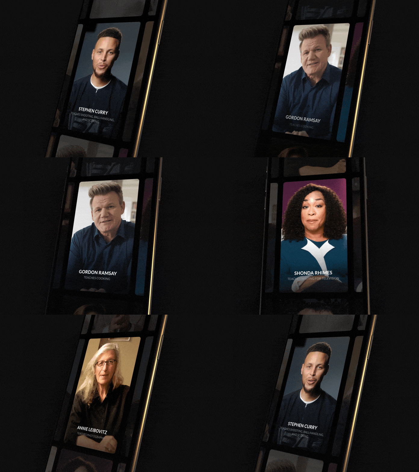
Along with the benefits, gesture-based interactions have a built in risk— since gestures are hidden, the interactions may not be intuitive for users. The design industry is still in the process of creating a shared language for gestures. As more gestures come into practice, they will be adopted by various mobile apps. Buttonless UI is an integral step towards a future where virtual interfaces rely entirely on gestures.
You might also like: 15 Myths That Can Ruin Your Mobile UX.
2. Bottom navigation 2.0
The original iPhone had a 3.5-inch screen. The 2018 iPhone XS has a 6.1-inch screen. Gone are the days of mobile phones with small screens. Modern mobile phones with large displays hold more content on the screen and are better for multitasking. But with a larger display comes complications: big screens move the interactive elements of a design further away from the natural movement of the thumb. As it gets harder to reach the top area of the screen, more apps are placing key navigation elements at the bottom. The bottom navigation bar therefore became an industry standard for mobile developers, helping users access core features of the app in one tap.
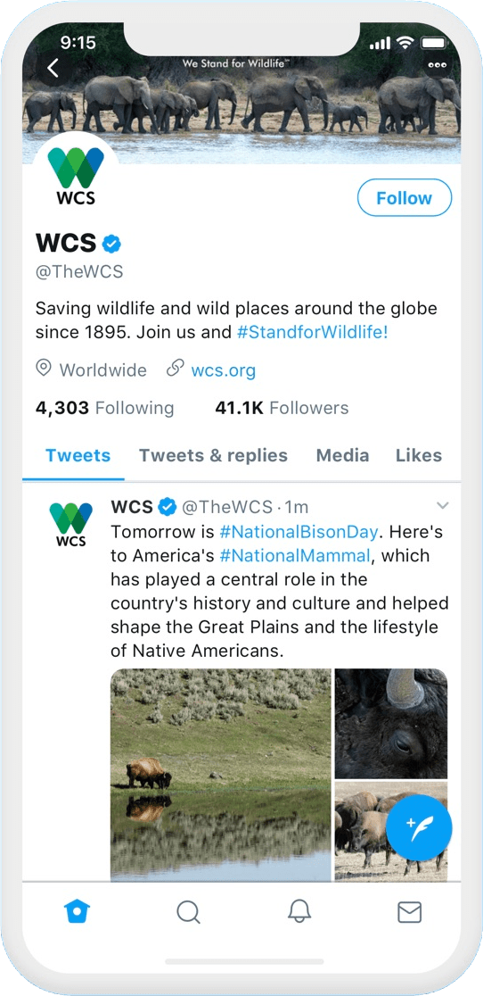
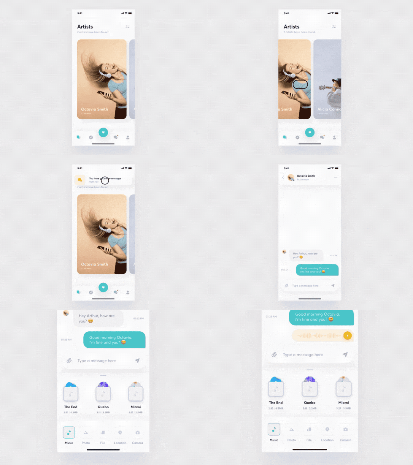
In 2019, mobile app designers continue to value the lower half a mobile screen but follow more creative approaches for navigation. For example, instead of using a bottom tab bar, some mobile apps now use the concept of bottom sheets, where the user sees a sheet with a few options at the bottom of the screen and relies on a swipe-up gesture to reveal more options.
Bottom sheets are quite a versatile concept that can be used in many different cases. They can be a good replacement for a bottom navigation bar:
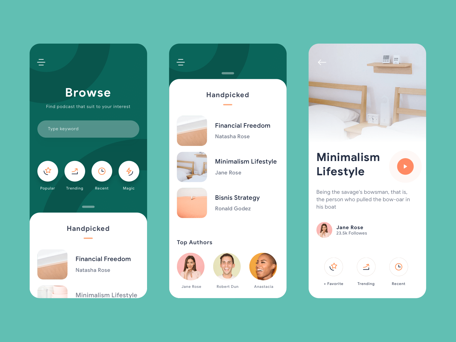
Or as an accompaniment to the bottom navigation bar:
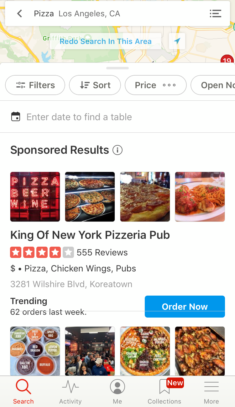
Using cards as navigation elements is another interesting technique. Every option is provided as a card, and users use swipe right or left to reveal more options.
If you're reading to start designing, check out our article on how prototyping and rapid prototyping will help the process (and check out some great prototyping tools).
3. Better personalization
The ideology of “one-size-fits-all” does not work for 2019 mobile users. Brands are looking for ways to fine-tune the user experience as meticulously as possible, and a personalized experience has quickly moved from a “nice-to-have” to a “must-have.”
With the rise of machine learning and artificial intelligence, it’s becoming much easier to make user experience more personal. Take SoundCloud as an example. The service leverages data analytics and AI to suggest songs you might like.
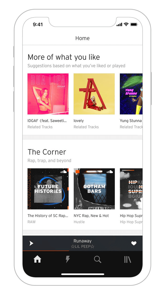
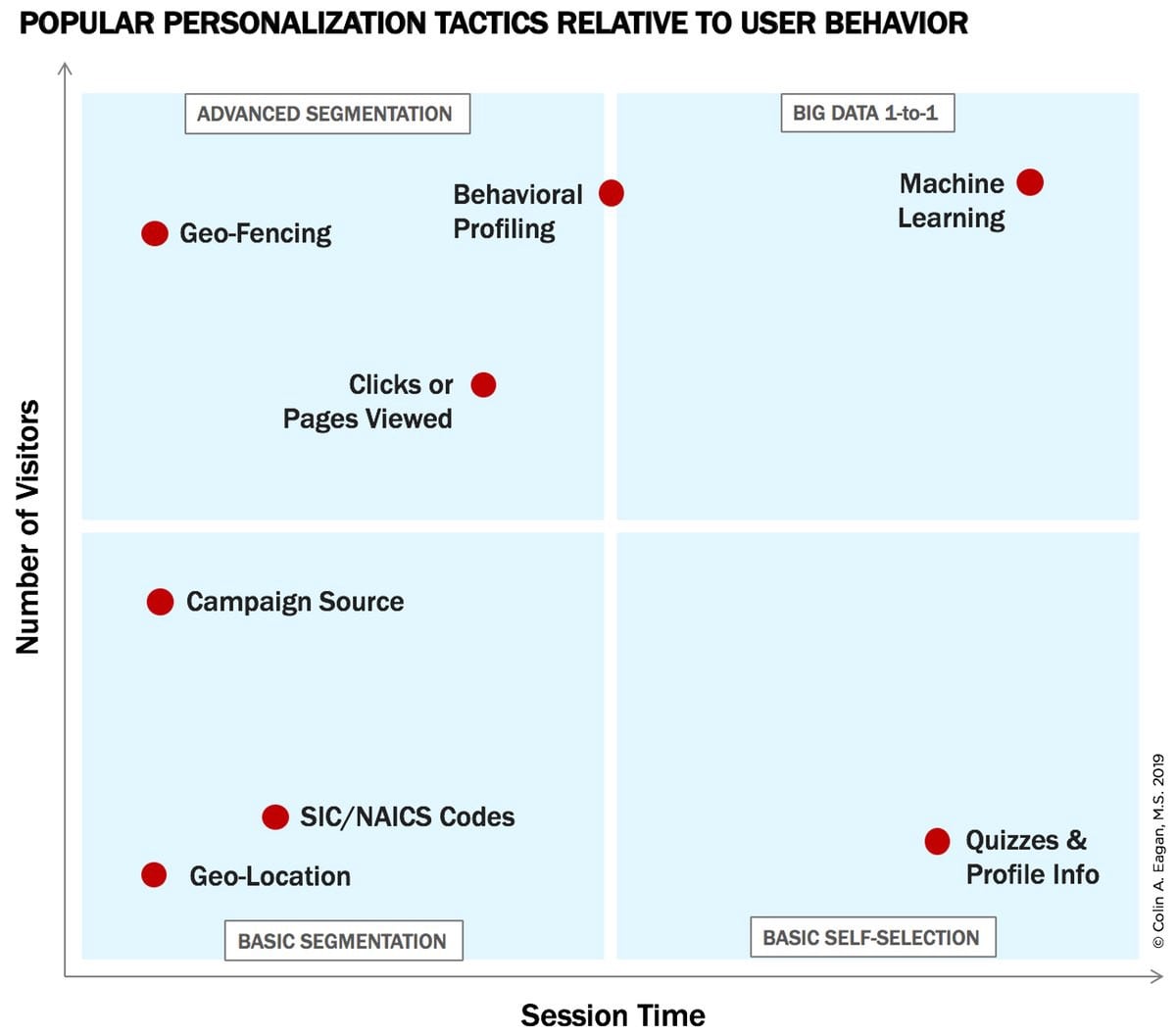
Good personalization is a result of using the right tactic for data that you collect on your users. A list of the popular personalization tactics includes geo-location, geo-fencing, behavioral profiling, SIC/NAICS codes, and machine learning. It’s essential to select the tactic(s) based on your audience and how they interact with your product.
In simple terms, it's possible to rely on two basic metrics—the number of visitors and session time—to find the tactic that will be relevant to your user behavior. For example, if you have a large number of users who spend a significant amount of time on your platform, you can use machine learning to provide useful personalized product recommendations.
You might also like: The AI-Empowered Marketer: How Artificial Intelligence Can Help You and Your Clients Increase Sales.
4. Round corners
Round corners are another trend that emerged from modern mobile devices. Both iOS and Android flagships have rounded corners—take a look at the iPhone XS or Samsung Galaxy S10, and you will see it.

The curved corners of the physical device are mirrored in the UI design. As a result, mobile websites and apps get the same rounded look and feel.

Unlike many other visual trends, this trend is not purely aesthetic; it also has a positive impact on user experience. Rounded corners are easier on the human eye and make information easier to process.
If you're looking for other ways to positively impact the user experience of your mobile users, see our tutorial on mobile logo images.
5. Password-less experience
Working with passwords introduces a lot of friction into user interactions. Every time we sign up for a new service, we have to spend time creating a new, easy-to-forget password. According to one study, 37 percent of people forget a password at least once a week.
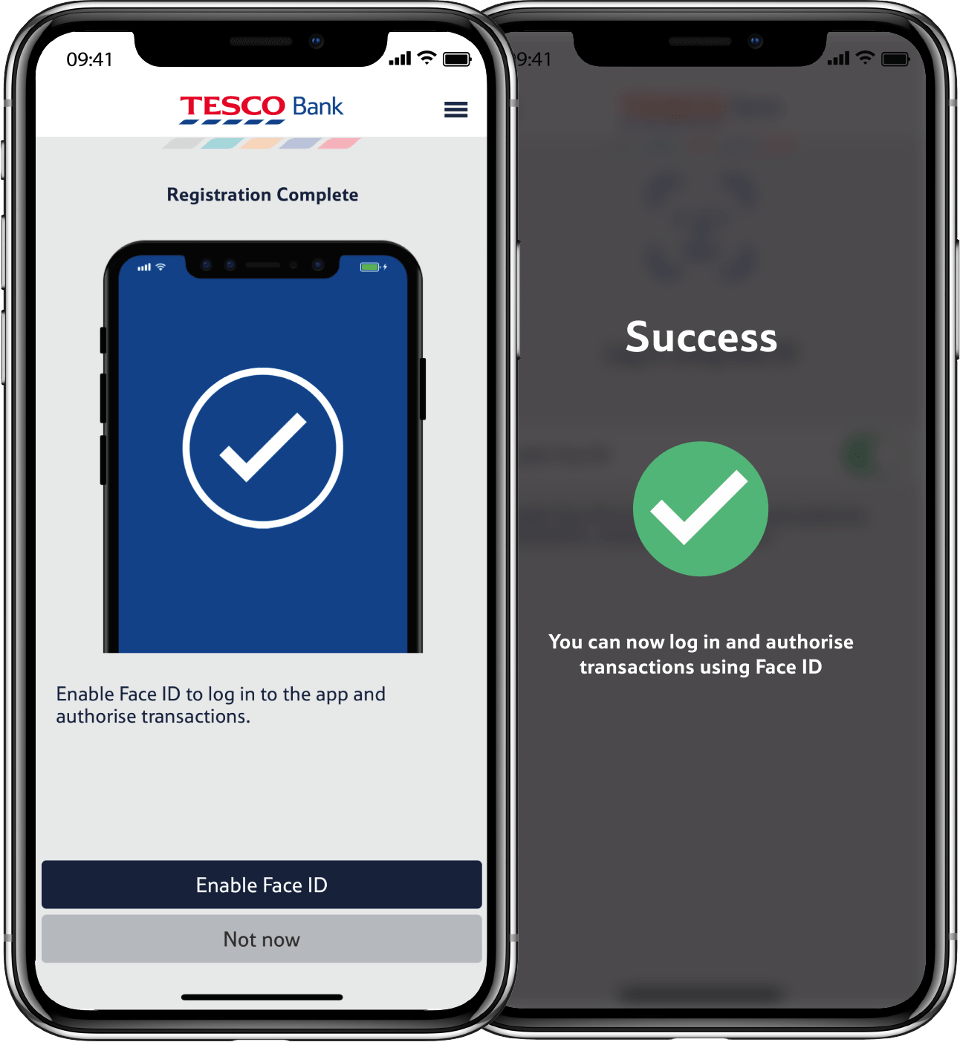
Fortunately, a few password-less login methods are available for mobile app developers. Password-less login can be in the form of biometric authentication (fingerprint or facial recognition features):
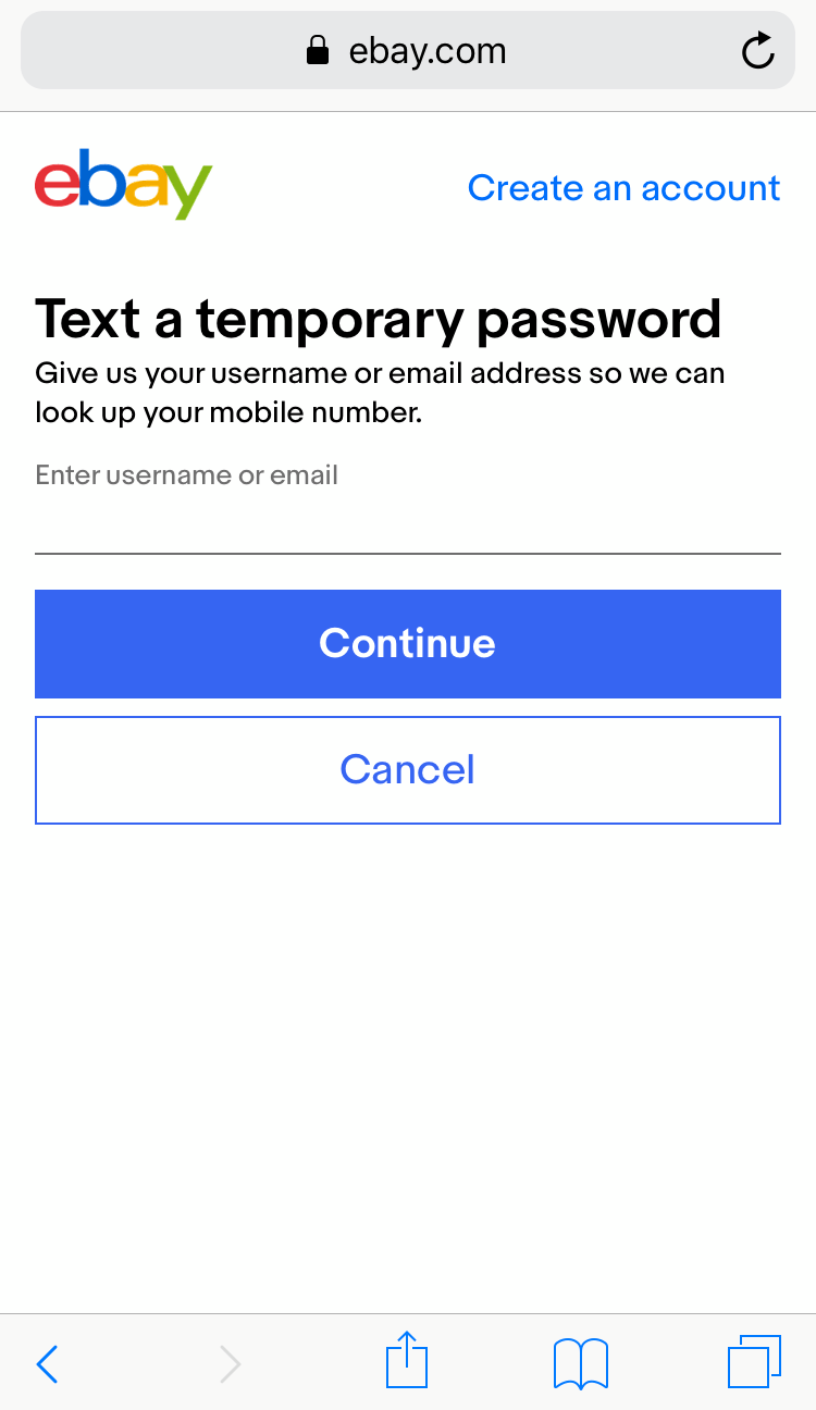
One-time temporary passwords:
Or a sign-in link:

With the rise of new products and digital services, the password-less approach of authentication is the only right solution for the password problem. Not only does this approach make things easier for a user, but also more secure—for example, a temporary one-time password mechanism also verifies the user’s contact details like their mobile phone number.
You might also like: 10 Ways to Establish Trust on Ecommerce Sites and Apps.
6. Advanced animation
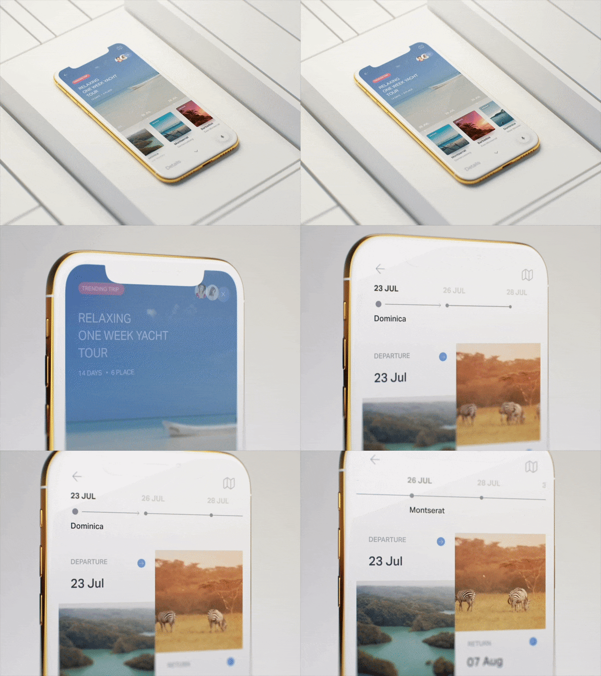
Functional animation is an essential element of good user experience. Motion and animated transitions convey a lot of information—they confirm actions, describe state changes, and add rhythm to interactions.
As mobile devices get faster and more powerful, mobile designers can create more and more advanced animation. Animation is no longer only for filling gaps between different states (also known as inbetweening); it’s also a part of branding.
Motion helps you tell a unique story about your product and brand. Animation helps spice things up for the users by creating movie-like scenes where information morphs from frame to frame.
7. 3D and faux-3D design
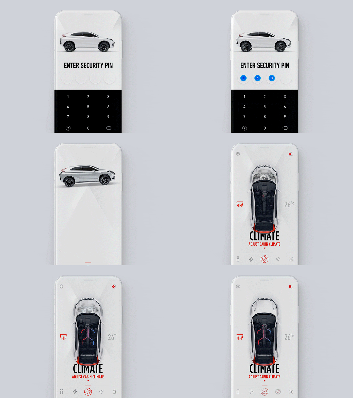
While using 3D objects in mobile apps is not a new trend per se, it was for a long time used only in games and entertainment. With the rise of device processing power, we have 3D objects emerge in regular functional mobile apps. By introducing 3D objects and pseudo-3D objects in mobile experience, you add realism into mobile interactions.
8. Gradients 2.0
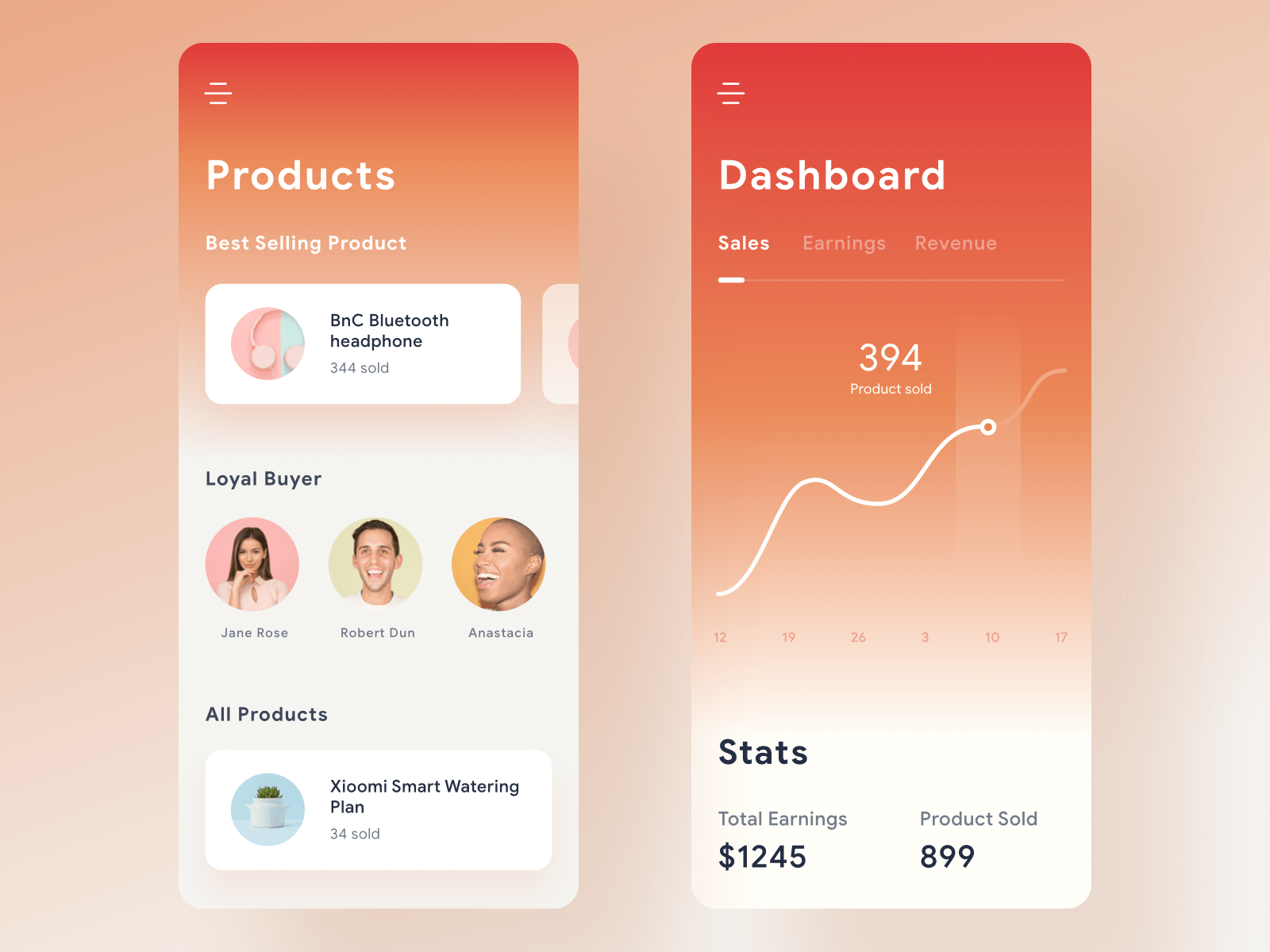
Modern mobile screens have a fantastic rendition of colors, and designers actively use this properly. That’s why in 2019 we see less grayscale and monotone colors, and more vibrant colors and bright gradients. Bright colors have traditionally been used as accents, but gradients 2.0 are different—now bright gradients are used as background colors, bringing depth and dimension to the UI.
When it comes to styling, new gradients are subtle and simple. They have a clear light source and are created using vibrant colors. This helps create a warm effect and promotes positivity.
9. The rise of illustrations
How to create a truly memorable experience is a question that many product designers ask themselves when working on a product. Companies are quickly moving from neutral design towards design that has an emotional impact. In 2019, product designers experiment with various illustrations styles in an attempt to create products that users can relate to on a deeper level.
10. Design systems
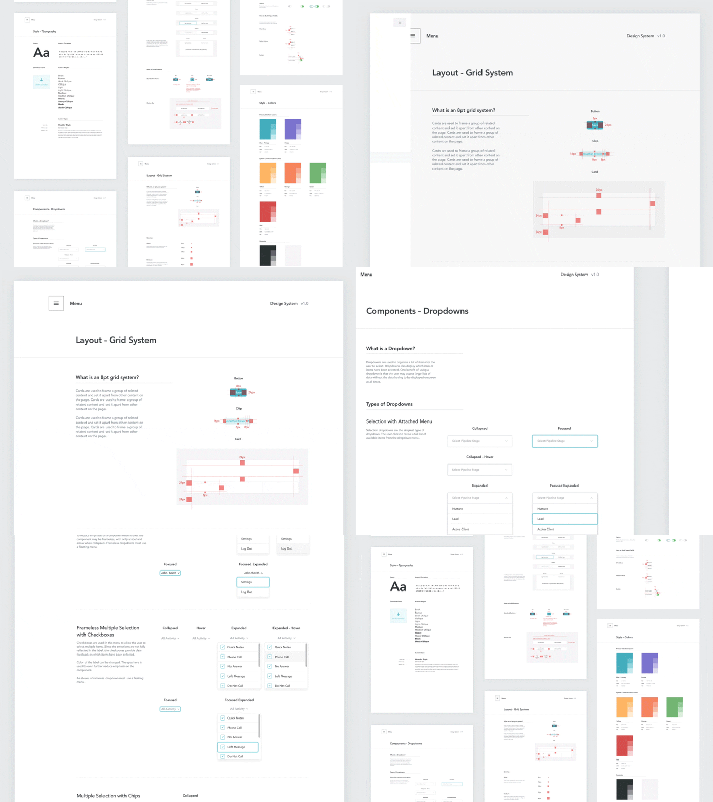
In 2019, more teams are starting to incorporate a systematic approach to design. While design systems are not a specifically mobile design trend, they have a significant impact on mobile design. Thanks to design systems, product teams can reduce repetitive work and, even more critically, achieve consistency across all platforms they design for.
11. Transparency and security
Security and data protection are critical today. People want to know how their data is used. Companies should establish clear rules for using personal information, and they should always follow those rules (otherwise, they risk facing a problem of trust).

Product creators should also invest in protecting user data. Of course, this does not guarantee that the company won’t face a problem of data security. But even when data security incidents happen, companies should strive for transparency.

12. Better voice interactions
Voice interactions aren’t the future. They are already here, and the voice will only continue to become more prevalent in 2019. Voice interactions are slowly but fundamentally changing the way people interact with interfaces—instead of relying on click or tap, users are steadily embracing the hands-free way of doing their routine tasks. More designers are mastering the art of voice user interface design and creating genuinely conversational UIs—interfaces that leverage human conversation.
When it comes to designing for voice, designers have to consider both the user’s needs and technological constraints. In 2019, product designers realize that voice alone won’t work in many cases. It’s much better to combine voice technology with typing. This gives users more freedom to choose the most convenient medium.

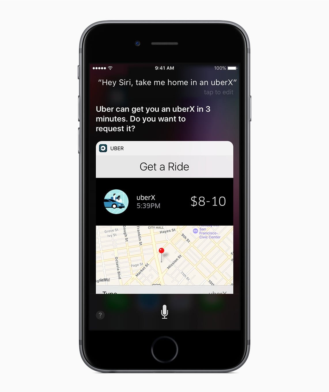
In 2019, we also see better integration between different services. One good example is Siri’s integration with Uber. The user needs only say, “Order me an Uber to home.” Siri knows where your home is and provides that address to Uber automatically, reducing the number of manual steps you need to take to order a ride.
You might also like: Designing for Voice Search.
13. Dark themes
A dark theme is a low-light user interface that displays mostly dark surfaces. Dark themes bring two significant benefits to user experience: they help to reduce eye strain by adjusting the brightness of the screen to current lighting conditions, and they conserve battery power by reducing the use of light pixels.

Dark themes are here to stay, and they will only get better. Starting with Apple iOS 13, all native iOS apps and widgets will support both light and dark modes. A new dark color scheme works system-wide; dark mode can be scheduled to turn on automatically at sunset or at a certain time.
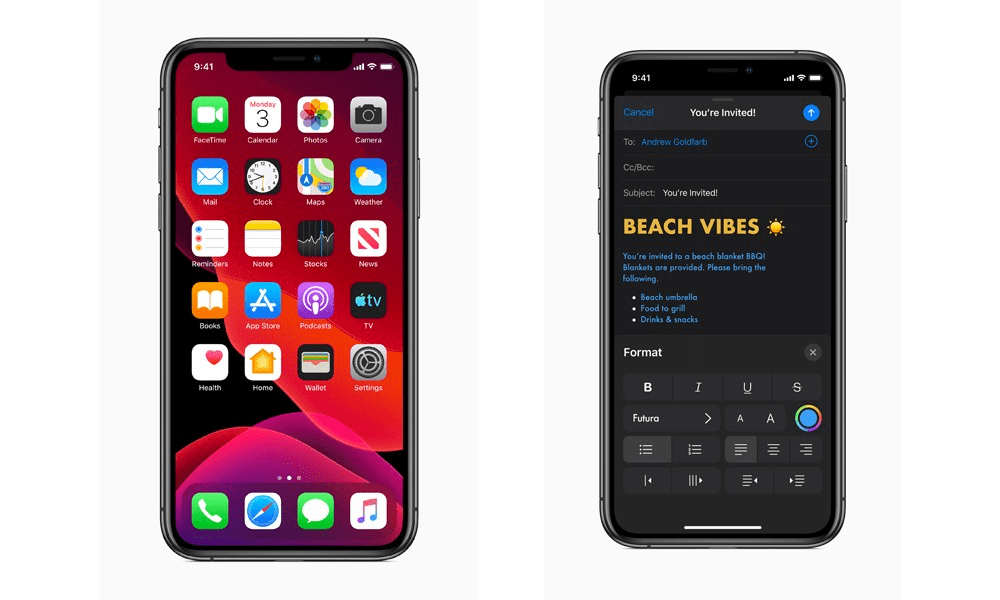
Google updated their Material Design guidelines with practical recommendations on how to design a dark theme for your app.
14. Device-agnostic experiences
By 2020, there will be around 6.58 network-connected devices per person around the globe. The rising number of smart devices like wearables and voice-enabled devices will influence the way people access information—users want to be able to easily switch from one device to another to continue their user journey. It’s no longer enough to think in desktop and mobile categories; in 2019, designers will need to think in terms of the user journey as a whole, not just in terms of what device is used.
Device-agnostic design is focused on creating a user journey that allows users to pass through different touch points—be it a desktop, mobile phone, smart speaker, or wearable—and have a smooth user experience through each one.
Good device-agnostic design is dynamic and adaptable. Imagine that you’re booking a flight to a different city. You might start a journey with your mobile device:

You can track the status of your flight using voice: “Okay Google, tell me about my flight to Los Angeles.” And after check in, you will have your boarding pass on your wrist.
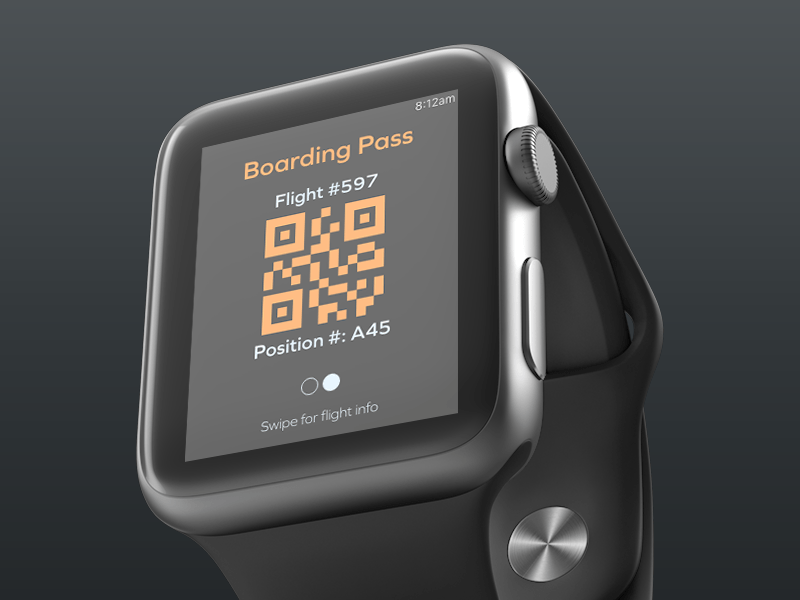
The experience moves with you from device to device.
User-centered design is our top priority
With all new trends that we have, it’s important to remember that the mission of the designer should always stay the same: use new technologies and approaches to make people’s lives better. Every time you evaluate a particular trend, think of it in the context of value it provides for users, to build the best possible experiences.
Read more
- Top 13 Web Design Conferences You Should Attend in 2016
- Top Ecommerce Web Design Trends from January
- How to Use Video in Ecommerce Web Design to Boost Conversions
- Top 5 Features to Include When Building a Successful Fitness Site
- 4 Things to Consider When Designing Wholesale Stores for Clients
- 8 Best Practices for Designing an Ecommerce Site that Converts
- Working with Apparel Clients: Trends, Apps, and Themes to Consider
- Color Psychology: How Color Influences Decisions
- Free Webinar] Dirty Little Tricks From the Dark Corners of Front-End
What mobile design trends are you most excited about? Let us know in the comments below!

