As the web and inbound marketing continue to evolve, one thing remains clear: video is increasingly going to be a positive factor for conversion rate lifts.
According to a recent Cisco white paper, by 2020 IP video traffic is going to make up 82 per cent of all global consumer web traffic. This is up markedly from just 2015, when it totaled 70 per cent of all global consumer web traffic.
With site visitors consuming so much video, it stands to reason that web designers will do better for their clients’ site conversions and user experiences if they incorporate more video into design.
It’s easy to include more video in your design blueprints because the web is very receptive to it. Video is easier to consume than the written word, and there are many diverse ways that to add video to your clients’ sites.
Here are the best ways to use video to boost conversions.
You might also like: How to Use Video Footage in Web Design
1. Tell a story with explainer videos
Everybody loves a good story, especially your clients’ visitors. We’re programmed as human beings to enjoy a good tale because it’s a unifying element of our human race that’s been around in every culture since we began walking the face of the earth. This makes it imperative that you use this inborn favoritism for storytelling in the videos you use on your clients’ sites.
There’s no need to reinvent the wheel to engage your audience, and it just so happens that explainer videos are the perfect visual medium for telling stories.
Explainer videos are short videos, usually going no longer than one or two minutes, telling a story about your client’s brand, or how to use a product or service. They have shown time and again to play a role in boosting conversion rates, no matter where they’ve been used.
For example, Salesforce.com’s Work.com saw a 20 per cent increase in conversion rates on its homepage alone when the company added an explainer video to the homepage.
Famous cloud service Dropbox also used an explainer video several years ago when barely anyone knew what it was — and it increased its conversions by more than 10 per cent. This resulted in several thousand more signups to its service each day. Dropbox’s explainer video tells the story of the company, what it’s about, and how people can quickly gain the benefit of using the service.

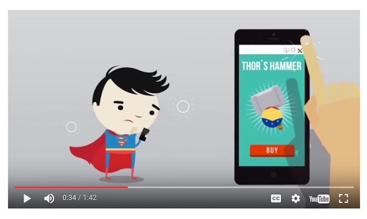
Image From Appier
User-targeting platform Appier features a neat, animated explainer video on its homepage. This video efficiently sums up what the platform is about, and what it can do for customers by telling its unique selling proposition as a story in wonderful, easy-on-the-eyes animation.
If you’re designing for an ecommerce store, you can include an explainer video, too, so visitors understand the concept behind your store. For example, if you’re selling flowers online, the explainer video you design could use animation to humorously and engagingly explain how an order is placed, how customers can track it, and how it’ll finally be shipped to them.
While explainers are very effective videos, they won’t help if customers want to really understand physical products they’re buying from an ecommerce site. For this, we turn to product-page videos.
You might also like: 5 Psychological Concepts Web Designers Should Use to Maximize Conversions
2. Use videos on product pages to wow shoppers
Videos are popular on ecommerce sites for an obvious reason: they allow customers to see exactly what they’re buying before shelling out their cash. This is extremely vital in ecommerce, as shoppers can’t examine the product for themselves, as they would in a brick-and-mortar store.
Videos are also useful in boosting site conversions because they give shoppers more confidence in what they’re buying, specifically that it’s legitimate, high-quality, and worth their money.
Online business owners that have used videos on product pages have garnered stellar results. Smart Insights quoted various ecommerce heads who all confirmed that product-page videos boost conversions, specifically:
- Wiggle.co.uk began using sharp 360 images for its product views, leading to double-digit conversion gains in some categories.
- Ao.com found that video reviews on product pages led to customers being 120.5 per cent more likely to purchase, customers spending 157.2 per cent longer on the site, and conversions being boosted by 9.1per cent overall.
- Winterson introduced videos to its product pages a few years ago; since then, it’s benefitted from significant boosts in its conversion rates and decreases in page exit rates.
- Zappos has seen a consistent boost in conversions and a decrease in returns since bringing videos to its product pages in 2008.
Clearly, the presence of videos on product pages has been a big plus for many retailers.
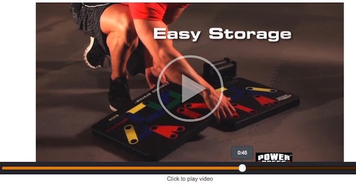
 Image From Amazon
One of the best examples of video on product pages is from Amazon.com.
On the product page for the Power Press Push Up – Complete Push Up Training System, shoppers can see a short video of this piece of equipment in action, which gives them a perfect idea of how to use it. This information makes it easier for them to make a buying decision.
If you want to build legitimacy for your product, there’s nothing like the video testimonial.
3. Build credibility with video testimonials
On the web, nothing can increase brand credibility as much as the testimonial. If you feature video testimonials on your client’s site, that’s great because video testimonials are harder to fake than written testimonials, since people are speaking for a brand directly on camera.
Video testimonials are also more engaging than regular, written testimonials, as they involve visuals and audio rather than just mere text.
Studies support the fact that your conversion rates will drastically increase when you use video instead of written testimonials.
In a case study performed by Marketing Experiments, an online registration page for a consumer credit-counseling company was compared to two treatment pages; one featuring a written testimonial, the other featuring a video testimonial.
The treatment page with the written testimonial only got a 25 per cent conversion lift, compared to the original page with no testimonial, which is good, but not great.
By comparison, the treatment page with the video testimonial received a whopping 201 per cent — yes, you read that right! — conversion lift compared to the control page with no testimonial.
Case studies like this prove that if it’s available, you should definitely use video testimonials on your clients’ sites instead of written ones.
More and more companies today are already using video testimonials to build extra credibility with leads, and it’s no wonder why.
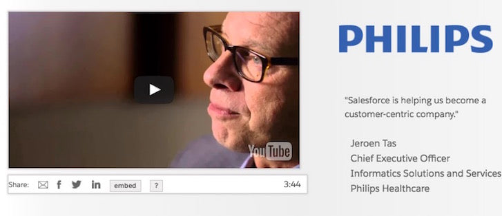
 Image From Salesforce
Take the case of Salesforce. This company features video testimonials like this one that include CEO of Philips Healthcare. This type of testimonial presentation adds a lot to the experience of a user watching it, and helps them make a decision on the credibility of the brand.
Video testimonials are especially powerful when you’re designing for an ecommerce site. Picture the following scenario: your client’s site has just shipped its 100,000th successful order, and the shopper’s video testimonial talks about how fast the delivery was for a product that arrived in perfect condition. That is persuasive to anyone watching!
While video testimonials work great, one of the best places to find videos also being used effectively is on landing pages.
You might also like: The 11 Best Free Video Editing Software Programs for 2019.
4. Generate engagement with landing page videos
Landing pages are some of the best tools available to get leads to click through to your client’s site and make a final conversion. Landing pages usually incorporate the same old, expected elements such as:
- A big headline
- Subheadings
- Images
- Bullet points
- Value propositions
- Calls to action
Not all landing pages today use video, though, which is a shame. Eyeview, a video-solutions provider, determined from its own study that landing pages with a video get as much as an 80 per cent conversion boost compared to ordinary pages without a video. That’s a stunning number to consider because it’s almost double the number of conversions your clients could be enjoying, and all that from simply adding a relevant video into the landing-page flow.
Whether your landing page is a short or long-form version, the evidence demonstrates that it simply pays to add video to it. A few brands today are already adding video to their landing pages, and so should you.
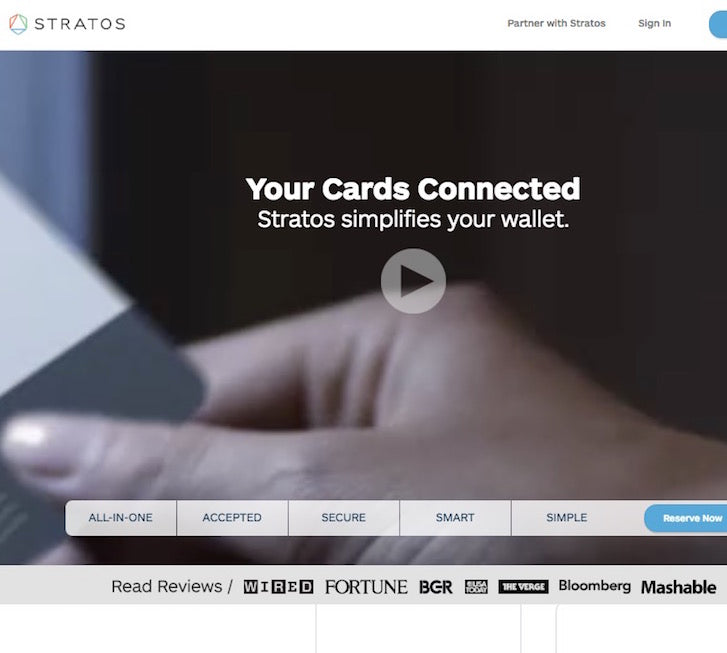
 Image From Stratos Card
Take, for instance, Stratos Card’s landing page. When visitors land on its homepage, they immediately see a giant-sized video telling them all about the merits of this wallet-consolidation tool that basically turns your wallet into just one digital card. The placement of this huge video above the fold is strategically smart, as it virtually ensures visitors can’t ignore or miss it.
Such a landing-page video can work wonders for ecommerce stores as well. You could, for instance, design a video that features the most popular product on your client’s ecommerce site and splash that right on the homepage of the site. It would go above the fold to ensure that as many shoppers as possible can see it, right when they land on the page.
What’s curious about this landing page is that there’s sort of a dual-video effect. You first notice the moving-video animation in the background, and then when you click on the play button, that’s when the video tells you about the Stratos Card’s purpose and features.
Boost ecommerce conversions with video
Simply put, video is the future of web design and inbound marketing. That future is getting closer a lot sooner than later, due to the sheer percentage of people who are consuming video on the Internet. As a web designer, it’s better for your bottom line, career, and clients to get out in front of this trend as soon as possible.
Incorporating video into your design appeals to the visual side of your client’s visitors and customers. Taking in information visually is more engaging and interactive than having to pore over a large piece of text for the same information. That’s why video has been proven to work, and will continue to get more popular on the web in the near future.
As a recap, the use of video on the web has four big implications for ecommerce stores today:
- Explainer videos for storytelling.
- Product-page videos to draw shoppers in.
- Video testimonials for better credibility building.
- Landing-page videos to really sell your product or service.
How do you incorporate video in ecommerce designs? Tell us in the comments section below.
Read more
- Top Ecommerce Web Design Trends for March
- Top Ecommerce Resources for July
- Top Ecommerce Web Design Trends from January
- Working With Technology Clients: Strategies, Apps, and Themes to Consider
- Designing For Augmented Reality
- Top Ecommerce Resources for October
- 4 Things to Consider When Designing Wholesale Stores for Clients
- How to Direct, Control, and Hold Focus Through Design
You might also like: 5 Creative Strategies for Using Overlays to Boost Conversions During the Holidays

