Pop-up shops are about creating an experience, allowing you to connect with customers in a physical space that communicates your brand message through a thoughtful retail design.
As one of the fastest-growing segments in retail, experiential commerce is really all about telling a story. Previously, we looked at how to determine the purpose of a pop-up shop and find the perfect location. Now it's time to ensure that your retail design tells a story that will make a lasting impression on your customers and the media.
Due to the short-term nature of pop-up events, you don't have the luxury of being able to establish your brand through repetition — as is the case with most stores. Limited customer exposure means that your visitors need to be immersed in your brand messaging in order to get your point across, surrounding them with the lifestyle that your brand represents.
Of course, just like any other physical retail space, telling your story starts long before anyone sets foot in your space. But here is how retail design can help you create an immersive experience for your customers and tell your brand story.
How to Create an Immersive Experience With Retail Design
Create a Lasting First Impression
 The “first impression” of your pop-up event determines whether or not people will explore further — and that starts with the window display. The window display is your first opportunity to connect with naturally occurring foot traffic and draw them in.
This is nothing new — traditional retailers do this all year long, changing out their window displays and setting new scenes. Think of how many people travel to New York City to walk down 5th Avenue during the holidays or Champs de Elysee in Paris to stand outside storefronts and admire each window display. Whether you have 50 square feet of signage or 500, this is an area where you need to invest time and budget.
FURTHER READING: Drive more foot traffic and turn heads with our guide to attention-grabbing window displays or get inspired for the holidays with Christmas Window Display Ideas, Inspiration, and Best Practices for Retail Stores.
In a pop-up shop, you also need to communicate the temporary, exclusive nature of your limited-time event. People walking by your space should understand that this is a unique opportunity that's exclusive to this particular location during this particular time period. Communicate how long your pop-up will be open. A clearly defined beginning and end helps customers understand the difference between your pop-up shop and other stationary storefronts nearby. And always include your website, since you want to be sure to connect your online destination to your space.
You can accomplish this with signage, printed marketing materials (pamphlets and flyers), and by posting this information on your website.
For example, Los Angeles-based online retailer Johnnie-O was interested in introducing their brand to new markets and decided to open a pop-up shop in New York City. In order to introduce people to the West Coast lifestyle, they brought the beach to mid-town Manhattan... literally.
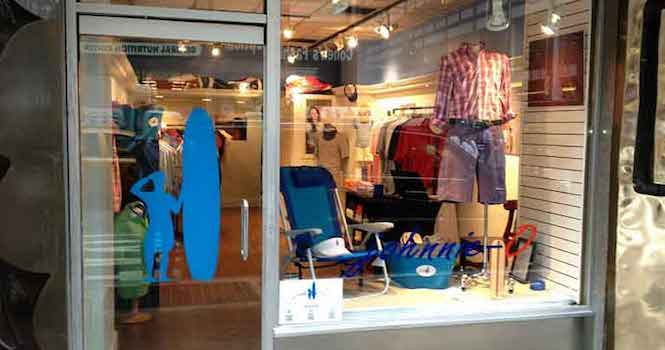 Real sand, beach chairs, and buckets of beer drew visitors into experience Johnnie-O's “West Coast prep” lifestyle, inspiring summer weekend getaways to the beach or golf course.
By timing their pop-up with the arrival of summer and the approach of Father's Day, their moisture-wicking polo shirts were a big success with locals.
Craft an Immersive Experience With Retail Design
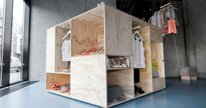 The storefront only sets an expectation for people as they approach your pop-up shop. Once a visitor crosses the threshold into your space, the environment needs to meet or exceed those expectations by immersing them in an experience. It doesn't have to be a realistic experience or a practical one, but it needs to evoke an emotional connection to your brand.
Creating an impactful pop-up experience starts with an honest assessment of your company and your brand. Start by asking yourself the following questions:
- What does your brand (or company) stand for? What is the brand message?
- Describe your customer. Who are they? Who do they want to be? What are the barriers between these two states that your brand or company helps remove? Build buyer personas to get to know your customers and to have research to refer to in the future.
- Are there required elements that need to be worked in for your brand? Does your brand have established logos or service marks that need to be represented?
- What is the environment that best suits your brand message? Ultra modern? Traditional? Rustic?
- What action would you like every visitor to take? Share on social networks? Make a purchase? Join a mailing list? This ties into the purpose that we established when planning the pop-up.
The answers to these questions can help you identify exactly how you want people to feel when they enter your space, and exactly what you want them to do once they're there.
Putting Together Eye-Catching Displays
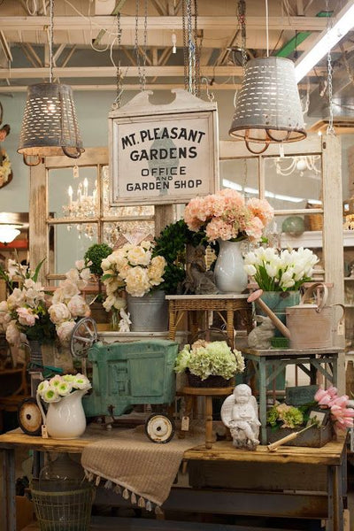
Image: Pinterest
Continue to take a holistic approach to your retail design: incorporate eye-catching elements into your visual merchandising and table displays. Now that you've determined your overall aesthetic, the display pieces should match.
For example, do regular silver racks make sense, or do shadow boxes and silver pipes better display your collection? The right shelving and furniture can also serve as the perfect display pieces for your merchandise. The key is to make your presentation fluid, clean, and enough to showcase your offering without feeling cluttered (leave duplicates and excess in your back storage area and replenish as needed).
Along those same lines, product displays should be determined by the pop-up goals and purpose. For example, are you trying to sell product (purpose is sales), or showcase product (purpose is brand expansion)? If you're showcasing your products, how do you want people to share them? Do you want them to post to Twitter or would prefer that they post a picture with themselves with your product?
Perhaps the purpose of your pop-up event is to generate a Facebook following, which you plan to market to later. In that instance, encouraging people to post a photo of themselves to their Facebook timeline is more important than displaying all available sizes and colors.
Get creative with your merchandising displays, as it will add to what makes the experience feel unique. A couple of online sites for inspiration include Pinterest (search retail displays) and Windowswear.com, which is a great destination to search some of the best window displays from across the globe.
Bringing It All Together
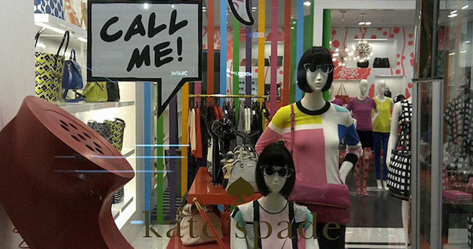 The key takeaway here is that you need to “immerse” people in your brand while also keeping focus on the purpose of your store. Once you've grabbed people's attention (outside) and immersed them in your brand (inside), you need to stay focused on your purpose and have a plan to convert your pop-up guests into new fans and customers.
If possible, try to visit the space you've rented multiple times to get a sense of the flow and energy in the space. Even if you've got the key merchandising and display elements figured out, be sure to plan out the overall flow of the space. That is the first point of contact for your customer when they walk in the door, and is a central element that anchors the room and contrasting elements while adding a necessary dimension that keeps the store intriguing to the eye.
The best quotes we hear when someone walks into one of our client’s spaces is “this space looks more finished than some permanent spaces we visit.” “I can’t believe this is a pop-up.” The key is to make it surprising that it’s only temporary because it feels complete; it feels like they walked into your store that happens to be a pop-up.
Not only do spaces that have a clear, branded experience receive more press accolades, but they consistently have a stronger ROI. Customers are simply more willing to open their wallets and follow a brand that’s invited them into their lifestyle and delivers the message that the brand will continue to deliver something special in the seasons to come.
Moving Forward With Immersive Retail Design
What are some of your retail design tips? How have you successfully used retail design to turn browsers into buyers?

About The Author
Melissa Gonzalez specializes in brand activation and Pop-Up retail experiences. She is the founder of The Lionesque Group, a company that has produced over 65 pop-up retail experiences in New York, Los Angeles, and the Hamptons. Connect with her on Twitter.
Read more
- 12 Retail Window Displays that Drive Sales
- Retail Branding: Build a Memorable Brand
- How To Hire an Interior Designer for Your Retail Store (And Why You Need One)
- How to Optimize Your Store's Power Wall to Spike Sales
- Let There Be Light: Retail Lighting Designs to Encourage Sales
- What Retailers Can Learn From These 5 Examples of Experimental Store Formats
- Product Merchandising: 11 Ideas to Steal (+3 Examples)
- 10 Visual Merchandising Tips for Increasing Event Sales
