Over the past year or so, accessibility has become a hot topic in the web design industry. This should come as no surprise given the prevalence of visual, auditory, and physical impairments (to name only a few) among the general population worldwide. Many aspects of your site can affect accessibility, from the font you choose to your ecommerce color palette. It’s up to designers and developers to find ways to create websites and web content that can be consumed by anyone, regardless of whether they live with an impairment or not.
While the following tools cannot entirely determine whether or not your site is accessible (this can only be truly accomplished through human assessment), they can help you on your path to accessibility by severely cutting down the time and effort it would take to implement a thorough evaluation. This will, in turn, help you identify and reduce the amount of accessibility barriers on your website and in your content — ultimately, improving its quality overall.
If you're designing for international audiences, be sure to check out our article on pseudo-localization to make the process easier.
To help you get started on the path to accessible web design, here are nine tools you can use to run simple accessibility audits on your websites and web content.
You might also like: 5 Ways to Improve Your Ecommerce Design for Colourblind Users.
1. AChecker
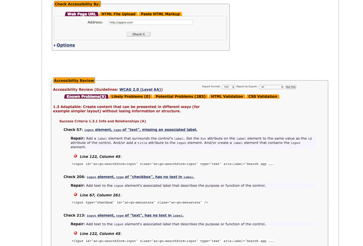 ‘AChecker’ is a holistic accessibility testing tool used to evaluate the HTML content for a single web page. You can test your web pages by entering the URL, uploading an HTML file, or by pasting the source code directly into the tool. After submitting your page, ‘AChecker’ scans your HTML and quickly produces a report that identifies certain, likely, and potential accessibility problems. There are additional queries that ‘AChecker’ can run as well, including HTML and CSS validators, but you’ll reveal a lot about the accessibility of your site by running the standard diagnostic procedure alone.
2. Color Oracle
 ‘Color Oracle’ is a free app that simulates various forms of colorblindness by adding a full-screen filter throughout your operating system (yes, it works with Windows, Mac OS, and Linux). Filter options are set to more severe forms of color blindness: deuteranopia, protanopia, and tritanopia. If your design passes with these filters, then you know it will also be easily readable by those with minor color blindness. Given that you can turn on these filters on the fly, this is the perfect tool for visual designers who want to evaluate their designs as they work.
3. Photosensitive Epilepsy Analysis Tool
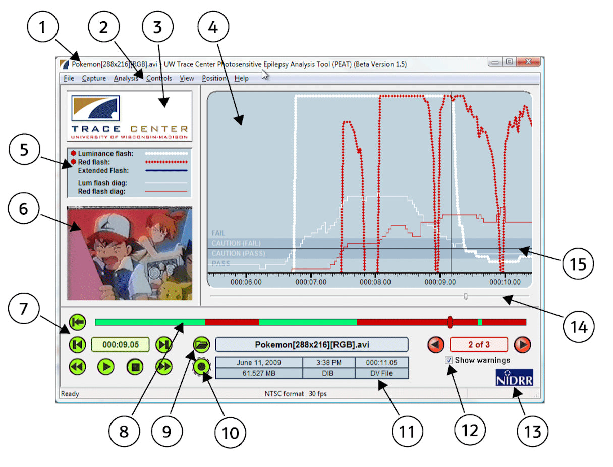 This free, beta-tool allows you to test your web content to identify seizure risk, using an analysis engine built by the University of Wisconsin-Madison Trace Center. The process helps determine whether animations or video you use within your web content, are likely to cause seizures for users with epilepsy. If you’re looking for more tools, the Trace Center has a ton of other resources to help developers evaluate the accessibility of their work.
4. NoCoffee
 ‘NoCoffee’ is a free extension for Google Chrome, which can be used to simulate a wide range of visual impairments including color blindness, low acuity, low contrast sensitivity, obstructed visual fields, and more. While ‘NoCoffee’ doesn’t necessarily evaluate and score your website as some other tools might, it will provide you with a unique perspective for how users with visual impairments experience your site.
5. Accessibility Developer Tools by Google
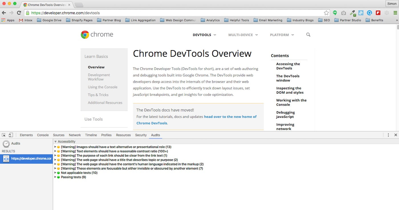 ‘Accessibility Developer Tools’ is a Chrome extension that adds a holistic accessibility audit, and sidebar pane, directly within Google Developer Tools (GDT). If you have GDT installed then running the audit is easy: you simply need to have the web page in question open in Chrome, navigate to the accessibility audit panel in Developer Tools, and hit “Run”. The audit will help you identify accessibility errors, including missing ARIA attributes, color contrast values, and much more. You can read the full list of audit rules, or suggest new features, by checking out the extension’s github repository.
6. Color Contrast Analyzer for Sketch
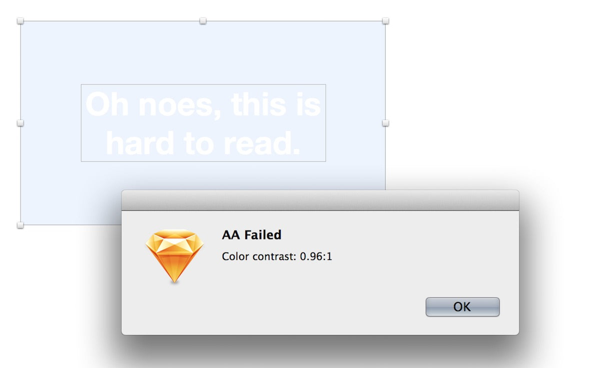 This plugin will allow you to test the accessibility of your designs for users who are colorblind, while you work directly within Sketch. ‘Color Contrast Analyzer’ gives you the ability to calculate the color contrast ratio of two layers (or a single layer against the artboard), and evaluate that value against WCAG standards. After the test is complete, the plugin will provide you with a pass or fail rating based on WCAG’s AAA and AA color contrast requirements.
7. Proof Setup in Adobe
 Similar to the plugin above, Adobe has taken the necessary steps to include colorblind accessibility proofing within its Photoshop and Illustrator software. The ‘Proof Setup’ filters allow you to see what your design will look like for users with different types of color blindness, specifically protanopia and deuteranopia. To simulate colorblindness on your design, simply look under the “View > Proof Setup > Color Blindness” menu and select either protanopia or deuteranopia. Yet again, another great solution for evaluating the accessibility of your design as you work!
8. WAVE
 ‘WAVE’ is a free, community-built tool designed to facilitate web accessibility testing by providing developers with a visual representation of issues directly on their page. The holistic tests assess a ton of accessibility issues, ranging from color contrast to ARIA attributes, and are based on compliance standards from both WCAG and Section 508.
The browser-based WAVE tool evaluates your web content after CSS has been applied, but does not evaluate any Javascript sources. If your site has a lot of dynamic content from scripts, you should opt for the WAVE Chrome extension — which also boasts 100 per cent private and secure reporting, great for assessing password protected sites like wholesale ecommerce portals or intranets.
9. YouTube Closed Captioning
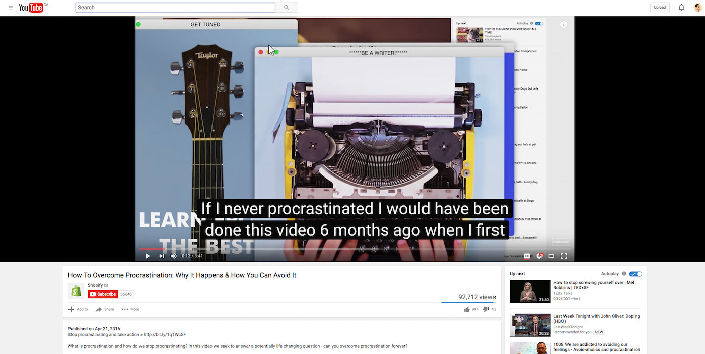 Very few tools exist that allow designers or developers to assess the accessibility of the auditory aspects of their web content. While not strictly an assessment tool, YouTube natively offers a resource that can help you boost accessibility within your video content. Closed captioning allows you to open up your video content to a larger audience — specifically those with hearing impairments, or those who speak languages other than the one used in your content. If you use YouTube to host or embed your video content, you can leverage their manual transcription and close captioning functionalities directly within the Video Manager.
How do you evaluate accessibility when you design or develop web content? Let us know in the comments below!
Read more
- Top Ecommerce Web Design Trends from January
- How to Use Icons to Enhance Your Ecommerce Website
- How to Direct, Control, and Hold Focus Through Design
- 6 Design Conferences to Last You 'Til The End of 2016
- 14 Image Tools for Web Developers in 2017
- Top Ecommerce Resources for July
- Working with Apparel Clients: Trends, Apps, and Themes to Consider
- Top Ecommerce Resources for August
- How to Integrate Shopify into your Client's WordPress Website with Zillacommerce

