Last year at Unite, we introduced our official style guide and design system, Polaris. Since then, hundreds of our partners have built or updated their app user interfaces to be more consistent with Shopify and easier for merchants to use. Along the way, we’ve looked at feedback, tracked usage, and identified plenty of areas for improvement.
Now we’re excited to announce the most significant round of updates and improvements to Polaris , available to all partners today! This update includes breaking changes to Polaris React, new and updated components, and a new version of the Sketch UI kit.
You might also like: Announcing Shopify’s New Sketch Plugin: Polaris Telescope.
New components
Based on feedback we received since the original launch of Polaris, we’ve added the following components to help you build better app interfaces. These components are available to you today.
Data table
Since launching the Polaris components, we’ve had many people ask why we didn’t include tables. While we have been moving away from using tables for comparisons that aren't tabular data (resource lists, for example), we recognize that there are still cases that call for them.
The data table component is our answer to those cases. While data visualizations represent part of a data set, data tables are used to organize and display all the information from a data set, allowing merchants to view details from the entire set. This helps merchants compare and analyze all the data in a unified way.

Drop zone
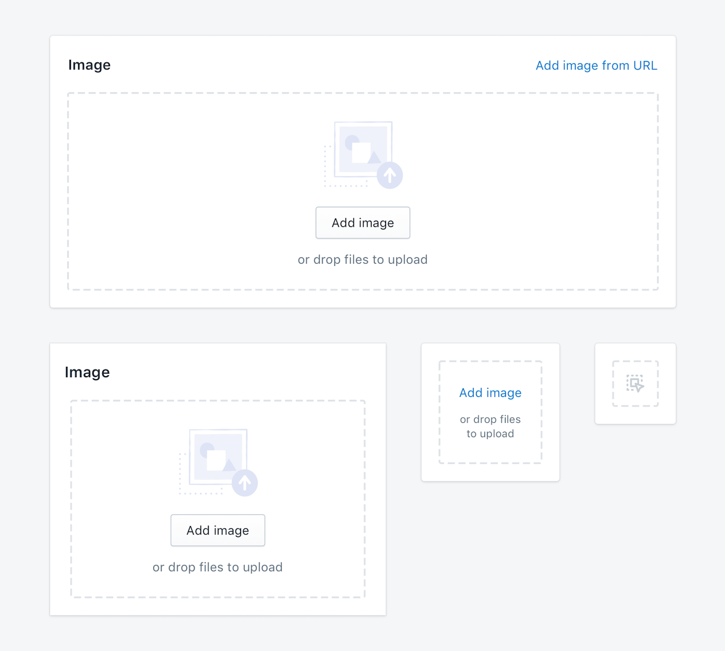
Currently we have several different interfaces for uploading files across Shopify, which leads to a lack of consistency and some missing features and capabilities. To solve this problem, we’re releasing a new drop zone component.
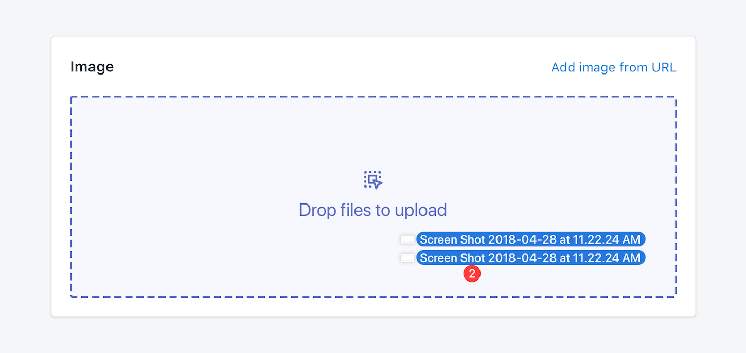
This new component allows merchants to upload files by dragging and dropping them into an area on a page. The component handles file type validation, dropping onto the window, and more, meaning more ease of use for merchants.
Modal
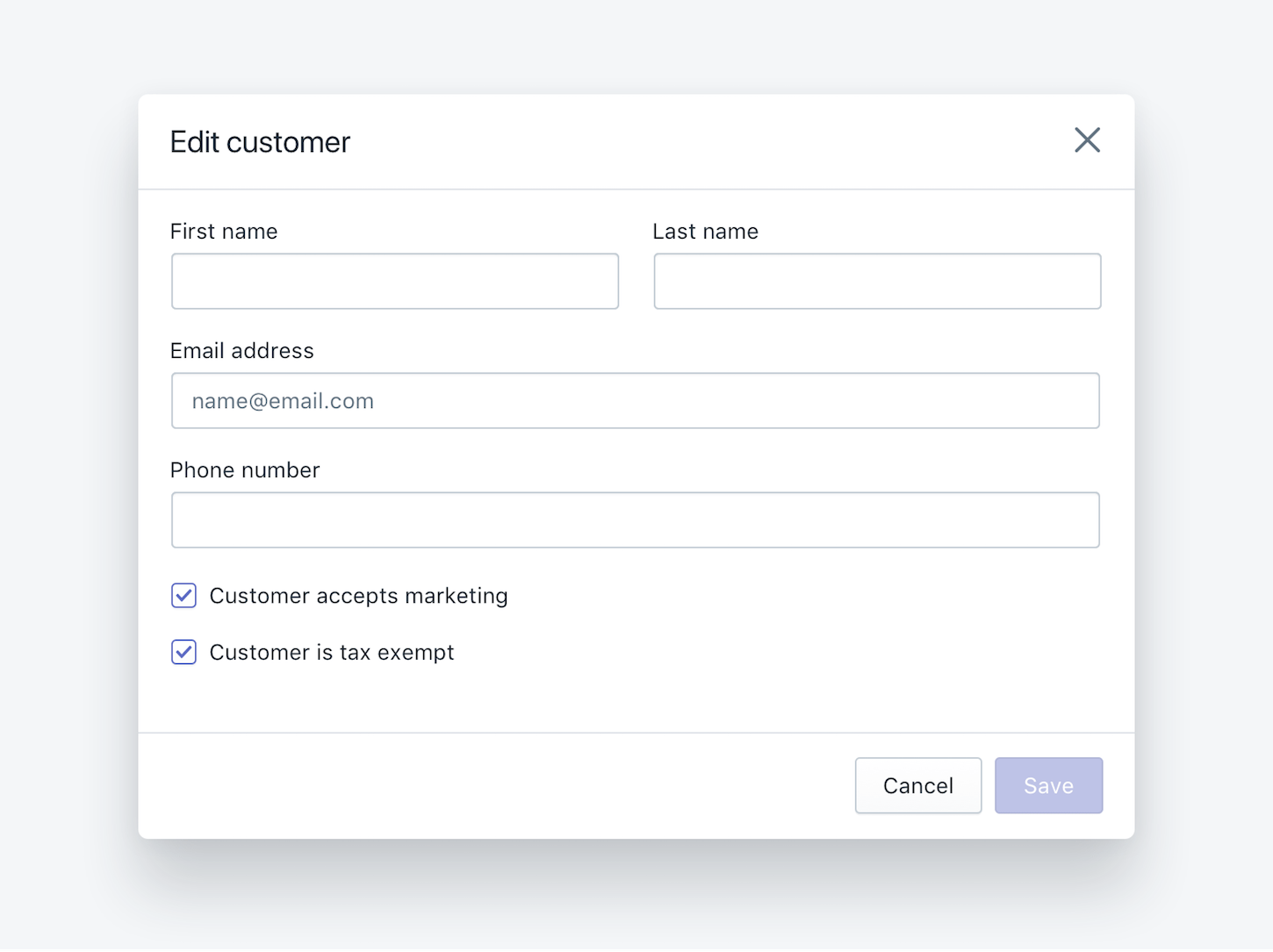
In the original Polaris, the modal component was only available to embedded apps. No longer. Our new modal component is universal in that it can be used in either standalone or embedded apps, and will handle the correct behavior for you.

App provider
The app provider is a required component that enables sharing global application config with the components in Polaris. This is used for the internationalization of strings in Polaris components, and to set other configurations such as a custom link component that all the Polaris components will use. This unlocks new ways for us to share configuration at an application level and have the components react to that configuration.
You might also like: How to Use Polaris to Build an App UI in HTML or React.
Component enhancements
In addition to adding new resources, we also looked at which of our current components could benefit from an enhancement. We decided to focus on the resource list component because it is such a crucial part of our merchant’s workflows.
Resource list
Shopify is organized around objects that represent a merchant’s business, such as customers, products, and orders. Each individual order, for example, is given a dedicated page that can be linked to. In Shopify, we call these types of objects resources.
The resource list component functions as:
- A content format, presenting a set of individual resources in a compact form
- A system for taking action on one or more individual resources
- A way to navigate to the show page of an individual resource
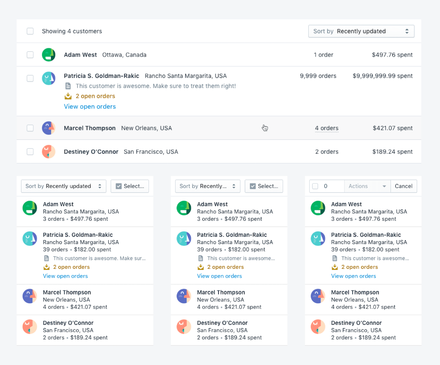
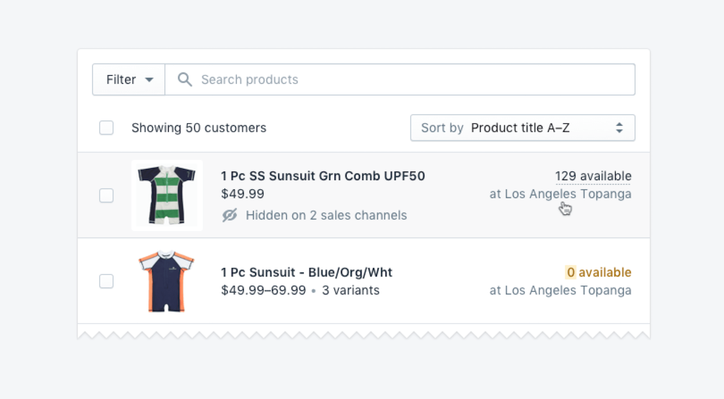
Our current resource list component gave you some nice defaults out of the box, but didn't take you much further than that. We recognized that each of these lists is unique and contains different information that is important to the merchant.
Our new resource list allows you to build custom items in the list, with their own layout, content, and styling. This gives you a powerful way to build these sorts of lists going forward.
Breaking changes
Polaris has a fluid and growing resource library. In making recent changes and improvements, there are a few breaking changes that will require you to upgrade..
-
React 16+: To make full use of some of the new features in React 16, such as fragments, error boundaries, and improved server-side rendering, we are removing support for 15 going forward.
Upgrade instructions: Upgrade your app to the latest version of React.
-
Tabs no longer accept title prop: To be more consistent with our other component APIs, the Tabs now use
contentinstead oftitle.
Upgrade instructions: Change all instances oftitletocontentinstead.
-
TextField onChange is required: Because we require you to manage state for your inputs, we’ve made
onChangerequired forTextFieldto avoid confusion.
Upgrade instructions: Add anonChangecallback to each use ofTextFieldthat is not disabled or readonly.
-
Removed default white color from Icon CSS: The CSS for Icons will no longer apply a color to icons by default. You must use the
colorprop on the Icon component to specify the color.
Upgrade instructions: Usecolorprop on all instances ofIconcomponent.
-
Anchor tags are no longer styled by Polaris components: To avoid conflicts with other styling or frameworks, we are removing the styling we globally applied to all
atags.
Upgrade instructions: Use theLinkcomponent instead.
You might also like: 5 Reasons Your App UI is Causing Merchants to Uninstall.
Updated Sketch UI Kit
We’ve also released a new version of the Sketch UI kit to reflect the new and updated components. The new UI kit includes more Polaris icons, as well as new layout templates for common page types . We’ve also revised how the kit is organized, so it’s now easier to use as a Sketch library.
We’ll keep updating the UI kit to ensure that the components in Sketch match the latest versions in React.

Upgrade instructions: Download the new Sketch UI kit.
A growing system
With new upgrades and additions, Polaris is now an even more powerful design system and component library to build your apps with.
Having a familiar and easy-to-navigate app interface is the best way to help merchants successfully navigate and use your app. While Polaris launched with all the fundamental components you may need, we also know how quickly software, merchant needs, and merchant solutions evolve. As your app business expands and innovates, we’ll continue to grow and update our Polaris design system to help meet your current and upcoming UI needs.
Read more
- How to Build a Shopify App: The Complete Guide
- How to Build Multilingual Shopify Apps
- Use the Kit Skills App Extension to Engage Your Users Conversationally
- Built on Trust: Making Apps More Secure for Merchants
- Implementing API Rate Limits in Your App
- Building a Shopify App That Makes a Positive Difference in the World (And Makes a Profit)
- How to Upload Files with the Shopify GraphQL API and React
- Free Webinar] Building Great App User Interfaces with Polaris
- How We Built Out Our Reporting Dashboard with Shopify Polaris
- Selling in Multiple Currencies with Shopify Payments: What this Means for App Developers
What updates are you most excited about? Let us know in the comments below!

