A long time ago, in a completely-innocent attempt to generate more interest in their products or services, web designers weaved animation into marketing creative and (unintentionally) interrupted the entire user experience of websites.
Shaking banner advertisements, swooshing homepage takeovers, flashing images. Cringeworthy, right?
Because of this, animation has been a little...well…infamous in the design community. This, as well as the perceived additional development time required to create animation, makes it difficult to sell to clients. But, when used in a meaningful way, animation and movement are powerful tools that can improve both user interaction and engagement with a client’s website.
When used in a meaningful way, animation and movement are powerful tools that can improve both user interaction and engagement with a client’s website.
Well-executed animation is not nearly as noticeable as the streamlined, and enhanced, user experience. You just need to know how to speak to it in a design-centric way.
Recently, we sat down with Val Head — designer, interface animation consultant, and author of Designing Interface Animation — for a Shopify Partner Session webinar, where we discussed how to use animation in a meaningful way.
Val outlined four ways that you can persuasively talk about animation. Below, we discuss these strategies, and how you can apply them to a new client project or pitch.
You might also like: Using Animation to Improve Mobile App User Experience.
1. Speak to animation’s ability to provide orientation and context
If there’s one thing animation is really good at, it’s showing where things are and how they relate to the rest of a website. If your client is looking to create an experience that’s responsive from mobile to desktop — across many different viewports — animation addresses the common design problem of communicating navigations, or page elements, that aren’t yet visible to the user.
Take a look at transitional animations — which use movement to show how one object relates to another. In the below example, Val’s CodePen uses a transitional animation on the navigation bar to let users know that, when they want to access more information about a particular item in the navigation, it’s hidden under the hover state of the icon.
See the Pen Show/hide example by Shopify Partners (@ShopifyPartners) on CodePen.
Google offers a similar example, using animation for both orientation and context. If a user wants to change the color of their Google Fonts page, all they have to do is click on the paint bucket icon.

But why is this action intuitive for users?
It’s because they have the preexisting artistic context that a paint bucket represents color. Also, paint bucket icons are used consistently across many platforms to depict a color picker, or the ability to fill an area with a pre-selected color.
With this context, users know that the color picker is inside the paint bucket icon. And they know to click on the paint bucket icon because the orientation animation has shown them that the menu exists within it.
So, if your proposed project has many modal layers, or hidden page elements, explain to your client that using animation for orientation and context can benefit their user’s experience, and make their website much easier to understand and navigate.
2. Speak to animation’s ability to guide tasks, show cause and effect of user actions
Oftentimes, you’ll be designing pages that offer more functionality than clicking through to simple webpage or brochure page. Your client’s users will actually want to do something with your client’s product, like move things around, save documents, access editable information.
This is where using animation to address the design problem of guiding users through more complicated tasks, or to show cause and effect, is crucial to creating a great user interface.
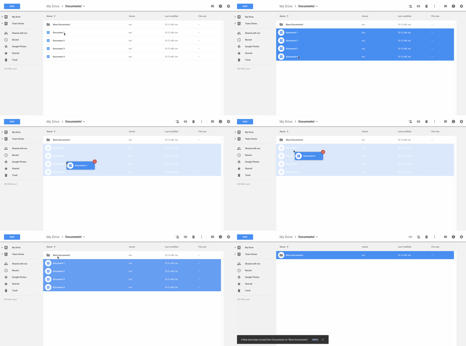
Here’s another example from Google: have you ever noticed how Google Docs uses simple animations to guide users through the task of moving, or rearranging, documents?
If multiple documents are selected, they’ll slide together into a single pile that indicates exactly how many files there are. Furthermore, if a user drags this pile over a folder, the background of that particular folder will change — indicating to the user that they’ve found an appropriate place to move their documents to.

This helps users understand the cause and effect, or potential effect, of their actions.The drag and drop experience mentioned above is very nuanced, but the motion created by animation makes the task more intuitive for users.
As we mentioned at the beginning of this article, good animation is less noticeable than an enhanced user experience. If your proposed client project expects users to interact with a particular interface outside of the traditional scope of a webpage, consider pitching animation to guide tasks.
If your client needs a little more persuading, offer the Google Docs example — it’s a tool a lot of businesses use on a daily basis, and you can physically walk them through how good animation makes interacting with the product a much more pleasant experience.
You might also like: 6 Animation Libraries to Save Time and WOW Clients.
3. Speak to animation’s ability to direct user attention
This benefit may already be known to your client, but being able to speak to animation’s ability to direct user attention in a design-centric way, makes it a much more attractive option for client projects.
Besides, that’s one of the most powerful features of animation as a design tool; it’s ability to command attention.
Animation can help direct a user’s eye to important elements on a page, or call attention to objects that may be changing. Pair this with really great content — information people actually want to read — and users are more likely to have an enjoyable experience.
Take Chris Coyier’s CodePen below as an example. When a user clicks their specific response, a follow-up question appears directly below. The animation helps users understand that there’s a new element on the form and directs attention to it, but the fact that it’s hidden until the user selects an option keeps the form simple and relevant to the user’s interactions.
See the Pen Reveal Form Fields as Needed with CSS :checked by Shopify Partners (@ShopifyPartners) on CodePen.
Additionally, as a designer, how often have you come across the design problem of intuitively indicating where a user has made an error on a form? In the above example, if a user leaves a field blank when submitting the form, an error message is animated to appear and shake at them — letting the user know exactly where their error occurred.
Another example of using animation to direct user attention is one you may already be familiar with. When using CodePen, if you haven’t saved your work in a while, the save button will shake at you — reminding you that, if you don’t press that button, you could lose your work should something happen (like, say, your browser encounters an error and has to restart).
Jed Trow has recreated this effect in his CodePen, seen below.
See the Pen Codepen style shaking save reminder by Shopify Partners (@ShopifyPartners) on CodePen.
So, if your proposed project includes important elements that a user needs to know about, or incorporates changes in elements throughout the user’s experience, consider pitching animation to help command attention to these areas.
4. Speak to animation’s ability to create perceived performance
Performance is a big deal when it comes to web design — it’s the difference between a user staying on a page, or bouncing after waiting for it to load. And as web designers and developers, we try to be as performant as we can when creating client projects and user experiences.
But, in some cases, waiting is unavoidable.
This is where animation can be used to make users feel like something is happening faster than it actually is. In her presentation, Val mentions a study conducted by Viget, where they compared how long users would wait with a basic loading animation versus a completely customized one. Viget concluded that users were more likely to wait longer if they were exposed to a custom loading animation.
Shopify uses this technique when users create a new store. Setting up all the elements of the dashboard, creating a new user account in the database, and all the other pieces that go into creating a store takes time. To create perceived performance, Shopify uses animation and context to make it appear like things are happening faster than they actually are.

Though these items may not be happening in the particular order that they’re mentioned in, it still makes users feel like they’re “in the loop” as to what is happening while they wait. Shopify has created perceived performance, which benefits the overall user experience of creating a Shopify store.
Creating skeleton content is another way you can use animation to address the common design problem of making users wait. You’ve probably seen this strategy on social media sites like Facebook and Twitter, where the user sees only shapes and lines until the content is loaded — giving them the feeling that the complete content will appear soon.

Shopify uses this technique when loading a store’s admin. In the above example, you’ll notice that until the dashboard content has completely loaded, users will only see skeleton lines and shapes. This skeleton content gives Shopify the ability to load all elements of the merchant dashboard at once — indicating to users indication that though they’re waiting, their dashboard will be completely loaded in a moment.
Next time you’re working on a client project that contains elements that will increase user wait times, consider pitching animation to increase perceived performance. Not only will this benefit the user experience, but it will also increase the likeliness that users will complete actions that take a little longer to load.
You might also like: Designing with SVG: How Scalable Vector Graphics Can Increase Visitor Engagement.
In conclusion
Whether you have lots of experience with animation, or you’re looking to start incorporating it into client projects, you may need a little inspiration.
To find great examples to show clients, have a look at capptivate.co — a collection of animations across different applications. Here, you’ll find out how things work together, and identify how you can create an experience through the use of multiple animations.
And don’t forget! When wooing your client on animation, use some of the design-centric analysis that we mentioned in this article to be more persuasive.
Read more
- Sketchnoting 101: Tips For Improving Your Visual Vocabulary
- Top Ecommerce Resources for December
- Top Ecommerce Web Design Trends from January
- 4 Things to Consider When Designing Wholesale Stores for Clients
- Top Ecommerce Web Design Trends for March
- Working with Apparel Clients: Trends, Apps, and Themes to Consider
- 13 Web Design Trends to Watch in 2020
- Designing Social Proof Into Your Ecommerce Website
Have you included animation in a recent client project? Let us know in the comments below.

