In our previous piece, Andrew Mauney explained how to set up an A/B test in Shopify using Optimizely. In this post, the third and final instalment in our series on optimization testing, we’ll demonstrate how to use iterative redesign and become a hero to your clients.
The biggest difference between iterative redesign and A/B testing is that A/B tests focus on isolating a variable in an otherwise identical experience. When we’re executing an iterative redesign, we don’t want to change one small thing, instead we want to serve an entirely different experience to a segment of our traffic. Ensuring a seamless transition between the two experiences, in this case, is a different challenge altogether.
Done right, this approach can earn you unequivocal trust as a partner, setting you up for a successful long-term relationship with your client. But done incorrectly, it can blow up in your face, ending the relationship before it ever really starts.
We’re here to help you stay on the right side of that divide!
You might also like: How A/B Testing Will Make You a Better Web Designer
Step 1: Set clear expectations
If we’ve learned one lesson that’s timeless and universal, it’s that just about everything in life and in business comes down to expectations management. And in this case, there’s a good chance that even if your client is nodding along in agreement, they really have no idea what to expect when you take them through an iterative redesign.
To help tell our story, we architect the entire redesign project using a roadmap. And with that roadmap, we explain that we’re going to redesign our client’s ecommerce store, piece by piece, beginning with the most important aspects of the ecommerce conversion funnel.
Over the span of three or four months, we’ll typically redesign each of the following user interface (UI) elements and interactions:
- Product detail page (PDP) and the add-to-cart experience
- Navigation and collection architecture
- Collection template
- Global styles
- Homepage
Here’s how we communicate that roadmap to our clients:
| Sprint One | Sprint Two | Sprint Three | Sprint Four |
| PDP Design | PDP Build | PDP Test & Launch | |
| Style Design | Style Build | Style Test & Launch | |
| Nav Design | Nav Build ... |
When we’re selling an iterative redesign, we’re also sure to be extremely clear about a few things:
- While iterative redesign shares some of the same principles as conversion rate optimization (CRO), the two are not the same.
- Iterative redesign is a superior alternative to an all-in-one revolutionary redesign — not an alternative to CRO. Iterative redesign allows for data-informed decisions and fewer assumptions, while CRO can allow for data-driven decisions while eliminating assumptions.
- Iterative redesigns are not perfect experiments. You haven’t isolated a variable in a challenger; you’re introducing an entirely new experience.
- Iterative redesign creates shorter feedback loops, mitigates redesign risk, and focuses on continuous improvement.
- To properly execute an iterative redesign, you’re going to need an A/B testing platform. At Rocket Code, we prefer Optimizely.
Step 2: Architect your experiment properly
To ensure that the iterative redesign experiment is as performant as possible, we actually prefer to force the variant URL to load using an altogether different liquid template by appending the view parameter to the URL. The parameter will look something like this: ?view=template-name.
This will display the template of your choosing at that URL, and it accomplishes two main things. First, it is non-destructive to the original page and template, so there’s no risk that part of the redesign, or the control, will bleed through and be seen by a visitor if an error occurs. Second, it allows you to make direct comparisons between the control and the redesign for metrics like page speed and page weight, since both pages are independent of one another.
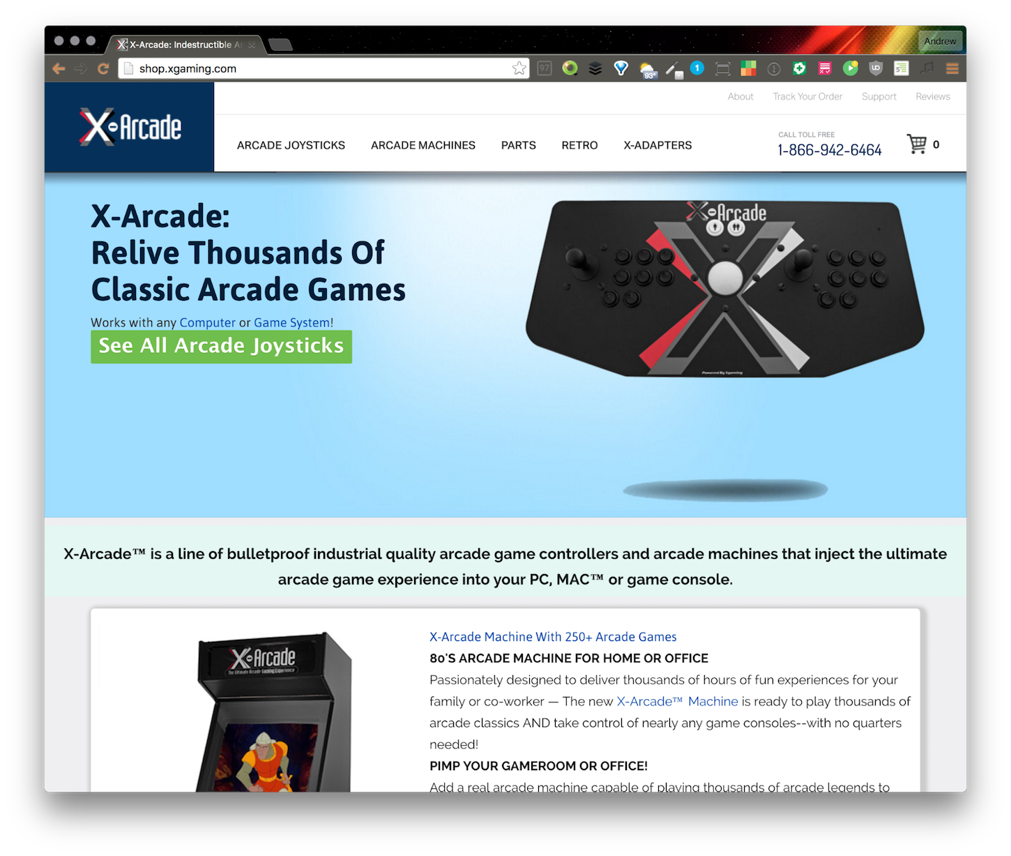
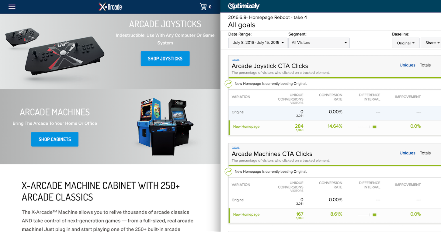
For our client X-Gaming, we were interested in increasing the conversion rate of the homepage through a redesign. As X-Gaming was already a top player in the arcade stick field, we felt that taking an iterative redesign approach would work best, as it would allow us to test revisions of the homepage to squeeze out as much performance as possible while improving the user experience. To accomplish this, we used the aforementioned URL parameter along with an Optimizely redirect test for several rounds of testing. You can see in the screenshots below just how different your pages can be when you use a view parameter:
Without the view parameter:
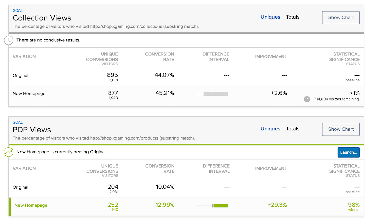
With the view parameter: Once you have your experiment code set up and ready to go, it’s time to input and verify the goals for your experiment. In this particular experiment, we were interested in how user interaction on the homepage affected the views for collection and product pages, and how those users converted when further downstream, primarily on PDPs.
You can see in the experiment above that the calls to action tracked in the challenger are altogether new; if you remember from the screenshots in the previous section, the original homepage only had one CTA that took you to one collection. So, we’re able to track those clicks, but we can’t measure them directly against an alternative in the control.
To more appropriately measure the performance of two separate UIs, you might need to go further down the conversion funnel. In this case, we used downstream metrics — how the user interacted with the site further down the funnel — to evaluate the control and challenger against each other.
You might also like: A Short Tutorial for Running A/B Tests in Shopify with Optimizely
Step 3: Let it run
Once you’ve got everything set up, it’s time to activate your experiment. In the execution of an iterative redesign, it’s acceptable to look for correlation and leading indicators rather than being beholden to statistical significance.
Step 4: Deploy the winner
Once your experiment has run its course, you and your client should feel confident deploying the new treatment. Hopefully, the data you’ve gathered will provide you with some observations and insights you can use to experiment with, once the iterative redesign is complete.
If you deployed your experiment using the view parameter, cleaning up your theme should be as easy as replacing the legacy Liquid template file with the new one. If instead you’ve manipulated your classes to deploy both variants from the same template, you’ll want to remove any namespacing from the file, as well as any functionality, styling, and logic you no longer need.
Step 5: Repeat until the iterative redesign is complete!
A big part of what makes this model so successful for us is that we’re able to parallel-path quite a bit of work. So, while one experiment is running, we’re engineering the next, and designing the one after that.
Done right, you’ll have executed a full redesign more quickly, pragmatically, and profitably than ever before. And you’ll have a happy client, eager to continue their relationship with you.
Read more
- How to Use Product Media on Your Custom Shopify Themes
- Shopify’s Buy Button 101: How to Use BuyButton.js in a WordPress Theme
- How To Use Translation Keys To Create Internationalized Themes
- How to Add a Social Media Marketing Icon to Your Theme
- How to work with Metafields when building Shopify themes
- How to Create a Customizable Announcement Bar Section in Shopify
- How the Routes and Page_Image Liquid Objects Can Help You Build More Robust Themes
- A Beginner's Guide to Sass with Shopify — Part 2: Making Stylesheets Smarter with Sass Mixins and Functions
- How to Display Price Ranges on Shopify Collection Pages
You might also like: Split-Testing: How to Run a Revenue-Driven Test in Shopify

