After successfully migrating Character.com from Magento to Shopify in 2016, the team at Bluegg said that their biggest takeaway from their second ecommerce project ever was that they bit off more than they could chew...but in the best possible way.
“It was a steep learning curve for sure,” explains Bluegg web developer Matt Jackson. “But now, I wouldn’t be scared of taking on pretty much any Shopify project, because we learned so much on this job.”
Character.com had a complex online store, with a number of Magento integrations, thousands of products, and solid SEO rankings not to be messed with. Despite its crummy UX, mobile experience, and site navigation, the business’s client base was loyal and loved the products.
“I think there was a lot of pressure on us, given that the merchant had a successful site already,” Matt says.
In the business of branding and web design for over 14 years, the digital agency based in Cardiff, UK had their work cut out for them.
But not only did the team get a double dose of ecommerce education with the re-platforming, they also helped improve the site’s overall conversion rates by 40 percent, and watched Character.com upgrade to a Shopify Plus plan only three months after the relaunch. Here’s how they did it.
Resources to help your next migration project
Migrating a client from a different commerce platform is a big job. We're here to help. Visit our migration page to download assets and resources you can use to educate your clients about ecommerce migration, their options, and the opportunities with Shopify.
Visit pageAbout Character.com
As the name suggests, Character.com is an online retailer selling character-based clothing for kids and adults.
“Whether it’s Peppa Pig pajamas or Sleeping Beauty slippers, you can find all the most popular characters on the site,” Matt explains.
Before moving to Shopify, Character.com was performing well and sold its products through several online channels, including its own dedicated site. But the merchant wanted to become less reliant on third-party marketplaces, increase brand awareness, and make Character.com the “go-to place” for character clothing.
That’s when they approached Bluegg.
“It was definitely already in the director's head,” explains Tom Lloyd, Bluegg’s Creative Director and the project’s manager. “I don't think he had made a decision, but he was very open to being convinced that it was a good idea to move to Shopify.”
Despite only being Bluegg’s second-ever ecommerce project, the agency felt confident they could deliver what their client needed, based on their background in UX design, web development on various platforms, and other digital work in their portfolio.
Character.com had recently refreshed their logo, but agreed to jump into a full redesign, restructure, and rebuild of the site with Bluegg’s help.
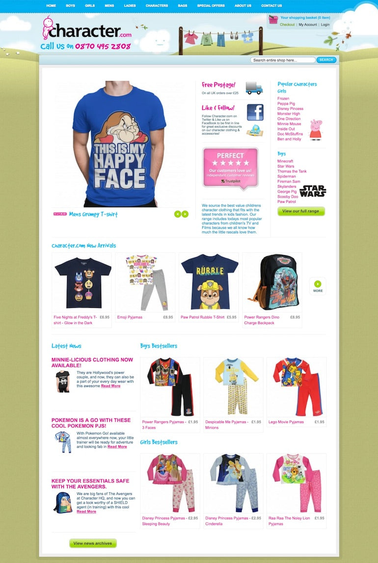
Tom explains that there were three key problems his team was trying to solve with the redesign and rebuild:
- The design was outdated and misrepresented the business. “Although the products they sell are comparatively cheap, they are much higher quality than the old site alluded to with its look and feel.”
- The old site had several key UX issues with search, the discovery of related items, and the organization of categories and products. It was also technically inadequate; it wasn’t responsive, despite over 60 percent of visitors using mobile devices. “Amazingly, they still had a good conversion rate,” Tom adds.
- The site was running on Magento, which had been developed over the course of many years. “As a business selling tens of thousands of products each month, changing the ecommerce platform was a big undertaking,” Tom says. But Magento had become difficult to manage, and the servers were creaking under the stress of a growing audience. Not to mention the increasing server costs.
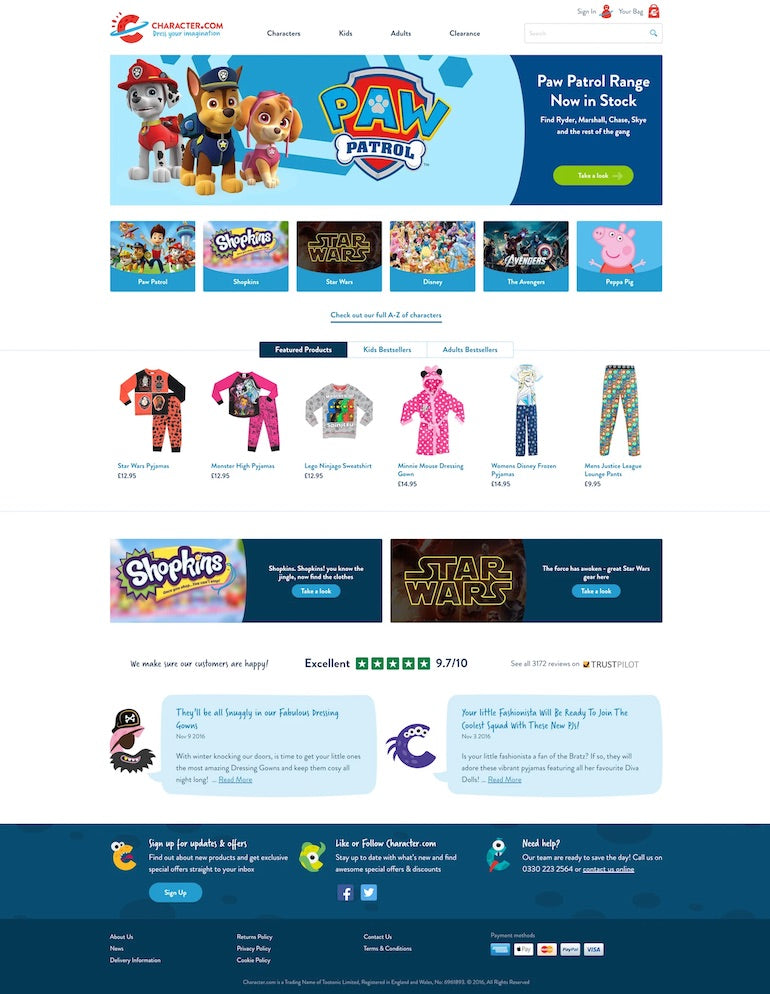
When it came to pitching the migration—the biggest part of the project’s puzzle—Tom says dealing with a merchant who was ready to make a change was helpful. But, there are a few key points to keep in mind when pitching a huge undertaking like this to a merchant:
- Don’t push people. “It's difficult to push people into the unknown if they're happy with what they've already got,” Tom says. Doing a bit of detective work, and asking clients where they’re at and how they find their current system is smart. But, understanding and accepting a client’s true needs as they are is key to a healthy and prosperous client relationship.
- Do make it happen. “We’re careful not to promise anything,” Tom explains. “Our approach is often, “Yes we can do that, but we’ll come back to you with how.” That’s generally how Bluegg approaches conversations with their clients, unless they’re dead sure about how they want to tackle a project. “The web changes so quickly these days that what you promised one client a month ago may not be the best way of doing it this month.”
- Know your stuff. “Any amount of knowledge that you have of the product is going to help you in talking confidently about why the client should make the change, especially any pros and cons against other systems,” Tom says. When it came to the Character.com project, the client was concerned with the financial implications of changing to Shopify, and weighed out the expense of a monthly fee versus what he was paying in server bills on the Magento site. “His server bills were skyrocketing,” Tom explains. “So obviously that played to the fact that there's no server cost to Shopify.”
You might also like: How Pixel Union Diversified Their Service Offerings and 10x’d Their Business.
The approach to design and UX
Beyond the migration from Magento to Shopify, the site required a complete overhaul from a design and UX point of view.
“Basically, the biggest problem with the old site was that it looked really out-dated,” Tom explains.
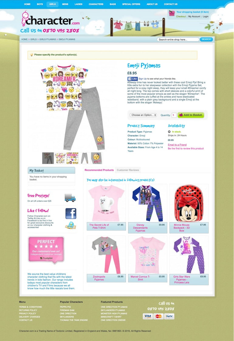
As one of their first major ecommerce projects, there was a lot to learn for the team. Bluegg’s lead web designer, Peter Dyer, looked for inspiration by analyzing what some of the best ecommerce sites in the business were doing. They eventually decided on a vibrant yet simple look and feel that put the products center stage.
“From a design point of view, it was about trying to distill the website down to the best bits,” Peter says. “Batman, Avengers, Peppa Pig—they all look lovely as design elements themselves, and we thought we should let that stuff sing.”
“From a design point of view, it was about trying to distill the website down to the best bits.”

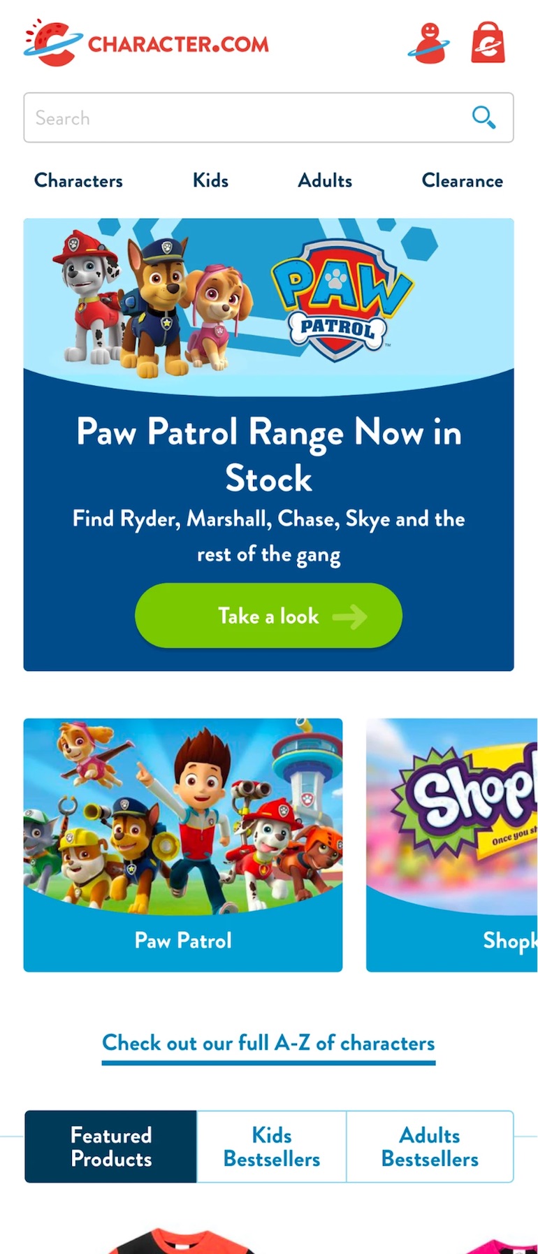
The team decided to design mobile first, which led to making important decisions on the structure of the site. Oddly enough, close to 60 percent of Character.com’s traffic was on mobile, despite the site being non-mobile friendly.
“Their conversion rate for a non-mobile website was ridiculously good,” Tom says. “That gave us a bit of confidence, because if people are coming onto this site on mobile, and still buying stuff, they must really like the product."
The Bluegg team started off with some user research and analyzed the site’s users. Because the merchant had a large customer base, with typically a high number of orders, the team had a lot of data they could play with in Google Analytics, such as gender and age.
“We basically found out that the majority of people were ladies, and they generally were slightly older, as well, because they were buying for nephews, for nieces, and for grandkids,” Tom says.
With a clear idea of the audience, Bluegg was able to test different UX patterns in InVision to prototype a range of user journeys, and narrowed in on the best approach to categorization and finding products.
“At that point, we decided to reduce the primary navigation to four items, allowing us to show the full navigation on mobile, rather than hiding it away in a drawer,” Tom explains.
To reduce the length of the site on mobile, Bluegg used a horizontal scrolling pattern with “peaks” to show content that was off-page. This gave the team the chance to use some rich images without sacrificing page length.
Overall, Tom maintains that the biggest design and UX challenge his team faced was ensuring a solid return on investment for their client. Because the site was already performing extremely well, they needed to ensure that a major redesign wouldn’t have an adverse effect, even if it did look and function better in the end.
“It was quite possible that we might lose traffic if the site gave the wrong impression by looking ‘too premium’ or high end. We did a lot of user testing during the design process to make sure we hit the right balance.”
You might also like: User Research Methods: 13 Expert Tips to Master the Process.
The epic migration
Importing the existing product data from Character.com’s custom Magento setup was a complex job, in large part due to the amount of custom work on the Magento site. The Bluegg team decided to write a custom import script, using Magento and Shopify APIs.
As the project’s web developer Matt explains, Bluegg got a version of the Magento site running locally.
“That way, we didn’t have to fire a long-running, database-intensive process on the live site. Once we had this, we wrote a complex script to map the existing product data to the fields Shopify needed in its CSV import,” Matt says.
Using this exported data, and with a little bit of trial and error, they were able to move the products to Shopify with relative ease.
“It also meant we could take the most current version of the product database as late as possible, before launching the new site, meaning the client could continue to add new products right up until launch day,” Matt adds.
Bluegg also used this process to import Character.com’s existing customers to Shopify, a process made easier by having already moved the product data.
Advice on re-platforming from Magento to Shopify

Migrating the site to Shopify was a highly custom job for Bluegg. With this in mind, Paul Goodfield, a Bluegg web developer who oversaw the migration, gave his best pieces of general advice for migrating a shop from Magento to Shopify:
-
Get the Magento install running locally. This means that running any queries on the database won’t slow down the production server. We managed to accomplish this without having to download the entire Magento installation; we just needed the
app,libandvarfolders and their contents. - Set up a PHP script to convert the DB data into the CSV format that Shopify expects. The script should create a model for the data to go into. We used a multidimensional array (an array of arrays). The first item in our array is going to serve as the header row of our CSV and will contain the column titles.
-
Bootstrap your app using the
Mage::app()function. This will give you access to all the Magento data. You can use Magento commands to pull out the data from the DB. Extra commands can be chained together to retrieve specific attributes and to filter results. You can then map these to the relevant fields in the array. - Map and format some of the fields to custom tags, to save time when setting up filtering and search functionality. This also made it easier to set up smart collections as the products were already tagged when we did it.
- Fill the array and loop through it to generate a final CSV. Setting the correct file headers in PHP meant that once the script was finished generating the CSV, the browser would prompt us to download it.
Overall, the team says the migration was a steep learning curve, with some trial and error. But at the end of the day, the challenging new experience helped them all grow professionally.
“I think one thing that we have learned is that no two re-platforming projects are ever going to be the same,” Matt says. “Learning a new technology is hard, so the best way to learn is to throw yourself into it, and trust that your expertise will guide you through.”
“I think one thing that we have learned is that no two re-platforming projects are ever going to be the same.”
Migration pays off
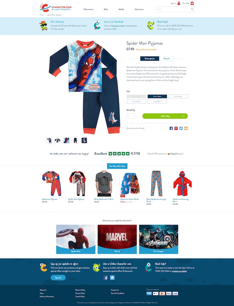
Character.com launched their rebranded and rebuilt website at the end of July 2016. By mid-October, they had increased overall conversions by 40 percent.
A fresh-looking website with simplified user journeys, paired with better site navigation and improved product discovery helped desktop conversions increase by 40 percent. On mobile, the presence of a user-friendly mobile experience, coupled with a simplified checkout, increased mobile conversions by 65 percent.
Overall, Tom says that the migration to Shopify and the more trustworthy branding and design of Character.com helped conversions increase.
The significant bump in revenue meant Character.com could upgrade to Shopify Plus—a great win for the Bluegg team.
In addition, the site’s bounce rate decreased by 10 percent, the average order value increased by nearly 17 percent, and pages viewed per session grew by 33 percent.
“We're keeping people on the site a little bit longer, and leading them around the products more,” Tom explains.
Growth across the board went up, and while Character.com was doing well prior to the relaunch, when comparing August 2015 to August 2016, revenue grew by 300 percent.
"When comparing August 2015 to August 2016, revenue grew by 300 percent."
“There’s obviously natural growth in that, as well as some big one-off sales,” Tom says. “But it also reflects the significant growth since the launch date, which is an amazing accomplishment for our team.”
You might also like: From Reddit to Redesign: How Fuel Made Increased One Merchant's Revenue by 30%.
New phase, new lessons
As Character.com entered a new phase as an enterprise-level merchant, the team at Bluegg has stayed on as a design partner, and continued to iterate and make improvements to the site. In fact, four years after migration, Bluegg is again working with Character.com to launch a whole new redesigned website.
In sum, taking on a massive challenge for one of their first ever ecommerce builds has not only been a very successful endeavor for Bluegg, but has also pushed the team to trust their ability to learn on the job.
“As an experienced developer or designer, it can be a bit of a struggle to be forced out of your comfort zone,” Tom says. “But you need to have confidence in your ability to solve problems and learn as you go. Because working outside your comfort zone is just part of the job.”
With Character.com’s move from Magento to Shopify, Bluegg proved just how successful stepping out of your comfort zone can be.
Resources to help your next migration project
Migrating a client from a different commerce platform is a big job. We're here to help. Visit our migration page to download assets and resources you can use to educate your clients about migration, their options, and the opportunities with Shopify.
Visit pageRead more
- Introducing Online Store 2.0: What it Means For Developers
- From Bookmarks to a Marketplace: Aveste Built a Custom Marketplace Serving Both Customers and Small Brands
- A Day in the Life of a Shopify Partner
- How Shopify Plus Partner Maestrooo Balances Building Themes and Apps, with Client Work
- Partner Spotlight: ReCharge Launches 5-Hour ENERGY Subscriptions
- Partner Spotlight: Squashed Pixel's Award-Winning Site for Rue Marcellin
- How We Built a Global Empire from a Small Island in the Pacific Ocean
- How Verbal+Visual helped an international home decor brand get a 163% revenue boost
- How Shopify Partner Endear Empowers Omnichannel Sales with Shopify and Shopify POS

