In the ecommerce industry, driving differentiated user experience matters more than ever before. In an Amazon world, if you are a commodity player, you lose. Brands have to find ways to establish differentiation by creating experiences that reflect a deep understanding of their target persona.
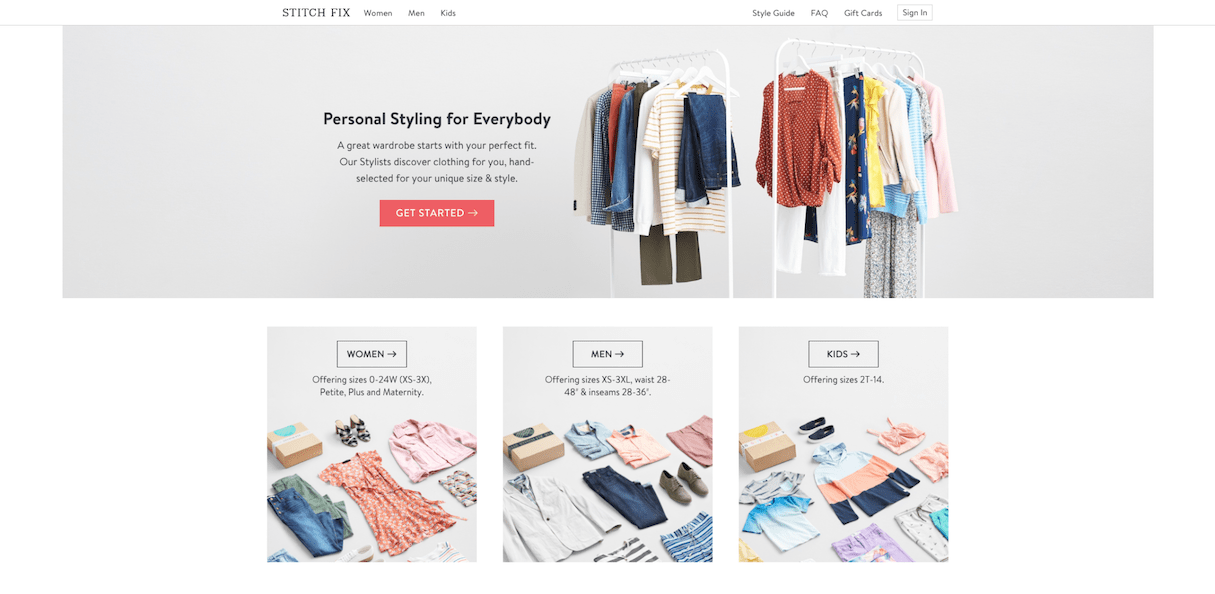
This can mean different things for different brands, depending on their vertical, target locale, target age-groups, etc. Warby Parker offers free shipping on five frames for its customers because they understand that their customers would want to try out a new pair of glasses before buying them online. Stitchfix onboards users by gathering a lot of information about them and their fashion preferences because it understands that fashion is a deeply personal thing. These are prime examples of user centered design.
User-centered design mandates the inclusion of the user in the design process to maximize the utility of the resulting solution for the user. In fact, the user is kept at the center of the process at all steps: developing an understanding of the use-case, understanding requirements, discussing design solutions and finally testing the solution against the requirements.
In this blog post, we will discuss what user centered design means for designers and developers of ecommerce stores, by going through implementations from leading brands across different verticals. By the end of this post, you will have the tools necessary to start defining a user centered design strategy for your clients’ businesses.
Understanding touchpoints in the user journey
According to McKinsey, consumers are interacting with brands across several different channels, more and more digital, with each point of interaction contributing to points of dropoff as well. The customer decision journey can be grouped into four phases:
- Consideration
- Evaluation
- Purchase
- Post-purchase
Digital touchpoints across these phases are growing each day. Think about the last time you made a purchase. You probably discovered the product on Facebook, clicked through and bounced. Maybe you read a blog next about the product, or looked up its reviews on Google. Finally, to make the purchase, you might have switched to your desktop.
To build successful flows for your client’s store, you need a deep understanding of how their customers make shopping decisions and what the points of friction are in their shopping journey. The best brands deep-dive into the unique shopping patterns for their vertical and build solutions that smooth out the creases in that experience.
Below, we look at examples from four different verticals to see how leading brands have built a cult following by closely understanding their users’ shopping journey and optimizing the brand's touchpoints to assist the user in their current phase—the crux of user centered design.
Sephora

Until Sephora came along, people were buying makeup in-store, mostly a mall, where a particular brand would sell them everything. There were probably better makeup options out there, but no one was sharing that information in a central, reliable place. Shoppers usually didn't have access to professional opinions, and that led to a forced allegiance to a particular brand—especially because every brand was saying that their competitor’s brand was bad. The message was clear: buy before you try.
This was the first space where Sephora made a difference. The salespeople at Sephora don't have an affiliation with any particular brand and don't work off commission, so they genuinely suggest the best products for each shopper. Additionally, shoppers can freely try products, take samples home, and mix-and-match products from different brands, creating their own looks.
From the lens of user centered design for a shopper in the consideration phase, this approach gave shoppers a lot of freedom to experiment with products, seek genuine advice, and find the products they really need. As Sephora's digital touchpoints, such as their mobile app and online site, gained traction, part of the consideration phase moved online. In response, Sephora brought the in-store experience online to help buyers seeking advice by starting the "Beauty Insider Community", something like a social network to share tips and resources.
Once customers had gone through the consideration phase, the next question they wanted answered was how the makeup would look on them. This typically involved an offline interaction with the brand. This is another area where Sephora removed friction. Shoppers usually shortlisted products by adding them to a wish list. When the shoppers moved to the evaluation phase and visited a store, the Sephora salesperson was equipped with a mobile app that displayed the shopper’s history and wishlist, so salespeople could help them try out the products they had already shortlisted.
For shoppers who didn’t want to or couldn’t get to a physical store, Sephora came up with a feature in their mobile app called Virtual Artist, where shoppers could apply makeup virtually. And once a purchase is made, Sephora onboards shoppers into a loyalty program. The loyalty program has tiers, with each tier having unique access to rewards and perks. This completes the shopper purchase journey and sets them on the course for their next purchase.
Restoration Hardware

While the retail industry collapsed around them, Restoration Hardware—which rebranded to RH—stayed true to its brand and customer base. RH had started as a source for old house restorers, but over time built itself up as a luxury homebrand.
RH focuses on the customer who appreciates good design and doesn't want to spend a fortune decorating their house. Their theory is that customers aren’t there to surf an online site; instead, they are looking to experience good design. To that end, RH has built what they call galleries.
Galleries are beautifully designed retail stores that aim to create an experience shoppers will keep coming back for. RH recognizes that shoppers don't buy furniture very often, but want to ensure that whenever they do, they are reminded of the wonderful meal they had at one of the RH galleries, or how inspired they felt in one of the RH rooms.
From a user centered design lens, RH is trying to get themselves into the initial consideration phase of shoppers by creating memorable experiences for them. They also have a loyalty program that unlocks early access to clearance sales, discounts, complimentary interior design services, and more. This results in a powerful retail only strategy in a world where everyone is going online, guided solely by the needs of the shopper.
Best Buy

Best Buy came back from the brink of dying along with retail counterparts such as Radio Shack by focusing on just one thing: user experience. Their example best illustrates the power that a deep understanding of customer expectations holds. As Amazon competed with them on pricing and their retail stores underperformed, Best Buy bounced back with an omnichannel customer-focused strategy that acknowledged the customer pain points and looked to address them.
Built off its Geek Squad support teams, Best Buy created a program called "Total Tech Support",which offered shoppers installation and unlimited lifetime support on any gadget for $199 USD. This was born out of an understanding that shoppers have 50 different gadgets at home, each of which have installation and maintenance problems.
Stitch Fix

I talked about Stitch Fix a little bit in the beginning of this post, but their work in user centered design is so impressive that it merits more attention. Stitch Fix is an online personal styling service that sends customers clothes depending on their unique tastes.
Stitch Fix's differentiation lies in personalization, in being able to send people clothes that they like and that fit them well. Both of these are hard problems to solve, and Stitch Fix only makes money when they get it right, since customers only pay for the clothes they actually keep. This makes having a deep understanding of the user Stitch Fix’s bread and butter.
They solve this problem with a combination of data and human touch. Other than the extensive questionnaire that each customer fills up at the time of onboarding, Stitch Fix also collects feedback data once a "Fix" is delivered. To get a better picture of what clothes customers like and don't like, Stitch Fix came up with Style Shuffle, a feature on their app that lets users rate a set of clothing images every day. This data enriches the algorithm that finds clothes a customer might like. Data on whether a dress fits or not helps Stitch Fix iterate on changes that the customers are asking for.
To add that final human touch, Stitch Fix hires stylists who have the power to override suggestions made by the algorithm and create special fixes for special requests made by customers. This boosts their brand loyalty and customer satisfaction.
You might also like: Frictionless Experience: How to Create Smooth User Flows.
How to make user centered design part of your strategy
User-centered design can be embraced by any organization, big or small. Its implications can range from small tweaks to the process to bringing completely new ideas to life.
Whatever stage your client is at, it's important to go through this analysis with them with complete honesty and commitment. If you discover a solution to a user problem that your client thinks is too hard to implement given their existing system, it's important to note that their competitors might not have that constraint. At that point, you should measure the potential upside they could get from implementing that solution, and proceed accordingly.
Let's go over four foundational principles of user centered design and discuss how they apply to ecommerce.
You might also like: Conducting User Interviews: How to do it Right.
1. Understand users and their flows
This exercise starts with creating user personas for your client’s customers. Businesses should know who they are selling to and what the characteristics of their ideal customers are. As you saw in the examples above, each of the brands had a deep understanding of their target user persona. This doesn't come easy. It's impossible to know upfront who your client’s offering will appeal to, especially given that there are so many diverse groups of people, with their own unique perspectives on the world. You have to start with an assumption and refine your definition as you go along. Check out Personas: Dead Yet? by Everett McKay for more details on how to build a user persona.
Next, you need a very clear picture on how users interact with your client’s brand today. How do they find it? Once they land on the site, how do they find what they are looking for? How do they manage products they are interested in? How and when do they add to cart?
This information is extremely hard to get in ecommerce especially, since we do not have the luxury of getting to see the user in action. The solution? Extensive data collection. Start looking at your client’s traffic channels, their Hotjar recordings, their Google Analytics insights. Again, understanding user flows takes time and a lot of experimentation. Use tools that allow you to create funnels and measure the dropoff and completion rates of those funnels. What you are looking for is the most accurate depiction of user flow for each of your target personas.
If your client has the means to invest in offline user interviews, focus on getting the right participants and asking them the right questions. Check out Rob Fitzpatrick's book The Mom Test to learn more about asking good questions during user interviews. It's absolutely brilliant.
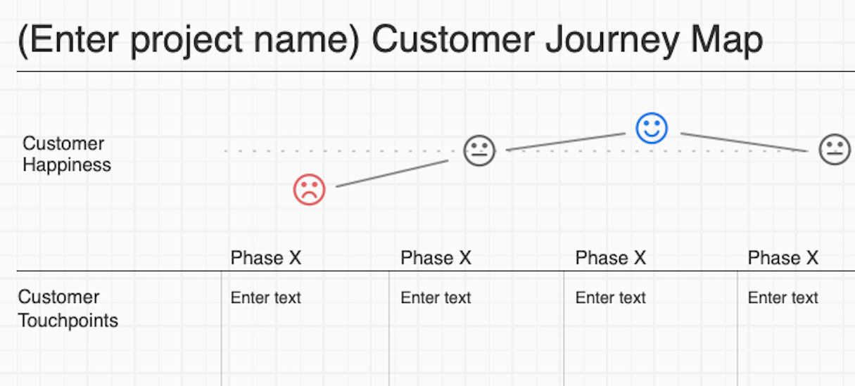
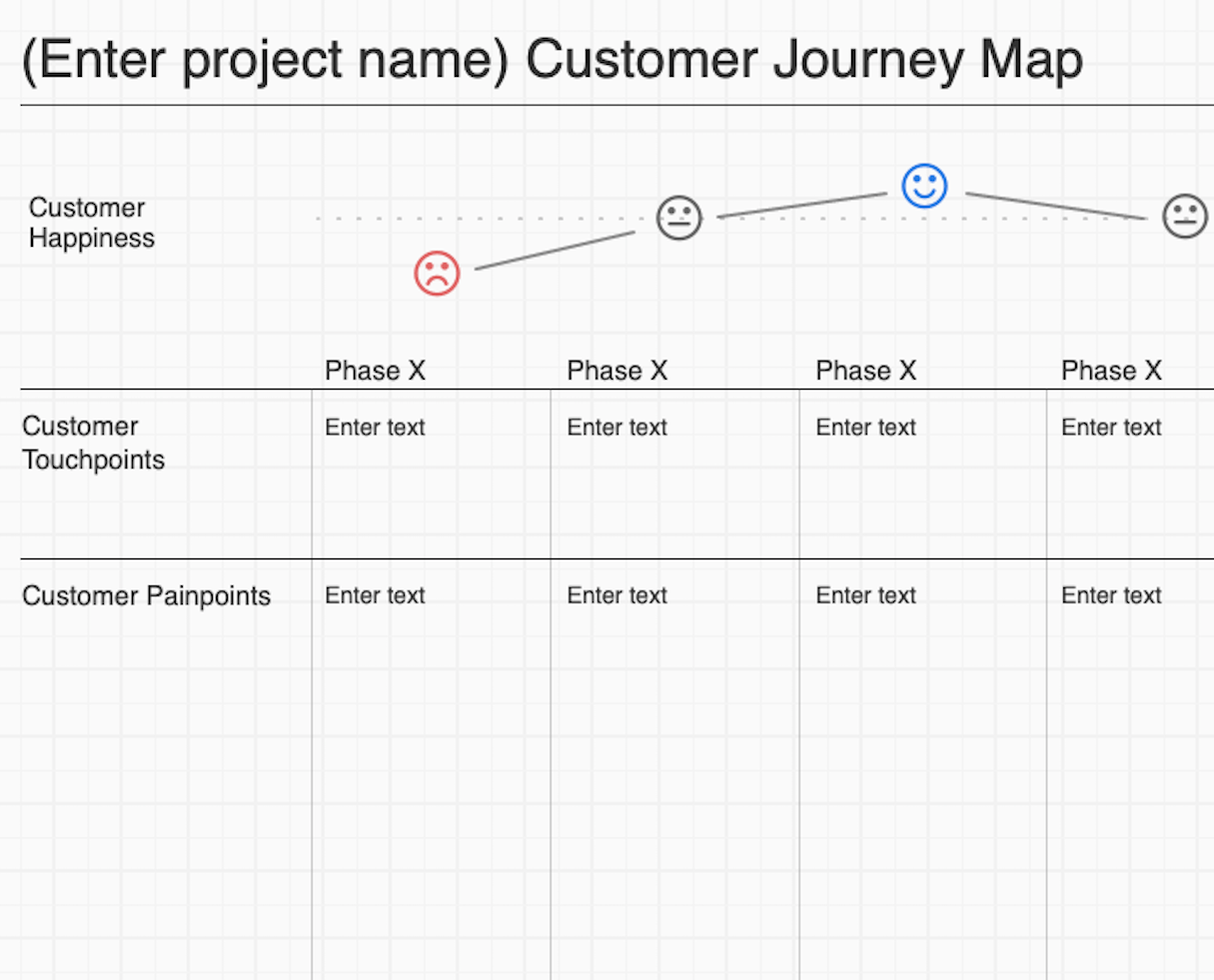
At the end of this exercise, you should have a pictorial representation of user flows for each of your personas. It might be something similar to the image below, taken from Balsamiq's UX Apprentice site.

2. Find points of friction and ask questions from first principles
Next, take a hard look at the flows you created above and ask yourself if there’s friction in this step. Why does it exist? Does it need to exist? Or is it because of your constraints that it exists?
What you're trying to do here is to completely step out of your current setup and step into the user's shoes. To the user, friction is friction and it doesn't matter what causes it. User interviews can help a lot in this phase. If you are asking the right questions, users will sooner or later point you to the things that most annoy them. Online, you can find pain points by observing your funnels and finding where you see the most drop off.
By the end of this exercise, you will have a list of possible problems your users are facing while interacting with the brand for each step in your user flow.

3. Run experiments and measure results
Now that you have a set of guesses for points of friction in your process, you should look for the fastest way to validate your guesses. Create experiments that let you cheaply test your hypotheses. Solutions that take too much time to implement or disrupt too much of your existing processes shouldn't be touched, since all we have at this point are guesses.
In UX, this step is executed by creating low fidelity interactive mockups that users can try out. If you can watch over the shoulder of your users as they interact with your new flow, you will be able to see if your solution is performing well. You will also discover potential issues with your solutions that you might not have considered.
Changes to existing flows should also consider what the impact of the change will be. If there's a way for you to measure the potential upside of fixing a user flow problem, you can rank your guesses by impact and run experiments on them in that order. In the world of website optimization, Google has a powerful saying: you can't optimize what you don't measure. I think it's quite relevant in this context as well.
4. Pay close attention to existing patterns
UX as a field is inspired heavily by user centered design. If you look at the top UX advice, it's never to be too novel. Something too novel or too "creative" is a new conceptual model that the user will need to understand. It's much easier to piggyback on models users are already familiar with.
The conceptual models that the users are already familiar with are called UX patterns. User-centered design is no exception to this rule. Creating flows that the users already understand is far easier to implement than completely new ones. For example, with just the word loyalty or reward points, users can grasp all the rules of the game, simply because they already understand it. As you think of solutions to smooth out friction points in your flows, keep in mind existing patterns in your vertical.
You might also like: 12 Ecommerce UI Patterns And Where To Find Them.
Consider user centered design across all touchpoints
In this blog post, we discussed what it would take for you to incorporate user centered design as a part of your strategy. But user-centered design has a technical cost as well. Brands use different technical solutions across different user touchpoints to smooth out friction in the user journey.
For example, Sephora uses Beacon technology to provide shoppers with an in-store mode in their app that allows them to scan products and read product reviews and ratings. This is on the retail side. On the online side, there are a plethora of technical solutions that cater to different problems in the user journey. Two new technologies that have caught attention recently are PWA and AMP. In the next blog post in this series, we will discuss what it takes technically to implement a user centered design strategy using these tools.
Read more
- How to Reply to Reviews in the Shopify App Store
- Human-Centered Design: An Introduction, Practices, and Principles
- Progressive Disclosure: Simplifying the Complexity
- What Makes or Breaks an Ecommerce Shopping Experience? This Survey has the Answers
- How to Use Eye Tracking in Usability Tests
- 5 Common Digital Content Problems and How to Avoid Them
- Content Strategy: The Principles we Followed to Build the New Shopify App CLI
- UX Designers: Are You Focusing Too Heavily on Creating a Beautiful UI?
- Dark Patterns: 12 Tricks You Should Never Use in Your Products
How have you considered user centered in your work with clients? Share your thoughts below.

