Announcing Online Store 2.0
Online Store 2.0 is an end-to-end overhaul of how themes are built at Shopify, launched June 2021. While the information in the following article is still correct, it doesn't account for Online Store 2.0 best practices, and may not include references to recent features or functionality. To learn more about how to build with Online Store 2.0, visit our updated documentation.
Visit docsAn often overlooked but thriving market for online retailers is the area of downloads and digital products. Digital products can be simply downloaded by buyers or accessed through an app, and this reduces the logistics burden on your clients since they don't need to source or ship physical goods. This style of online commerce is effective for both new brands starting off, or existing brands looking to add a new range of products to their catalog.
Many merchants may consider supplementing their current catalog of physical products with a range of related digital products, such as recipes, online classes, or videos that tie in with their brand. By optimizing your client’s storefront theme to facilitate selling digital products, you can open up a new revenue opportunity for them that doesn't rely on shipping or a supply chain, thereby setting them up for success.
It's important to be aware of how digital products can be positioned in your clients’ stores, and to be mindful of the differences between how potential buyers connect with physical and digital products. In this article we'll look at how visual patterns on product pages can communicate the value of your client's digital products. We'll also explore some theme customization techniques that can improve the user experience for clients who sell digital products, as well as looking at some examples of stores selling digitally.
Thinking about digital product UX
The way that buyers purchase and consume digital products is different from physical products, so the approach you take when designing and customizing your client's store should reflect these distinctions. Very often, specific elements like product imagery and descriptions will play a different role.
Take online learning as an example. Chances are, if you're a developer, you've likely purchased and attended an online class on programming or design at some point. Online courses are revolutionizing the way people learn, and creating an opportunity for any of your clients who have an area of expertise or knowledge they can share.
As well as evolving the way people learn, online learning also presents the challenge to reevaluate how online stores are designed. In order to provide the best experience for prospective students, you may want to adopt a different approach for communicating the value of the course than you would with a physical product.
Committing to a class is generally not an impulse decision, so you'll want to provide your client with the option of displaying a detailed course description, class schedule, and even a sample video. Features such as a frequently asked question (FAQ) section may need to be integrated to help your client address common questions about the course. They may also want to create a forum where students can start discussions on the class topic.
With any digital product, there will be nuances for how to surface download instructions, additional information, and requirements for use—these will determine how you design your client's store. Thankfully, there are theme customizations you can adopt that will assist with the layout of text and different content types on product pages, which we'll look at later in this article.
"With any digital product, there will be nuances for how to surface download instructions, additional information, and requirements for use—these will determine how you design your client's store."
Here are some questions you might want to ask yourself when optimizing a store for a client selling digital products:
- What information is important when potential buyers are evaluating the product?
- How will your client be populating their store with content?
- Will content hosted on third-party sites be embedded on the store?
- How can product demos be surfaced?
- How will buyers access and consume your client's products?
- What post-purchase support might your client's buyers require?
- Are there available apps that can improve the purchasing experience?
Once you have the answers to these questions, you can start designing the purchasing flow and expanding the product pages to include any additional features, such as video, description tabs, embedded demos, and more. For the actual exchange of the digital product, or to allow access to an online course, you will undoubtedly need an app. We'll look at options for this later in this article.
A great example of how to provide comprehensive information for online courses is from the musician Nina Strauss, whose Rock Guitar Fundamentals is an online teaching program that brings budding guitarists from ground zero to guitar hero.

This home page contains details on the different modules contained in the course, as well as a video introduction that gives buyers a sneak peek. What is also very helpful here is the FAQ accordion that provides expanded answers without cluttering the page.
Another inspirational example of solving for a complex layout of different text elements is from A Book Apart, which offers ebooks alongside physical books.
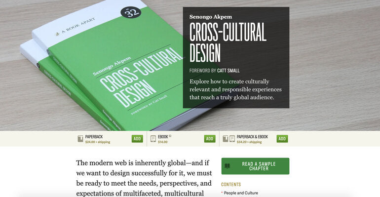
As would be expected from the design-focused publisher, the product page is easily navigable, with a neat formation of contents, author biography, suggested bundles, and product-specific metadata. There's also an email sign-up option where a potential buyer can receive a sample chapter of the ebook.
What is especially helpful from a digital product point-of-view is a tooltip element that provides extra details on the ebook, informing that the file format supports "Kindle, iBooks, Nook, and most other readers and devices." Small details like these make a big difference, and means that relevant information can be arranged on the product page to be displayed when needed.
It's possible that you’ll need to integrate additional content from a third-party site, especially if your clients are working with audio, as we see on this example from The Loop Loft.
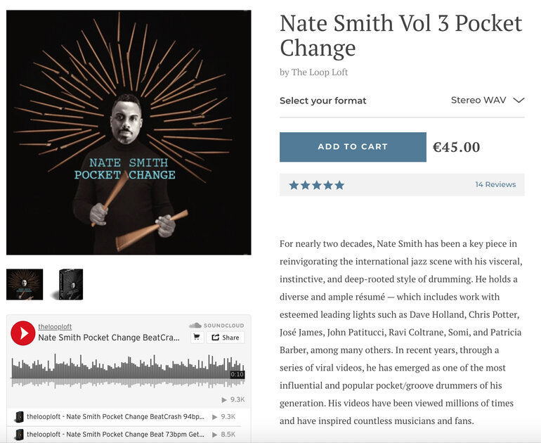
In this case, the product page contains music samples that are hosted on SoundCloud and embedded below the product images, making great use of the available space. Depending on where your client hosts their audio or video, you may be able to embed content from Bandcamp, YouTube, and many other platforms.
Some digital products may require specific instructions for use, a consideration that's especially important to keep in mind if your client is selling software. Mastering The Mix approaches the challenge of surfacing info on product pages with a sticky menu that helps potential software buyers navigate to different sections.
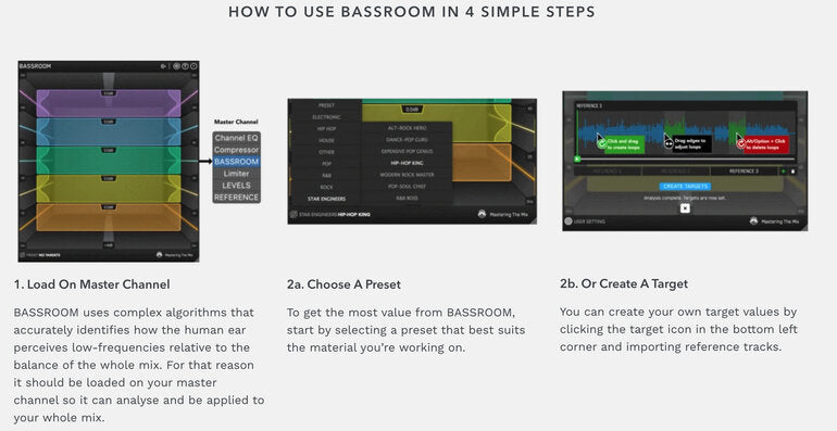
The "How it works" section gives a great walkthrough of how buyers can set up the software, complete with screenshots illustrating tips and tricks. The "Specs" section is also crucial for buyers to identify if they can use this software. Making a demo available is helpful to ensure customers can experience the software in an authentic way that can't be easily communicated through text and video alone.
As you can see from the examples above, there's no one-size-fits-all solution for designing pages for downloadable purchases. The best approach is to explore all the unique requirements of your client, and approach the design process with these in mind.
In the next section, let's look at some common storefront techniques that you can use when optimizing your client's product pages for digital goods.
You might also like: The Essential List of Resources for Shopify App Development.
Optimizing your client’s digital product pages
Both imagery and text often play a different role for digital products compared to physical ones. If the object is not physical, it may be challenging to include suitable images, meaning that greater priority is given to text or embeddable content like audio clips. For this reason, it's worth considering reducing the size of your client’s images on product pages, and adjusting where images are positioned in relation to other elements on the page.
"Both imagery and text often play a different role for digital products compared to physical ones."
If your client is selling both physical and digital products, you may want to also consider creating an alternative template for the downloadable products, which has a layout tailored to those products. We've previously looked at how to use alternative template files on this blog, and I'd recommend revisiting this tutorial if you haven't already.
Most platforms where created content is hosted (like SoundCloud, YouTube, and even Google Slides) will have an option for generating an embed code that you can paste into your client's theme. What will be helpful for your clients is that these embed codes can generally be pasted into the product description through the Shopify admin to appear on the product page.
If your client is selling downloadable content with a visual aspect, you can update their theme to make use of the new product media types. It's possible to render 3D images to give buyers a preview of specific products, like files for 3D printers or templates for model building, for example.
With only so much available space on a product page, it may be necessary to get creative when thinking about where supplementary text, like instructions or download information, should be displayed. This is where product tabs can come in handy.
Creating tabs for your client’s product descriptions
One common technique for including different types of text for your clients is to expand the product description with tabs. This will allow your client to separate out different content, or metadata, that buyers can find by clicking on the tab.
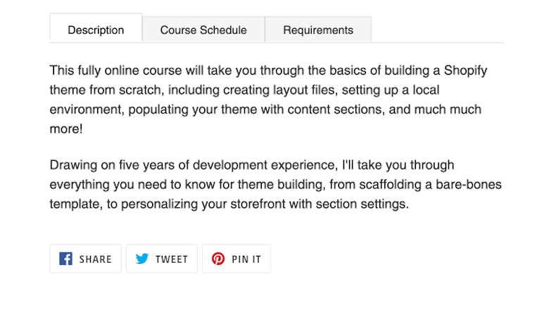
The first step in implementing this theme customization is to locate where the {{ product.description }} Liquid object is on your client’s theme. It will likely be in either the product-template.liquid file in the /sections directory, or the product.liquid file in the /templates folder.
Once you've located the product.description Liquid object, you'll need to replace this with the following code:
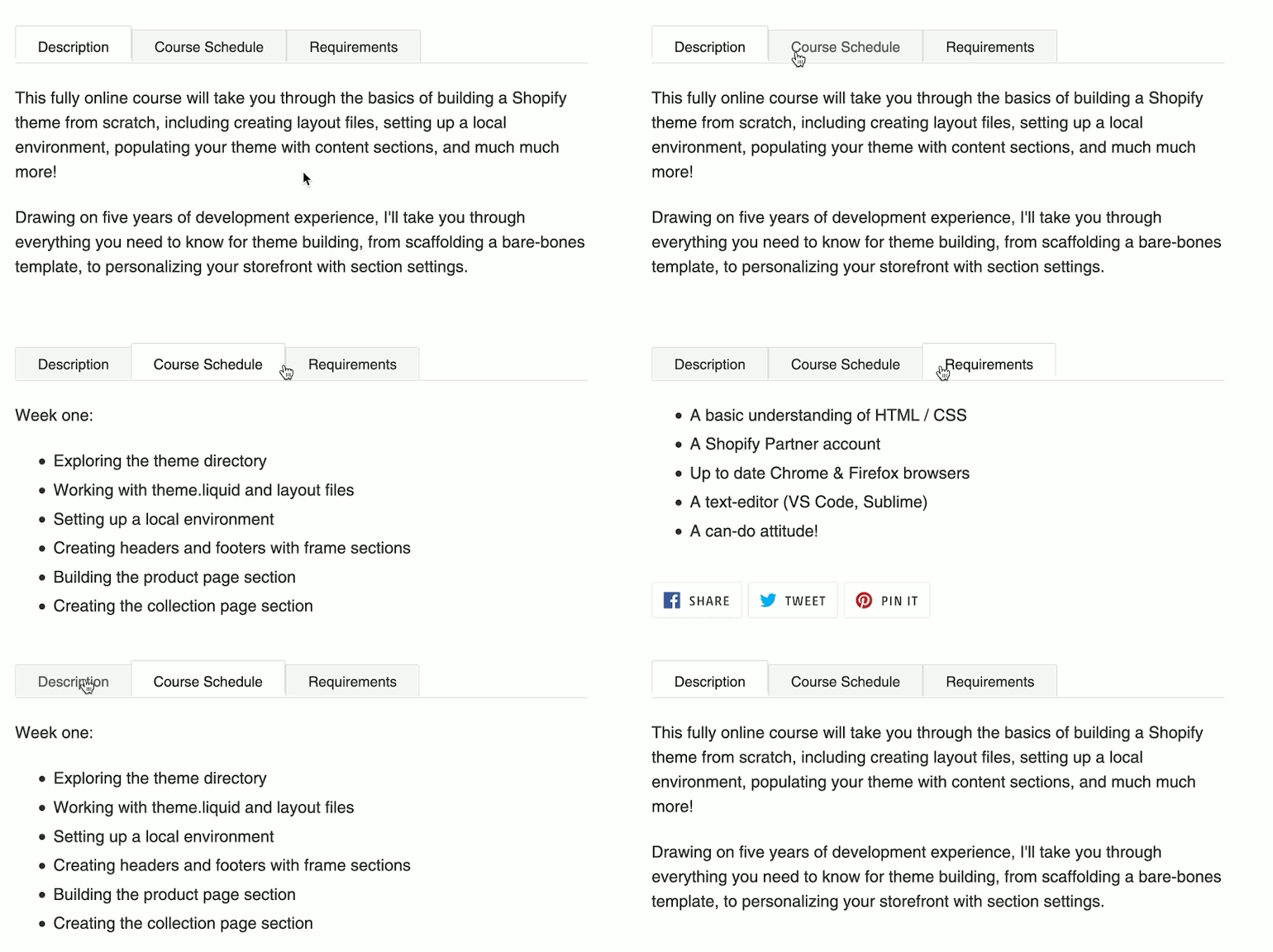
What we're setting up here is a set of links and containers that will pull in content from pages that we can create from the Shopify admin. The first tab will output the main product description, while each of the pages.name.content Liquid objects will output the content of the corresponding page.
Depending on your client’s requirements and the type of digital product you are building for, the names of the tabs can be adjusted. In this case, I'm creating tabs for an online course, and will be setting up tabs for the course schedule and requirements.
Next, we'll need to add some JavaScript to the bottom of your theme.js file, located in the /assets directory:
This enables the content from different pages to load on the screen when the product tabs are clicked.
While the links are functional now, we'll need to add styling to polish off the tabs. Here is some sample CSS that you can add at the bottom of your theme's stylesheet, likely the theme.css.liquid file in the /assets directory:
Finally, you can create pages on the admin that match the page handles in the markup, and the content for these will be displayed on my product tabs:
You might also like: 30 Developer Resources to Diversify Your Skill Set.
Expanding digital product options with apps
Given the purchase flow for downloadable products, your client will very likely need to make use of some apps, whether to facilitate the download of their products or to create a space where buyers can access their online courses and content.
Shopify's own Digital Downloads app is a great starting point if your client is looking for a basic way to connect buyers with digital products. However, if your client is looking for an app with more functionality such as multiple file downloads, apps such as FetchApp and SendOwl are well worth considering for their advanced features. Options such as allowing videos to be streamed rather than downloaded, and integrations with Dropbox or Vimeo could improve the buyer experience on your client's store.
As we noted earlier, sourcing and displaying product imagery could be challenging when your client's products cannot be easily photographed. To counter this, and add an element of storytelling to your client's brand, you could consider integrating galleries where you can display images of buyers using the product. Gallery apps such as Gallery By EA and Section Feed not only bring some charm to the page, but also add social proof to your client’s products.
An emerging collection of apps are looking to assist merchants who are adopting digital products or services, such as online learning and audio downloads. Instead of building an integration from scratch, it could be very helpful to test out apps like Courses which can turn your client's online store into a learning management system.
Whether you need to create a members-only area to gate digital content, or an advanced email system for following up with buyers, the app store is highly worth exploring for inspiration when optimizing your client's store for digital products. Many of the apps linked above are also partner-friendly apps, meaning that they're free to use while on a development store, so you can test without committing to a subscription.
Digital is the future!
There's no doubt that digital products will become more popular as options for online courses and services expand. Whether your client is a digital-only brand, or supplementing their catalog with some downloadable products, there are many different approaches to connect them with their buyers. Hopefully with the help of this article, navigating this space and optimizing your client's store for digital products will be a little bit easier.
Read more
- An Overview of Liquid: Shopify's Templating Language
- Deprecating Sass for Shopify Themes
- How Safe As Milk Grew a Successful Theme Partner Business
- How to Combat Image Cropping on Shopify Slideshow Sections
- How to Get the Most out of the Timber Theme Framework
- How to Create a Customizable Logo Bar Section
- Tips for an Efficient Shopify Theme Review Process
- 8 Development Tips for Building Better Custom Shopify Sites
- How to Work With Shopify Theme Blocks
Have you worked on stores that sell digital products? Let us know in the comments below!

