When you think of customer service, you probably have the traditional customer-service model in your head: going into a physical brick-and-mortar store, going to the customer-service help desk, and then returning something or asking for the manager. However, in the 21st century, customer service is more vital than ever because so much shopping happens digitally and without anyone manning the shop, so to speak.
Your client’s ecommerce operation lives and dies by how well-organized their online customer service is. If they have awesome customer service—responsive, timely, easy-to-find, etc.—then their businesses are more likely to flourish as customers will sing their praise to others. If their customer service is hobbled by bad design or, worse still, non-existent, then their customers will start leaving in droves.
That’s why, in our digital age, there’s great urgency to design a site with customer service front and center. Designers who include customer-service elements in their designs are giving clients an advantage, and making themselves more hirable.
Here’s how designers can include customer service elements in their work.
1. Live chat provides real-time customer support
On some ecommerce stores, you may have noticed a small window usually on the bottom corner of your screen, promising that a live agent will talk to you if you have any questions or concerns.
Meet live chat.
This online customer-service solution allows agents working for the ecommerce store to use an app or browser, to directly get in touch with customers navigating the site, in real-time. As a result, customers have instant gratification if they have a problem on the site, a question, some feedback, or any other issue that the store should address.
The beauty of live chat is that due to its effectiveness and ensuing popularity, it’s already integrated with Shopify making installation on your client’s site a breeze.
There are many Shopify apps that enable Live Chat for ecommerce store owners. Here is the full list, but a few notable mentions include:
According to American Express, referenced by Help Scout, 78 per cent of customers have abandoned a transaction or refused to go through with an intended purchase simply because of a bad service experience. This stat is abominable because it represents so many lost conversions, and consequently, sales that could have been salvaged if only the website builder had spent more time focusing on designing for the customer experience!

An example of a successful ecommerce store using live chat is Auto Accessories Garage. When you land on the homepage, it’s hard to miss the sticky live chat tab that follows you down the page when you scroll. Further, it’s been designed in such a way to be noticeable, in case customers need it, but not so obtrusive that it obscures content or gets in the way of the user experience.
Live chat isn’t the only customer-service element that you can include in your client’s sites, of course.
2. On-site self-help resources empower customers to solve their own problems
The benefit of live chat is that your client’s customers can get help right away, which beats sending an email or calling up a customer-service rep on the phone (only during business hours!).
What if there was an even faster way for online shoppers to find the help that they’re looking for when they have a question, problem, or just want to learn more about a site’s products or services?
There’s the option of designing a part, or a dedicated page, of your client’s site, devoted exclusively to self-help materials customers can access and pore over until they find answers. A so-called knowledge base of information—everything from frequently asked questions, to how to use a certain product or service properly—is exactly what many online customers today want.
According to Zendesk, a stunning 91 per cent of respondents want sites to have a knowledge base for self-help information, if it’s done correctly, of course.
That begs the question, how should you design your online knowledge base so that it gives your customers the quick support they want?
Let’s take a look at a company that’s mastered creating an on-site self-help resource for their customers.
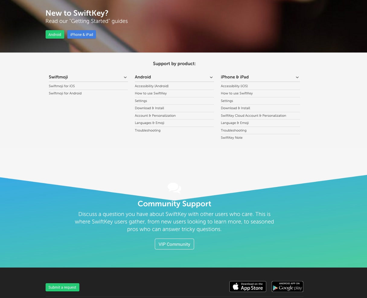
SwiftKey is a maker of iOS and Android apps that serve as an input method to help users type faster and with fewer typos, especially when using emojis and special characters. Its support page offers a thorough guide on using its apps; self-help materials on how to use different aspects of its apps; a user-driven, community-support section for answers to questions; and a request-ticket call to action button. In short, customers have a lot of resources on the site if they get stuck while using SwiftKey’s apps.

Note also how the support page’s information architecture has been intelligently designed to take user flows into consideration:
- First, there’s a general guide to get people familiar with its products.
- Second, there are self-help materials to get customers around problems if they arise.
- Third, there’s community support for real-time answers.
- Finally, if all else fails, they can get in touch with someone at SwiftKey directly.
3. Social customer service addresses concerns where customers are
Social media is a huge part of people’s lives today, and the smartest online stores are harnessing its powers to design yet another layer of awesome customer service on their sites. Welcome to social customer service!
Your client’s customers want to get service the way they expect it, which is on social media. With how much time people today spend on social networks, it only stands to reason that this is an excellent place to reach them for awesome customer service. Think of social customer service as a logical outgrowth from your client’s online store.
A Social Media Examiner article talks about how:
- 35 per cent of customers surveyed by Parature (a Microsoft company) have asked brands customer-service questions via social media.
- 51 per cent of those customers revealed that brands who responded via social media increased their favorable view of the brand.
- 42 per cent of customers surveyed by Edison Research said they expected brands to respond in less than an hour on social media.
Clearly, your client’s online store should be capitalizing on social, in order to provide stellar customer service.

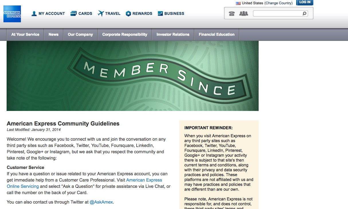
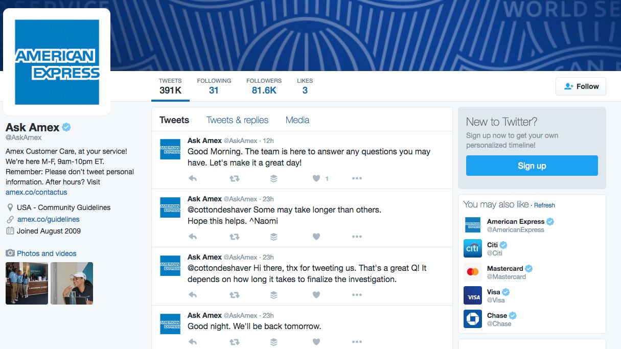
A great example of incorporating social customer service into web page design comes from American Express. On its Community Guidelines page, the second paragraph provides customer-service resources, and it also offers a link right to American Express’ Ask Amex Twitter account. By including customer service’s Twitter handle on its site, this brand is ensuring that its customers can get help where they feel most comfortable.

4. Contact info gives peace of mind to shoppers
Something as basic as having your client’s contact info easily visible on their online store can go a long way toward marvelous customer service. Think about it; having a phone number prominently displayed on a site gives an additional level of reassurance to customers that there are actual people to talk to in case of problems. Such credibility goes a long way on the web.
Having your client’s email address visible is also extremely helpful as it is another way that customers can get in touch with them if there are problems. Anything that clearly lets customers get direct access to your client’s support team is a boon for their customer service.
From a psychological standpoint, this is a lot of peace of mind, as some stores on the web are illegitimate. Phone numbers and email addresses that pop out on the page due to easy readability, are basic trust signals that your store should never be without.
Read more
- How to Direct, Control, and Hold Focus Through Design
- 14 Image Tools for Web Developers in 2017
- Top Ecommerce Resources for October
- Designing for Conversion: A New Course Series to Level up Your Skills
- 3 Digital Marketing Strategies for High-Priced Inventory
- Top Ecommerce Resources for August
- Top 5 Features to Include When Building a Successful Fitness Site
- Why Fonts Matter: How Fonts Help You Build a Better Shopping Experience

Printful, a Shopify app by the company of the same name, designs its pages in such a way that its phone number is always prominently displayed in the header. Note how, no matter what page you visit, the phone number is always visible at the top-left of the page, which is also in line with common reading patterns, based on eye-tracking studies. Its phone number is also featured near the bottom of some pages.
Something as simple and easy to include as contact information means a lot to prospective customers.
The customer should be number one
You’ve heard slogans like “the customer is king” and “the customer is number one” from many businesses, but not all practice these simple principles. If you want to design an online store that’s successful, has a low bounce rate, and a great conversion rate, then you’ll design with these customer-service touches in mind.
The Internet can sometimes be a scary and uncertain place; scams are still common, and your client’s customers may not be the most web-savvy or experienced users out there. The best way to put a customer’s mind at ease is by drastically raising your client’s credibility. When customers feel at ease in a store, they’ll convert at higher rates, too.
To recap, designing for the customer-service experience first includes:
- Live Chat
- On-Site Self-Help Resources Like Knowledge Bases
- Social Customer Service on Twitter and/or Facebook
- Contact Info (both a phone number and email address) prominently displayed on all pages

