One of the worst situations to be in is to have an amazing product—but no one understands what it does. That’s why it’s critical you learn how to brand your Shopify app—so merchants understand exactly what it’s all about, and why they should install it. Your app brand is an important aspect of your marketing plan, but strong app branding can be more easily said than done.
In the complex world of apps and software, often the best way to learn is to experience a product first-hand. But how can you get merchants to try your app if they don’t understand how it will impact their business? Even if they have some inkling of what your app offers, and it’s the best fit for them, merchants are likely looking at other app options because those apps are marketing their products better. Since perception is reality, even if you have the best app out there, if merchants perceive another app as being better, it’s likely they’ll install theirs instead of yours.
How can you get merchants to try your app if they don’t understand how it will impact their business?
So how can merchants come to understand, and ultimately choose, your app? The fastest and most effective way to win over merchants browsing the Shopify App Store is through clear and differentiated branding that resonates with them.
In fact, when researching the impact of brands, studies found that 82 percent of people searching for a product choose a familiar brand.
Even if you’re not a marketer or branding expert by trade, this article will set you on the path to creating a brand and having a brand launch that can win both a merchant’s heart—and an install spot on their store.
Register now for the Shopify App Challenge 2021
Build something extraordinary. Reimagine commerce.
Join our app challenge and build in public with us! Solve interesting problems through creativity and innovation and help merchants win BFCM.
Register NowPre-branding exercises
While you may be tempted to jump straight to designing logos and brainstorming app names, there’s important pre-work to be done. To help get you primed for crafting a solid brand identity for your app, you must first do a deep analysis of your merchants and competitors.
Create profiles for your target users
The best way to make sure that merchants understand your app is to look at your product from their perspective.
"The best way to make sure that merchants understand your app is to look at your product from their perspective."
With the number of products and types of merchants becoming more diverse, it’s important to understand these four areas:
1. Which geographies are your merchants located in?
- Are there any symbols or colors that are perceived negatively in that culture?
- What dialects and tones are common in these markets?
- When making app demos, what items are common in that region? Are there any taboo items or products that should be avoided?
2. What types of products are they selling?
- Is there one industry your app works best for? Will you need to make sure the naming and visuals resonate with merchants in that field?
- What are the common standards for this product category?
- Do the types of products they’re selling involve specific logistical issues?
3. How technically proficient are your merchants?
- Do they understand the technology behind your app?
- Do you need to state the app’s functions in simpler terms?
4. What are these merchants’ styles in managing their stores?
- Are they time-poor and need quick solutions and quick explanations?
- Are they working full-time on their store, but working alone, and appreciate a bit more banter and humor?
Once you understand your merchants, you can better choose brand elements that suit them and their desires. However, you’re likely not the only app they’re considering. To help ensure your app stands out among the others, it’s important to determine competitor apps, and how they’re perceived.
You might also like: How to Design a Great App Icon: What You Need to Know.
Create a perceptual map of your app and its competitive set
To determine how merchants will view your app in comparison to your competitors, you’ll want to create a perceptual map.
In perceptual mapping, you’ll once again put yourself in the merchant’s shoes to consider how they evaluate or perceive apps, based on a spectrum of two product qualities. Two common perceptual mapping axes are “low cost to high cost” and “low quality to high quality.” You can consider almost any feature that’s important to your app, such as support provided, ease of use, and app function customization.
After determining which axes make sense for your app and its users, you’ll place all competing or comparable apps on the map. From there, you’ll visually map out how your app is similar, or different, in perception.
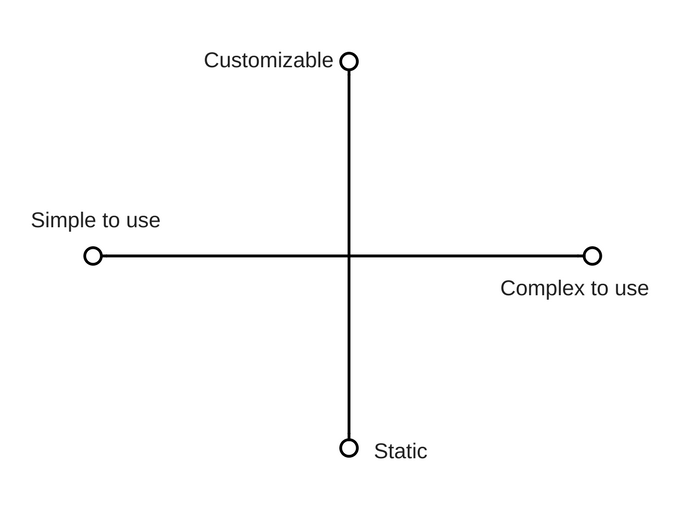
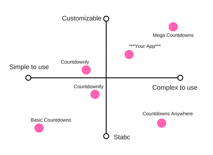
Let’s say you have a “countdown to sale timer” app. You could look at the degree to which merchants are able to customize the functionality of countdown to sale apps. Your app may also be more complex to use than other such apps, so it’s important to recognize this position and therefore write an optimized app listing that appeals to more technically-savvy merchants.
Here’s an example of what a blank version of this chart may look like, as well as a filled-in chart with a hypothetical countdown to sale timer apps.


You might also like: 7 Insights From the Shopify App Review Team to Set Your App Up for Success.
Brand creation
Now that you understand what kinds of merchants you want to appeal to, and how comparable apps are perceived, you’re ready to put pen to paper (or cursor to screen) and start creating a brand identity for your app.
Naming your app
When it comes to recognition and staying top of mind, a simple, clear, and memorable name is key. Merchants need to remember your app name when they search for it on the app store, as well as when they’re on a merchant message board responding to someone looking for app recommendations.
"When it comes to recognition and staying top of mind, a simple, clear, and memorable name is key."
Things you should avoid when coming up with an app name
- Trendy names. Trends fade, and you want your app to last.
- Unusual spellings. Not only are unusual spellings harder to remember, they’re also more susceptible to autocorrect, thus limiting discoverability by merchants.
- Lengthiness. Even if you’re trying to be descriptive, creating a long name can hurt a merchant’s ability to remember what it’s called. And, given that most of the top brands in the world have very short names (eg. Apple, Nike, Starbucks) there’s an association with succinct brand names and quality.
Things to do when coming up with an app name
- Choose words with easy spellings and pronunciations. This will help merchants with recall and search.
- Make sure the wording works across different dialects. Since some words and phrases can have different meanings in different regions, you should consult with an idiom dictionary.
- Check search engines. Ensure that there isn’t a similar app on a different platform.
- Check domains. As your app business grows, you may want a landing page associated with your app. You can use a free tool to check what domains are available.
Now that merchants can read, remember, and search for your name, how will they experience it visually? The next step is to establish brand colors, stylings, and visuals that will represent your app.
You might also like: Expert Advice for Branding Your Shopify App.
Choosing brand colors and imagery
Human beings are often visual learners, meaning that aesthetics can play a big role in decision making. In fact, studies show that people make snap judgments on products based on their colors, up to 90 percent of the time.
"Studies show that people make snap judgments on products based on their colors, up to 90 percent of the time."
Things you should avoid when creating a visual identity for your app
- Using too many colors. It’s best to stick to two brand colors, three max.
- Using trendy visuals. Much like choosing the app name, you want an image or app icon that will stand the test of time.
- Using intricate or complex images. Not only are these hard to distinguish, they’ll likely not render well on different devices and screen resolutions.
Things to do when creating a visual identity for your app
- Make sure colors are complementary. Use free tools to make sure you have the best pairings.
- Check that your visuals look good on all devices. With over 50 percent of Shopify merchants using mobile devices to manage their stores, you’ll want to test your app listing’s appearance on different devices.
- Consult expert principles. It’s okay if you’re not a designer by trade. You can still tap into the knowledge of great designers through resources such as the Polaris Style Guide.
- Don’t be afraid to invest in logo design. Your app icon is an integral part of how you communicate your app's value. Even if your funds are limited, you can still commission great designs through networks such as 99Designs, Fiverr, and Upwork.
Now that you have an app name, brand colors, and an idea of your brand’s visual identity, you can start packaging it all together into an app and app listing page that’s distinguishable to merchants.
You might also like: How to Choose the Right Pricing Model for Your App.
Successful apps with great branding
Still foggy on what good app branding looks like for Shopify apps? Below are three examples of successful Shopify apps that have achieved clear and impactful branding.
1. ShopPad

What makes their app branding impactful:
- Consistently uses the same app banner layout and fonts
- App names are short and easy to remember
- Clear and simple icons are used
2. Space Squirrel

What makes their app branding impactful:
- Clear visual identity: scattered patterns created with bright colors
- Fun and edgy aesthetic that’s uncommon on the app store
- Playful use of fonts
3. Hulk Apps

What makes their app branding impactful:
- Clear and legible app badge that
- Consistent border and visual style used in all their key benefit images
- Short and descriptive app names
A final, crucial step: check in with the crowd!
Ask friends, family members, and merchants themselves what they think about your app. Since you’re so close to the product, the nuances of the branding may make sense to you, but not someone looking at it with fresh eyes.
The Shopify Partners Facebook group, Shopify App Developers Facebook group, and Slack are great places to connect with both merchants and partners, where you can ask for feedback on your app.
Staying true to your positioning
If you’ve followed all the above steps, chances are you’ve ended up with a clear and captivating brand for your app. However, just as successful apps require support, testing, and occasional updates, your brand may require a bit of upkeep as well.
As new devices come out, you may want to test that your branding still renders well. As your app expands to new markets, you may want to make sure that your imagery is familiar to these merchants. If you decide to make a major change to your app, you may also have to update the branding to make sure everything still aligns.
Brands can always update and change a little bit as your app business expands and evolves, but if you want to win merchant attention early on, spending time on developing good branding is an investment that will continue to pay off as your app business grows.
Read more
- How to Get Reviews for Your Shopify Apps
- How to be Successful on the New Shopify App Store
- The Importance of Data Analytics and Collection
- Introducing New Tools for App Billing Management in Your Partner Dashboard
- Announcing the Winners of the Shopify App Challenge: Commerce and COVID-19
- The Top Trends in the Shopify App Store in 2020 (And What You Can Learn From Them)
- Build for the 20 Percent: How Cleverific Evolved to Meet Merchant Needs
- How to Make Your Embedded Apps Load Quickly and Reliably
- 4 Must-Read Shopify Docs to Maximize your Success on the Shopify App Store
- Announcing the Shopify App Challenge 2021

