Back in March we asked you, web designers of the Shopi-sphere, to submit your best ecommerce builds — and boy did you deliver.
It was a fierce competition, an all out battle that tested our ecommerce design community on their ability to delicately balance beauty and function.
We poured over thousands of applications from around the globe, but in the end, only four could be crowned the 2016 Shopify Ecommerce Design Awards winners.
Best Homepage, Best Mobile UX, Best Product Page, and Best Overall Ecommerce Design… yeah, it was a tall order.
This year, the talented designers who rose to take top honors not only get the glory, but will also receive the opportunity of a lifetime with exclusive mentorship in New York City from some of the design world’s leading thinkers and doers.
 Without further ado, we are proud to announce this year’s Ecommerce Design Awards winners!
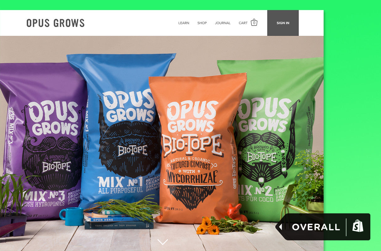
Best Overall Design — Opus Grows by Herman Scheer
Designer: Herman Scheer & Drawn
Store: Opus Grows
Location: California, USA
“The design of the Opus Grows website was so clear and beautiful, it made shopping for soil fun. The information about the product was presented in a way that was discoverable and approachable.”
-Lea Hickman, VP of Product Management at Invision
The design of the Opus Grows website was so clear and beautiful, it made shopping for soil fun.
Most people don’t think to order premium organic soil online — that was challenge number one for Herman-Scheer’s web design team.
“That process involves touch, smell, and really learning about the products. We knew we needed to create an experience that was equivalent in education and understanding,” says Herman Scheer co-founder, Chapin Herman.
The vision for OpusGrows was to create a virtual extension of the product and brand, and to make users subtly aware of what the merchant truly stands for.
“We aimed to acknowledge and encourage the satisfaction that’s experienced when someone grows something with their own bare hands,” Herman explains.
In addition to the design and development, Herman-Scheer’s team also shot all of the website’s photos and videos. And while Herman says all aspects of the site are pride-worthy, the stunning video backgrounds at the bottom of each product page hold a special place for the team, and represent the possible outcome of using the organic soil.
“It felt like the best way to wrap up the narrative of the products, with beautiful footage of the grown goods themselves.”
You might also like: Why You Should Specialize in Ecommerce
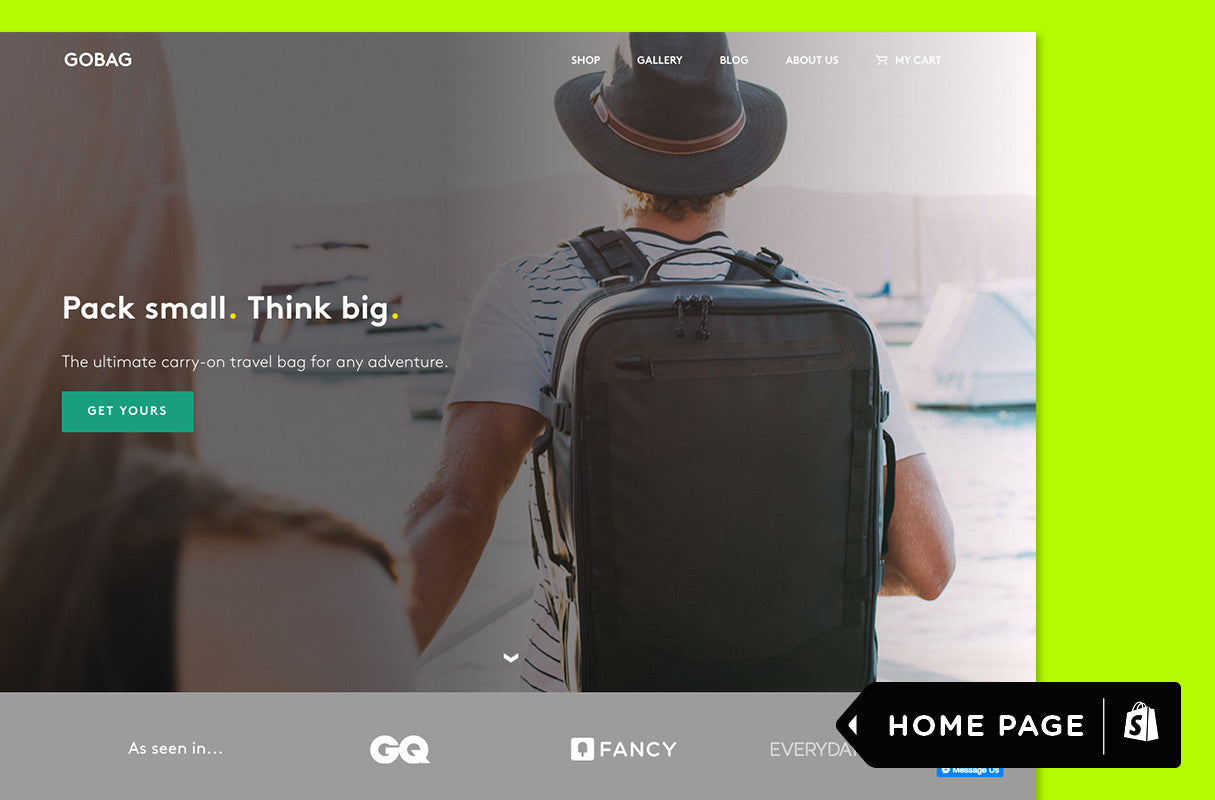
Best Homepage — GOBAG by Series Eight
Designer: Series Eight
Store: GOBAG
Location: London, UK
"A great homepage should draw you in and make you hungry for more. GOBAG's beautiful illustrations, subtle transitions, detailed photography, and informative product content did just that. The homepage is a clear reflection of the care and passion that went into the bag itself, which left me not only falling in love with the product, but also with the brand."
-Verne Ho, Director of Design at Shopify
The homepage is a clear reflection of the care and passion that went into the bag itself, which left me not only falling in love with the product, but also with the brand.
From the beginning, designers Francesca Yacoumis and Mario Vassiliades of Series Eight sought to communicate exactly what the GOBAG product is, from the moment users first land and scroll on the website.
“The main challenge was to create a digital experience that matched the product,” Vassiliades adds.
A cabin-sized adventure bag, the essence of the GOBAG is that you don’t have to compromise on adventure when you’re compromising on space. It’s a functional bag, with lots of technical aspects to it.
“We needed to instantly communicate all of this by somehow igniting wanderlust in the user — before taking them through a visually stimulating presentation of the bag, and how they can use it,” Vassiliades adds. “Whilst doing so, it was important to inject the notion of adventure and the outdoors into a finished digital product and avoiding a static site.”
The team accomplished this by using product photography, adventure stills, and hand drawn illustrations to create texture in the visuals, and depth to the overall online experience.
You might also like: 10 Beautiful Ecommerce Website Color Schemes
Best Product Page — LilGadgets by DBNY
Designer: DBNY
Store: LilGadgets
Location: NYC, USA
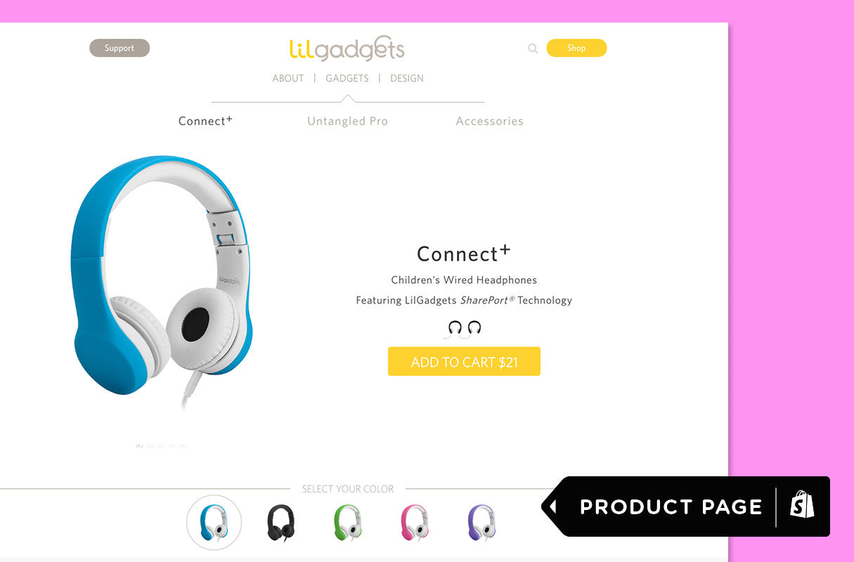
"The UX for LilGadgets' product pages is a delight, both on the desktop and on mobile, and reflects the brand perfectly. A clean, fresh design with beautiful illustrations and subtle interactions that's very easy to use, and crucially gets straight to the most important product info."
-Oliver Lindberg, Editor at net magazine
The UX for LilGadgets' product pages is a delight, both on the desktop and on mobile, and reflects the brand perfectly.
For DBNY, good design shouldn’t require an explanation; it should just work.
“Our design philosophy is rooted wholly around customer intentions and usability. We value the nuance of details and embrace the elegance of simplicity,” explains DBNY’s Amlan Das.
That ethos shines through when you peruse their award winning product page for LilGadgets, an online shop that sells high quality children’s headphones and accessories.
“We designed the category and product detail pages in a manner that presents crucial product information, through micro-interactions and animations, bringing the experience to life in an easy to digest way,” Das says.
LilGadgets is a company that prides itself on providing a product that encourages kids and parents to connect, share, and love — a sentiment that is well reflected throughout the website, with the help of engaging imagery and illustration.
“Embracing this brand mantra helped us establish the design standards for the site. Much like how the products are created to be functional and well-designed, the ecommerce experience had to mirror this principle.”
Best Mobile UX — Luxury Farms by Blue Like Neon
Designer: Blue Like Neon
Store: Luxury Farms
Location: California, USA
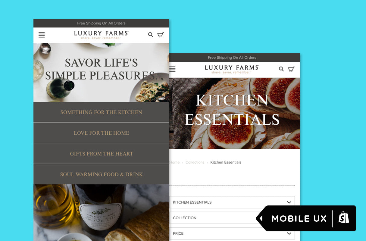
"The mobile experience is cleverly optimized for smaller screens and quick inputs, making the shopping experience elegant and efficient."
-Aarron Walter, VP of Design Education at InVision
The mobile experience is cleverly optimized for smaller screens and quick inputs, making the shopping experience elegant and efficient.
Blue Like Neon was tasked with introducing a new brand to the web for the first time, a challenge they were excited to take on.
“We realized that Luxury Farms could not compete with Amazon from a pure cost standpoint, so we had to connect with consumers on an emotional level and provide them with a story and experience that would entice them to engage and purchase,” says Blue Like Neon’s Founder Ryan Kodzik.
Luxury Farms sells artisanally-made food and kitchen products, and Blue Like Neon’s vision for their mobile experience was to carry through the essence of the brand, while keeping usability top of mind for users-on-the-go.
“We wanted to create an experience that encouraged exploration and allowed users to discover products in an organic way via expressive product categorization that unfolds in the mobile navigation.”
Kodzik adds that the biggest insight from the mobile build came from looking beyond the data, and trying to connect with users directly. By using tools like usertesting.com, the team was able to watch how people interacted with the site, and ensure they were speaking to users who fit within the identified target audience.
“We find that getting real human feedback is an eye-opening affair,” says Kodzik. “Analytics are always important, but we find the added layer of real, targeted user feedback is immensely valuable.”
Honorable mentions
There’s no doubt our four winners raised the bar on what ecommerce design can accomplish. But after receiving so many amazing submissions, it was impossible for us not to showcase some of the tremendous talent that thrives out in the ecommerce wild. Here are 10 honorable mentions that deserve a little time in the limelight.
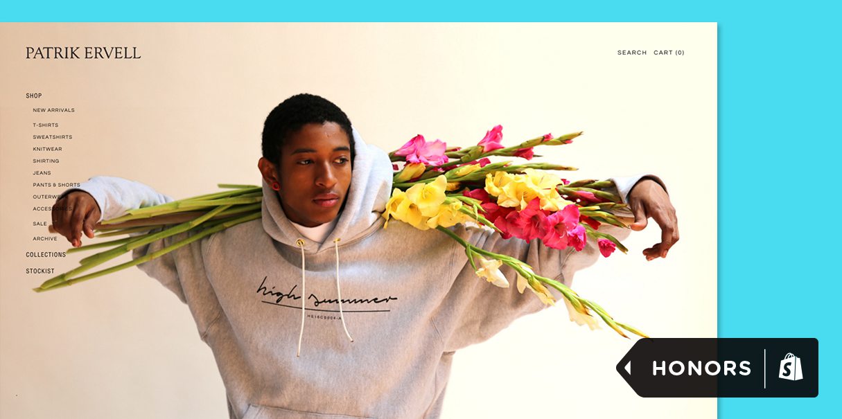
Half Helix for Patrik Ervell
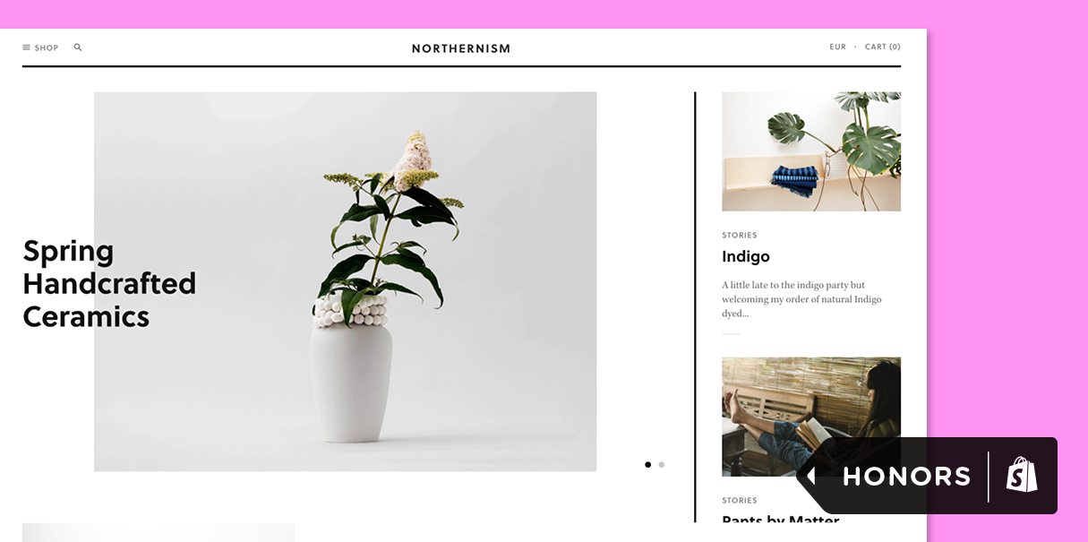
Hatch Inc. for Northernism
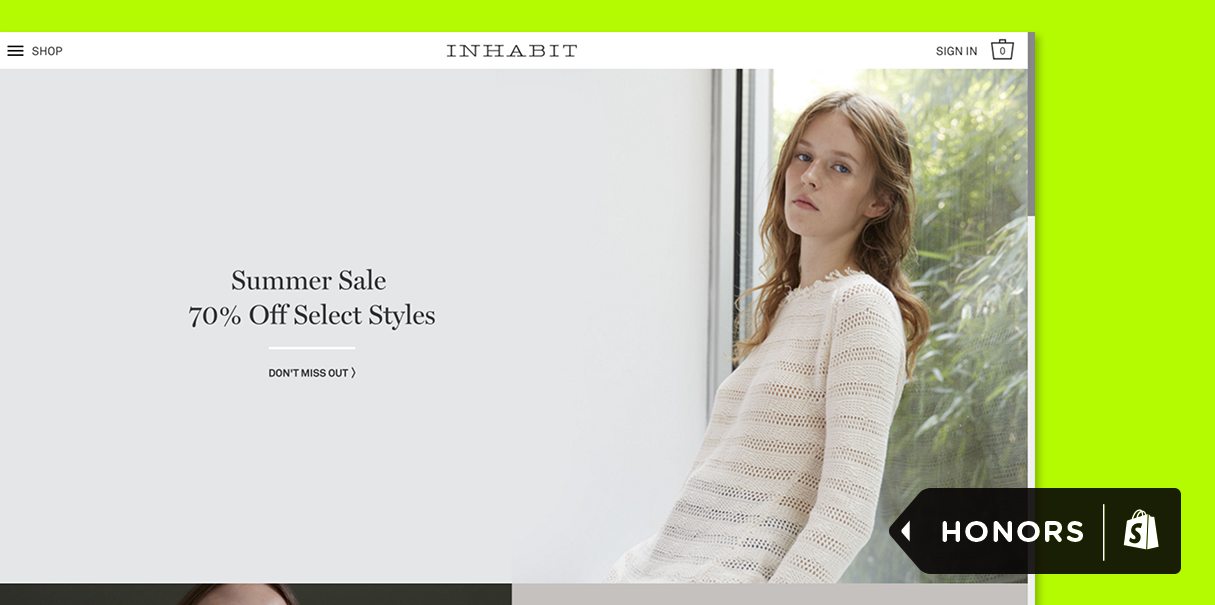
Little Rocket and Jane Creative for INHABIT
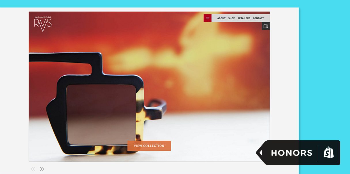
The Vaan Group for RVS Eyewear
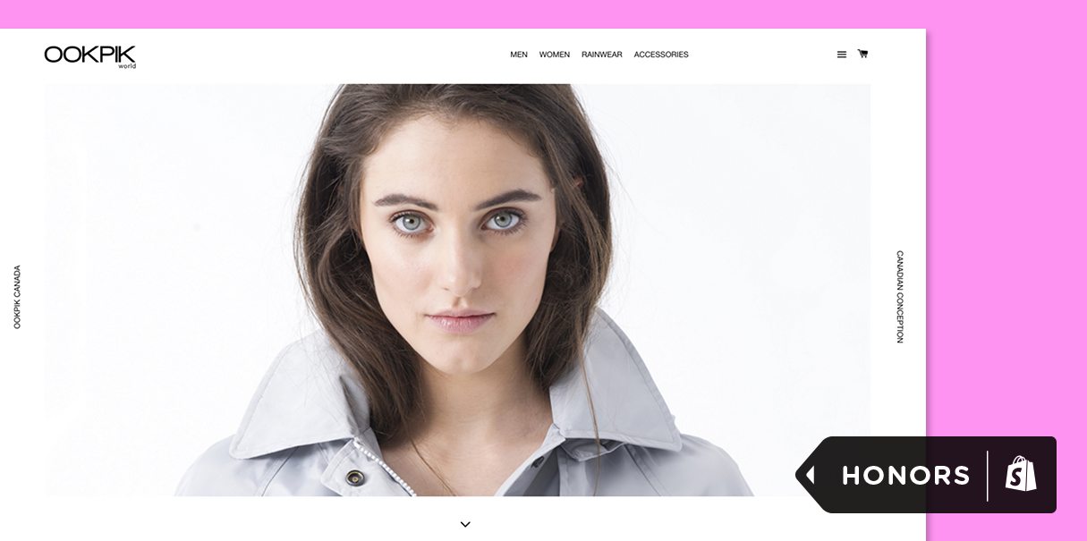
XL Cinq for Ookpik World
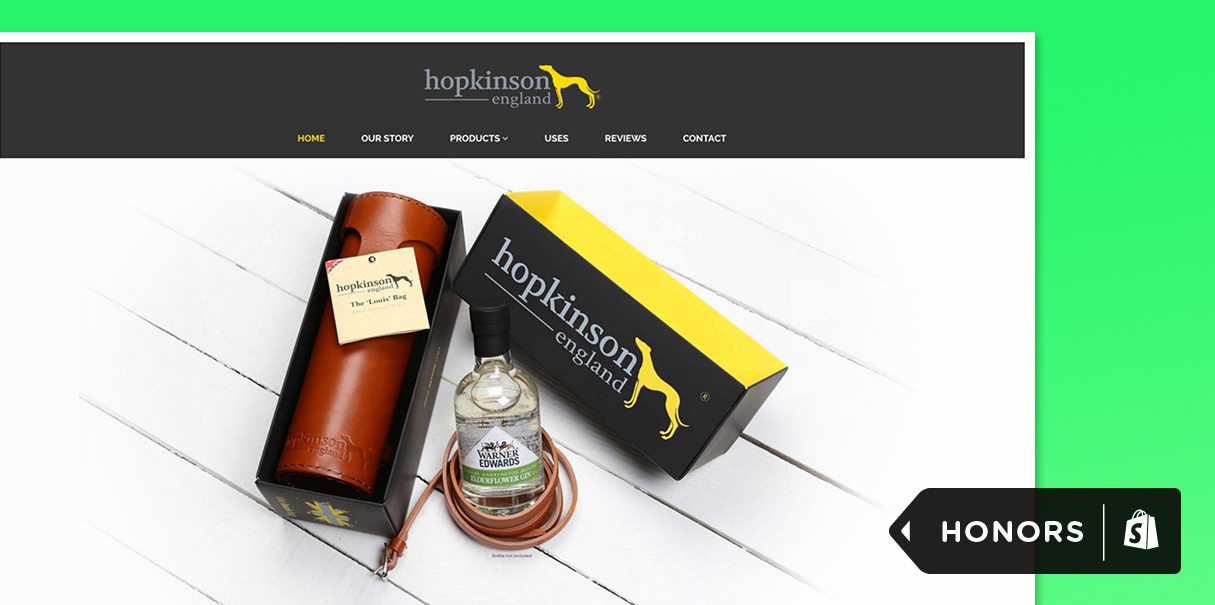
thinklab for Hopkinson England
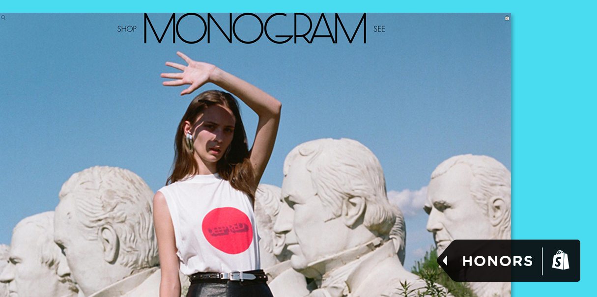
Gross Development and Scissor Studio for Monogram
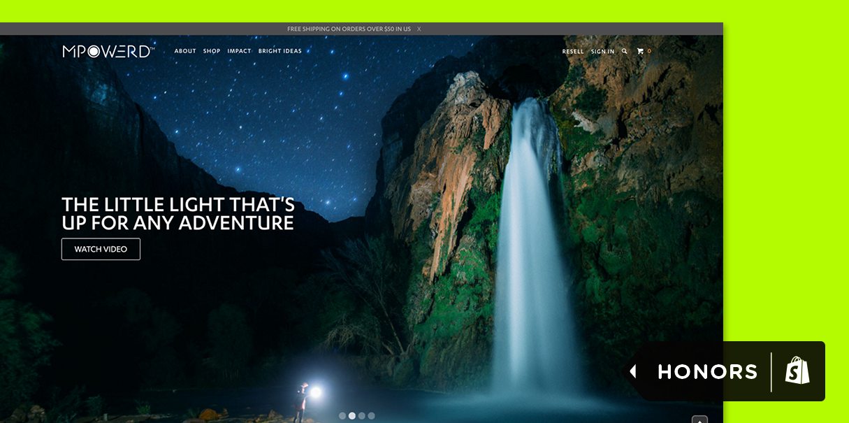
Genome for MPowerd 
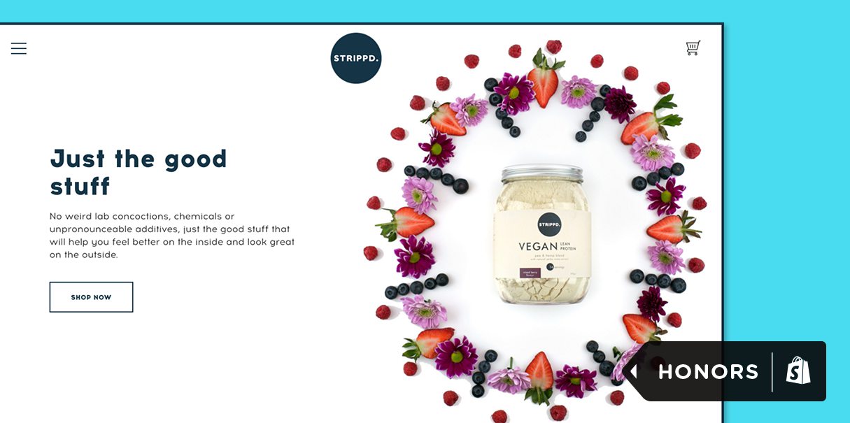
The Big Webowski for STRIPPD.
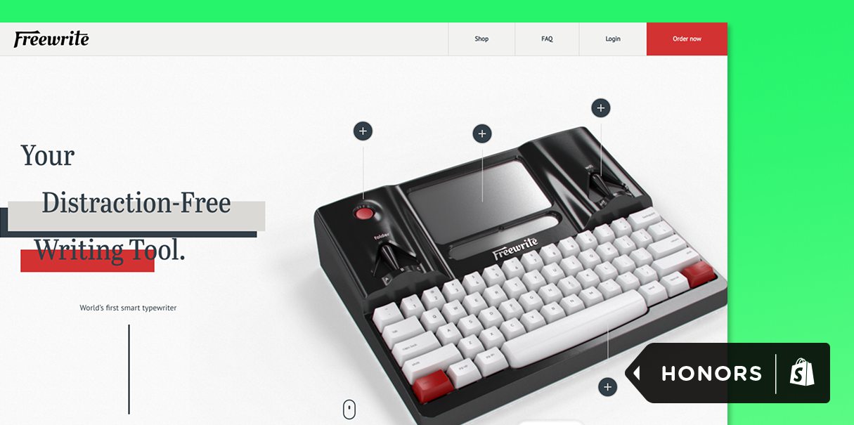
Astrohaus for Freewrite
Thanks to everyone who entered this year’s Ecommerce Design Awards! Keep building great designs, and be sure to watch for next year’s competition.
Read more
- 7 Web Design and Development Awards You Should Apply For
- Unite 2018 Keynote Roundup: Bringing Commerce to Everyone, Everywhere
- What’s New at Shopify: April 6, 2018
- Selling Shopify: How to Educate Your Clients About Shopify
- Join the Conversation at Unite (on the Ground or via the Livestream)
- Announcing The Shopify Commerce Awards — Celebrating 2017’s Best in Commerce Innovation
- Meet the New Freelancers in the NYC Shopify Partner Studio
- Developer Digest: February 1, 2019
- What's New at Shopify: September 7, 2018
- How to Win Shopify’s Commerce Awards 2017: The Judges Weigh-In
You might also like: Why You Should Specialize in Ecommerce

