How do you build a community that unites designers around the world? Easy: you make t-shirts.
Well, it seems easy on the surface. For a company like InVision, however, bringing designers together is their life’s work. Whether it’s by building great prototyping tool or filming an entire documentary about how designers are changing the landscape of business, InVision has made it their mission to support designers everywhere, any way they can.
Their latest initiative — Marketplace — is no exception to this trend. At first glance, Marketplace might appear to just be a simple online t-shirt store. But when you begin to delve deeper, Marketplace is really the heart of a thriving online design economy that supports in two ways: it creates a space for designers sell their designs while simultaneously showcasing great products that designers will enjoy.
“We know designers like well-designed things, especially from designers they love,” explains Aaron Stump — VP, Creative Director at InVision. “We have all these amazing connections with designers and illustrators in the community. Why not make something that brings these people together?” From that simple idea, Marketplace was born.
We caught up with Aaron Stump and Robbie Manalo from InVision to get the details behind the design of Marketplace.
What is Marketplace?
Aaron: InVision Marketplace sprang from a desire to be a part of the design community beyond what happens inside the InVision product. It’s a place where people can purchase or win t-shirts and posters designed by some of the best designers and illustrators in our industry. Simply, InVision wanted to create a product — or series of products — that designers would love to wear.
We have a motto at InVision — “Design makes everything possible” — and we decided to use it as the inspiration to the designs you will find in the Marketplace. It’s a cool opportunity to bring that motto to life through great designs from some of the most amazing designers out there.
Where did the idea come from?
Aaron: The inspiration behind Marketplace was to celebrate designers and what designers do. We really believe that designers — especially product designers in particular — are shaping the success of business. If you look at many of the companies using InVision, like Twitter, Netflix and Uber, they are all succeeding because they put design at the forefront of what they do. Marketplace was a fun idea where we got to celebrate the fact that what we do can impact and change the way people do life.
How did you get started?
Aaron: We knew right away we wanted something that could stand on its own, and have its own voice, make-up, and artistry. We also knew we wanted a design system that put the art of the individual designers and illustrators at the front and point of prominence on the website.
Knowing that we were going to create a new brand with its own personality outside the InVision brand, we started by focusing on the logo and overall branding look. Through a lot of ideation and concepting, we landed on a minimalistic and monochromatic approach to the brand. The logo is a simple mark using our InVision brand font, Brandon Grotesque, with a frame around it. We also created several seals and secondary marks to complement the primary logo. Once we had the logo and direction of the brand’s personality in place, we started working on the website as our core property of the brand.

Where did the inspiration for the store design come from?
Aaron: Like the logo, we wanted to create a design that really stood back — the kind of design that gets out of the way and allows a designer’s art to be at the front, making the designer the hero of the experience. So when you come to the site, you see our simplistic logo, which allows beautiful imagery to shine through and display the art in a way that conveys a lifestyle feel that really connects to our audience.
 When you scroll down, you see the products in a nice, simple grid. Again, we wanted the art to be the focus here. When hovering over a product, we display info about the artist and the option to toggle between the t-shirt and poster options of the designer’s art.
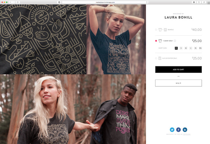
 When you go into a detail page, the UI is super minimalist — all of the call to actions and information about the product are nicely displayed and anchored on the right-hand side, and then two-thirds of the page is completely dedicated to the art of that designer making the designers and their art the heroes and focus of the whole experience.


Can you give us a breakdown the design process?
Aaron: I always start by writing a list of all the things my design has to include. In this case, we needed the ability to buy the products, win the products, share the products, learn more about the designers contributing to the Marketplace, and introduce InVision.
 Once I have my list, I always start by doing rough sketches with pen and paper. I start configuring layouts in different ways to accomplish all those “must-haves.” Once I have a good idea what I want to do, I take those rough sketches and create thumbnail flows. It’s extremely important for us to see the entire path from entering the website to browsing through purchase and engagement beyond that purchase.

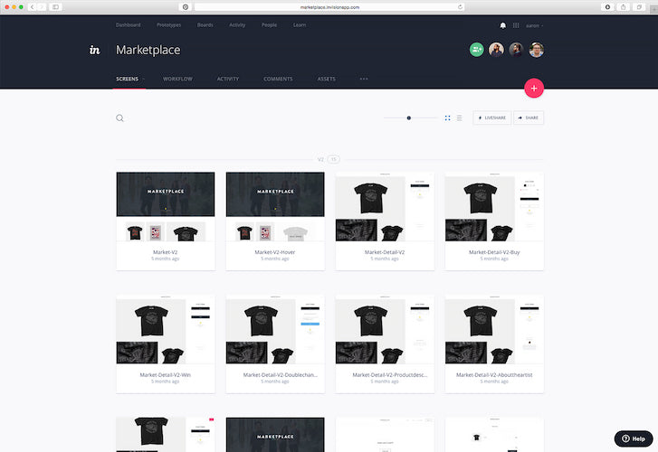
When those thumbnail flows are together and I have the full experience understood as well as a clear path created, we’ll create hi-fi designs and put it all in InVision. That’s when the design really starts to come to life. We can click through the design to get a real sense of how it will work and feel for the user. This part of the process always includes comments and feedback from the stakeholders in the project. It's a great opportunity for collaboration and fine tuning on the details of the design in the prototype to arrive at the perfect design solution. After fine tuning the design experience as a prototype in InVision and get approval, we hand the design off to Robbie’s team to build.

Why did you choose Shopify to power Marketplace?
Robbie: We’d recently done an Inside Design for Shopify on the InVision Blog, and someone suggested we use Shopify. We started looking into it, and it was exactly what we needed because we weren’t prepared to handle things like credit card processing or storing account information within our servers. We would have had to build a larger security team for that, and that would have been a major undertaking.
But we also still needed a solution that was flexible enough to allow us to implement Aaron’s fully thought-out design. Shopify wound up being the perfect solution thanks to everything it offers: from Liquid templating to all the snippet code, to the credit card processing and fulfillment integrations. We’d get to make a completely custom design, but the backend would be managed by Shopify. It was a lifesaver.
We have an in-house security team, and after we launched Marketplace, they contacted us and asked, “Why didn’t anyone tell us about this? We have to make sure everything is secure.”
I said, “You know, all that stuff is handled by Shopify.”
And they said to me, “That’s the best answer you could have possibly given us.”
Where there any challenges?
Robbie: Absolutely not! My team of developers already had some experience with Liquid templating because it’s used in a lot of other situations as well, so that made it really easy for us to create our custom design. All the tools Shopify has available in the admin interface were all very straightforward. And even being able to hook scripts into the check-out process was really handy because we could do things like track how many people completed an order or how many people abandoned carts.
The only tricky part was the email tool. We write a lot of emails at InVision and we commonly run them through a Litmus test to make sure they’re working across all devices, so we had to set things up so Shopify would send test emails through litmus for validation before we made them live.
Did you implement any unique features?
Robbie: As Aaron mentioned earlier, we have a “Win it” button in addition to the traditional “Add to cart” CTA on our product pages. Since Shopify has an open templating system, we were able to code that button directly in there. After that, we tied the button to a lot of third party APIs, so when a customer fills out the form for “Win it,” it actually submits to our lead generation software and we can pick the winners from that. But customizations like that were simple because we had full control over the templates. Aside from that, we didn’t have to change anything about how the system worked.
Did you use any other tools to create the website?
Robbie: We used Gulp to do the deployment up to the server. We compile our javascript so that it’s minified and then we use SASS as a preprocessing language for CSS, which means we have to convert the SASS into a flattened CSS file. But once we’d finished all that, the third part of the job was to push our code up to the Shopify API, which would update all the templates on your servers. So even though you can’t run a Shopify environment locally, when we’d hit save within our IDE to make a change, we could just go to the browser, hit refresh, and the change would already be there in Shopify because our Gulp process would link all the files.
How are you handling shipping and fulfillment?
Realthreads is printing all our t-shirts, and they’ve been absolutely awesome at helping us to get the designs looking exactly the way we want them to. Then we’re using Amplifier to help with the fulfilment. They have an app — which is in the Shopify app store — that utilizes our code to create a fulfillment service integration, so all they needed was access to our admin to go in and set up the integration for us. This gave us a really nice two-way communication. When we send an order their way, it’ll sit in their queue until they process it and ship it out. When they process it, Amplifier presses that information back to Shopify and Shopify kicks out the notification email to the customer that lets them know their order has shipped. It’s a really slick integration.
What’s next for Marketplace?
Aaron: We’re going to continue to expand Marketplace and launch more great designs in our store. Look out for new shirts from some amazing designers in the coming months.
Read more
- How Bold Commerce is Innovating in the Present, and Dreaming Big for the Future [Part III
- Partner Spotlight: Ethercycle Boosts Conversions for Everest Bands
- How Shopify Plus Partner Createur Helped Migrate One of Australia’s Top Online Retailers
- Building Superpowered Merchants One Migration at a Time: How ICEE Social Found Success with Shopify
- How We Built a Global Empire from a Small Island in the Pacific Ocean
- Developing Customer Centric Solutions: How Yoast scoped, built and launched their Shopify App
- From Reddit to Redesign: How Fuel Made Increased One Merchant's Revenue by 30%
You might also like: 12 Budget-Friendly Gift Ideas for Web Designers

