When setting up an online store for clients, many designers do a great job of creating a wonderful storefront and customer experience leading up to a purchase. But what happens after a purchase is made? The post-purchase experience is usually an afterthought for most projects that ends up falling by the wayside, but it doesn’t have to be.
When consumers interact with an online store by making a purchase, creating an account, or abandoning a checkout, the store automatically responds via email notifications. These email notifications are sent out by Shopify in plain text by default. Here lies an opportunity to design email templates just as beautiful and engaging as the site design. As a founder of Spently, which developed the popular Notifications app on Shopify, I’ve gained some valuable insights I’d like to share on the benefits of designing Shopify’s notification emails. So, what emails am I talking about? I’m talking about Order Confirmations, Shipping Confirmations, Customer Welcomes, Abandoned Checkouts, POS Receipts, and more. There’s 11 customer-facing email notifications that you can customize in total.
Unlike the routine emails written following a standard business email format, we discovered that not only do these emails continue the branded shopping experience of the site and give the store a more sophisticated look, but they also have tangible marketing and revenue benefits! We always knew that the open and click rates were 5x higher than newsletters, but we were curious to learn how much revenue they actually generated in terms of add-on sales and additional purchases. So, after we released a feature for ROI tracking on the email notifications, we decided to do a case study to learn just that.
We took a sample of 500 stores on Shopify that used the Spently app to design their email notifications and measured how much revenue the emails generated over a 6-week period. We discovered the emails lead to over $6 million in additional purchases! That’s $1 million a week in extra sales. It works out to an average of just over $2,000 in sales per week for every store. One of our users even let us know they generated an ROI in less than 24 hours.
You may be wondering how emails could generate that much additional revenue for stores, but with the right design and marketing tactics it’s quite easy and possible. I’ll share some ideas and best practices to achieve that kind of success for you and your clients. In addition to including brand assets such as logos, banners, and social icons, here are some marketing ideas for some customizable email notifications.
Learn more about how subscription based email marketing will help your clients with subscription-based businesses.
You might also like: How to Help Your Clients Get Results with Email Marketing
1. Order Confirmation
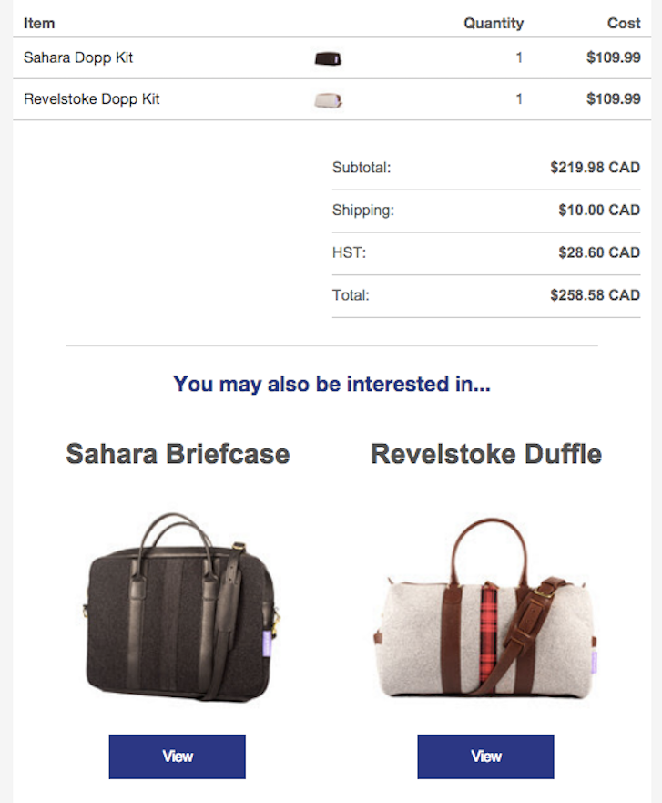
Help your client upsell additional products by displaying other items from their store in this email. It may say something above them like “You may also be interested in…” and our ‘Recommended Products’ algorithm automatically displays two additional products. The items displayed are based on what a customer has recently purchased, which items they had in their cart, and what other customers have viewed and purchased. Simply drag & drop the component onto your template, format it to your liking, and let it work its magic.
2. Shipping Confirmation
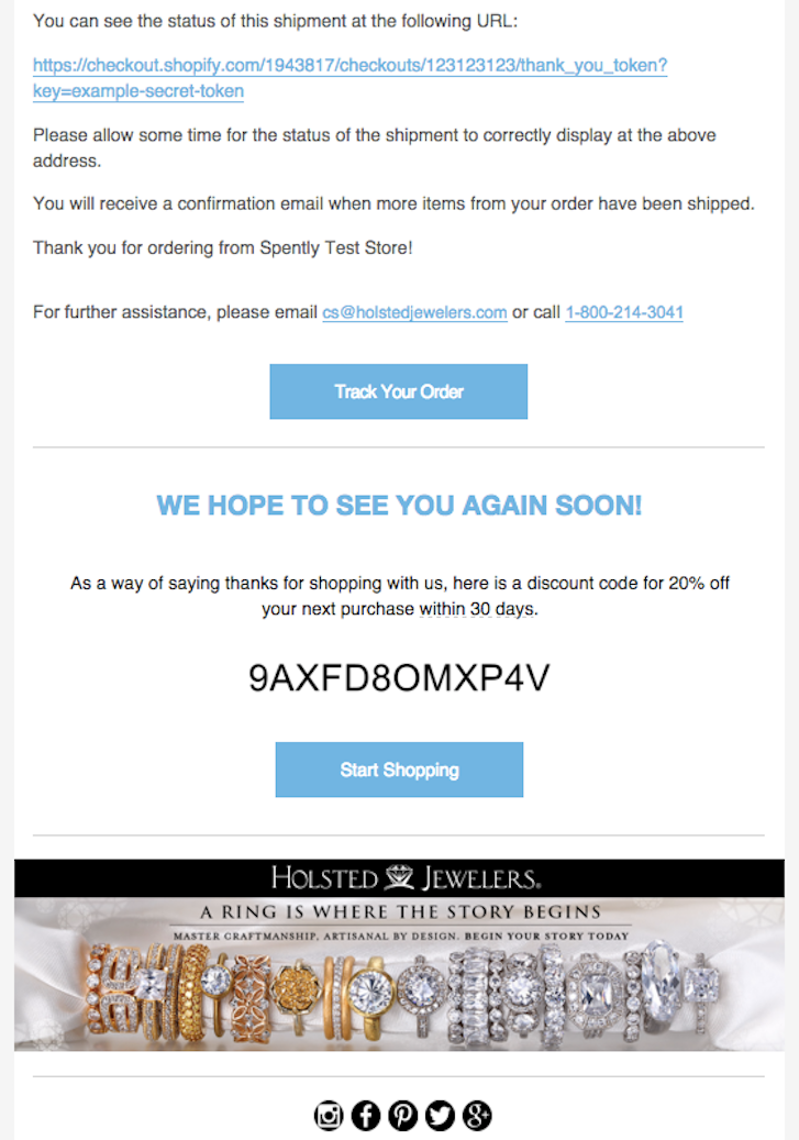
Once a shopper's items are on the way, reward them by including a discount code in the email to encourage them to shop again soon and save. One of the most effective ways to drive additional purchases is by rewarding customers with incentives, and discounts work really well.
3. POS Receipt
After a customer has a made a purchase in-person and gets their receipt on mobile, let them know you also have an online store and include an offer to “Shop Online”. This is a great opportunity to provide an omni-channel approach, allowing customers to shop in person, on their desktop, or on mobile. Additional channels can quickly turn into additional transactions per customer.
4. Customer Welcome / Account Confirmation
When a customer signs up for an account on your client's site, but has yet to make an actual purchase, they get this email. You can feature a product collection banner and include a discount to encourage them to visit the site again and shop, now that they have an account. This is a brilliant opportunity to nurture a qualified prospect to conversion.
5. Abandoned Checkout
Shopify sends this email out either 6 hours or 24 hours after a checkout is abandoned, so it’s a great opportunity to remind customers what they left behind. It may also be a good idea to include a discount code here to give these uncertain customers an extra push. This well-designed email will help recover all those lost sales — and maybe build some return business.
You might also like: Basic Elements of Ecommerce Website Design
Setting up the emails
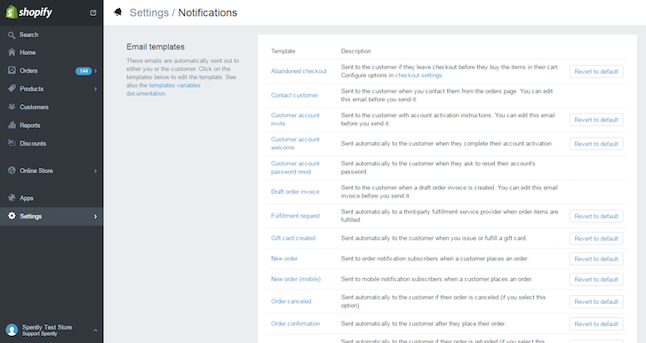
Once these emails are designed to your satisfaction, all you have to do is export the HTML to Shopify by copying and pasting it into the Shopify admin under Settings → Notifications. Make sure to select the HTML tab and remove the existing code before pasting the new template. This ensures you’re replacing Shopify’s default email and you aren’t sending duplicates to your customers. Now all you have to do is keep an eye on the analytics and watch the results pour in.
What email services do you offer your clients?
Read more
- How to Build a Customizable Related Products Section
- Your Guide to Ecommerce Microsites: How, When, and Why to Build Them
- 12 Ecommerce UI Patterns And Where To Find Them
- 10 Beautiful Ecommerce Website Color Schemes
- 15 Funny Lorem Ipsum Generators to Shake Up Your Design Mockups
- The 9 Best Codepens for Summer
You might also like: 5 Simple Google Analytics Reports You Should Create for Every Client

