After an incredibly successful Kickstarter campaign, Rhino Camera Gear decided to migrate their online store from Magento to Shopify, while preserving the strong brand identity that made them famous amongst filmmakers. To help with the kind of custom work required for a smooth transition, they reached out to Helium Development.
We caught up with Nick Mealey — founder of Helium Development — to find out how his team helped with the transition.
Tell me about Helium Development.
We’re a small team of developers and creatives based near Seattle, WA that specialize in Shopify development. We deliver user-focused interfaces and solid web software. We love building custom Shopify apps and themes that challenge us to do bigger and bigger projects.
We think that the delivery of UI and backend applications should always focus on the end-user. In the case of Shopify, we’re always building for the customer. Every business and project is unique, so we offer work that focuses on building unique experiences that are built for users. After all, ecommerce is about people, not websites.
You might also like: Partner Spotlight: ReCharge Launches 5-Hour ENERGY Subscriptions
What’s one of your favourite Shopify projects you’ve worked on?
Definitely Rhino Camera Gear. They are a unique company that builds exceptional camera gear, and their current primary marketplace is their website. We had some big ideas we wanted to see come to life and that challenge made it a really exciting project. Since this company was mostly founded through the internet, upholding their brand on the site was an important piece we needed to maintain. So the site needed to be more than simply a place to buy products; it needed to maintain the momentum of their brand loyalty generated by their Kickstarter campaigns. They’re selling products where buyers are doing a lot of research before actually purchasing. With that in mind, we built nearly a dozen custom product pages that have unique content and interaction, a fully custom support app, custom menu structuring, and product configuration before checkout.
Tell us about Rhino Gear’s Kickstarter campaign. Did they have any unique requirements because of their crowdfunding?
The company originated from Kickstarter. To date, they’ve had five successful Kickstarter campaigns and made a big impression on the filming community. Crowdfunded projects encourage a lot of engagement with customers, as you invite them to be a part of a growing company. With that in mind, we had to build something that was engaging and uniquely focused for filmmakers. Since filmmaking really comes down to telling a story, Rhino has made it their mission to make gear that “moves your story.” That's why you’ll find a lot of lifestyle images that show the gear actually being used by real people on their site.
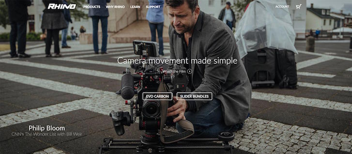
This is an example of the Slider collection page, where the product is actually quite hidden, but the use of it is more important showing the product directly. The idea is to show what the product actually accomplishes before getting into the details. In contrast, product images that involved the details were taken professionally on a white background so that there’s nothing to distract the eye other than the product itself.
Where did the inspiration for the store’s design come from?
Since film is all visual, we really wanted to capture what using the gear was like visually. For this reason, the site is very photo and video heavy. The site also really focuses on the products, so product pages are designed to be simple, clean, and to make the product the centrepiece of the page.
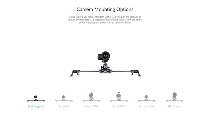
Instead of crowding the page with content, we built layouts that read naturally by scrolling from feature to feature. For each product feature, we have a short title, paragraph, and image or video that is tailored for that feature. This helps customers learn about the product visually without having to read detailed descriptions.
Did anything change along the way?
I’ve yet to work on a project that didn’t have changes, but that’s just part of working with someone to deliver something that works. You have to explore possibilities and be willing to move on from ideas that don’t work. Often times you’ll try something, look at from the left, right, and sideways and realize it’s not at all what you had imagined. Then it's back to the drawing board to rethink it.
An example of this was the "learn page," which is our version of a blog. Originally we wanted it to have a very book-like feel, with a serif typeface, big margins, comfortable reading width, and a lot of whitespace. We ended up completely redesigning it, but we still held on to some of the concepts from the first rendition. Since we wanted the images to be the centrepiece, we created a grid of images to represent each article for the layout.
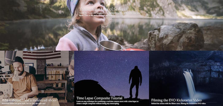
We also changed the typeface, article layout, and navigation. Instead of using navigation, the user browses by searching or clicking through related posts. This created a more engaging experience because the images are emphasized over the text.
You might also like: Partner Spotlight: SplitMango Gets Flexible With Namaste TV
High quality videos are obviously an important part of this product. How did you use video in your design?
Since the site's audience was mainly filmmakers, it was important to deliver content that represents the products and brand in a favourable way. On a number of pages, there’s a single call to action to “watch the film” that is placed above the fold. The “Why Rhino” page is a good example of this.
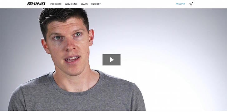
It encourages viewers to watch the video without even reading a single line of text. This instantly engages someone interested in knowing more about their company and philosophies. Each one of these featured videos directly relates to the page, collection, or product they’re viewing. Most of these focus on what can be accomplished with the gear rather than simply showcasing the product itself.
Since video is very bandwidth heavy, we had to be selective with where we have video. With that in mind, we tried to focus on one or two videos per page. Compression is a big deal when creating a site with a lot of video content. No human enjoys watching a buffering wheel spin. So sometimes you have to sacrifice a bit of image quality to bring download speeds into an acceptable range.
What was the transition from Magento to Shopify like?
Switching definitely took some time, but it was worth it. The Shopify product import tool is really handy. Importing products into Shopify by matching columns from a CSV is quick and eliminates the need to manually add each product into the store. Plus, the major apps/plugins that Rhino Gear was using with Magento were really simple to migrate over since these third-party applications were also available in the Shopify App Store. Finally, since we built the theme from scratch, there wasn’t much transition that happened implementing the front end.
Was there anything in particular you did to improve the user experience of the site?
Switching from the old site was night and day. We spent a lot of time before even touching the code to plan out the whole experience and take stock of what we had learned from the old site. We wanted to look through the eyes of the user and build an experience that was easy to navigate and very informative.
We also worked with a designer to improve the consistency of our styles by formulating a style guide so that buttons, fonts, and colors would remain consistent. Building out these styles within pre-defined classes in our stylesheets, we were able to focus more on the content and not how a specific button looked. Naming CSS classes is the difference that makes a UI feel cohesive. For example, we have a “button” class that contains modifier classes such as “cta-button," "link-button," and "secondary-button." Earlier versions of Rhino’s brand were marked by darker grays, blacks, and a specific hue of blue. Since then, they’ve moved to more whites, light grays, and the same blue color. The result was a much more crisp feel to the site.
As for load times, we were able to improve performance of the site by doing a better of job of handling JavaScript, CSS, and image compression. On some pages we cut the load time by more than half. We found it a real advantage to use external services such as Rackspace to leverage parallel downloading for image-heavy pages.
What about mobile experience?
We like to use statistics to drive how we build web apps. In this case, they have more desktop users than mobile, so we designed for desktop and scaled down for mobile users. It’s important to know who is doing what with which device. For example, there might be more purchasing customers on desktop, so we wanted to focus on the roadmap from informed to checkout.
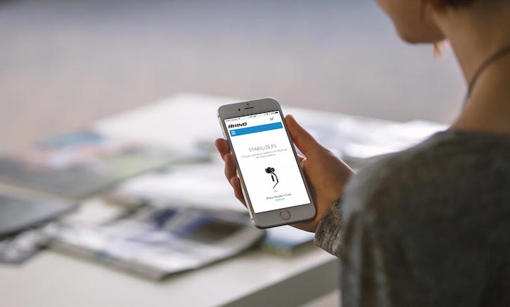
Most people on phones are most interested in reading about products, checking out blogs, and becoming informed buyers. With that in mind, we made the interface really friendly for using the site on mobile. Fonts are scaled for reading, images fit the screen size, and content stacks instead of being laid out side-by-side.
Did you use any special integrations or apps?
We’re using a number of apps that help improve the site. We’re using KissMetrics to track conversions and behavior. It allows you to track what paths customers went through to actually checkout, which enables us to make informed decisions about content strategy. For customer service, we’re using Olark. For inventory management and shipping, we’re using Brightpearl and ShipStation because they work seamlessly with Shopify to update shipment information. Finally, we built several custom apps for the site that fuel the support section and extra product images. Working with Shopify’s API and Web Proxies is a total joy.
What tools did you find most useful when creating the site?
We wanted a really robust build environment, so we’re running with Compass, Sass, and RequireJS. Building a Shopify theme this way requires a lot of organization, so we’re using a custom file structure and build process to make it all happen. We’re also using the Ruby gem to upload files to the theme, which makes smooth development possible. Most developers are used to working on a local environment where they do work, but with Shopify themes you have to upload files before your changes can be seen. The gem automatically detects changes made locally and pushes them to the store. Of course, this overwrites any changes made on the online text editor. We’ve found working with Git branches really necessary when implementing changes made from the theme editor (like an app implementation) within the Shopify admin.
This presents an issue if you don’t want to be doing development work on a live site. Our solution was to create a separate staging store that we can do development on without it being public. You could also do this on a smaller scale with duplicate themes and “previewing” the development theme, but there’s a number of restrictions going that route. When we want to push a change to the production site, we switch API credentials between staging and production.
What was the most difficult part about creating this shop?
There’s a number of custom product pages on the site that are really the most important pages. There are a fair amount of development challenges to build these pages, including custom 3D video rendering that tracks with scrolling. When you’re doing a bit amount JavaScript in a Shopify theme, it’s important to modularize everything.
I haven’t read or seen much about many developers working with RequireJS in a Shopify theme, but we’ve come to really like using it. The first challenge is the limitation of sub-directories within the asset directory. Our solution is to have the whole JS working directory in the root of theme and flatten and copy these files to the assets directory. And example directory might look like:
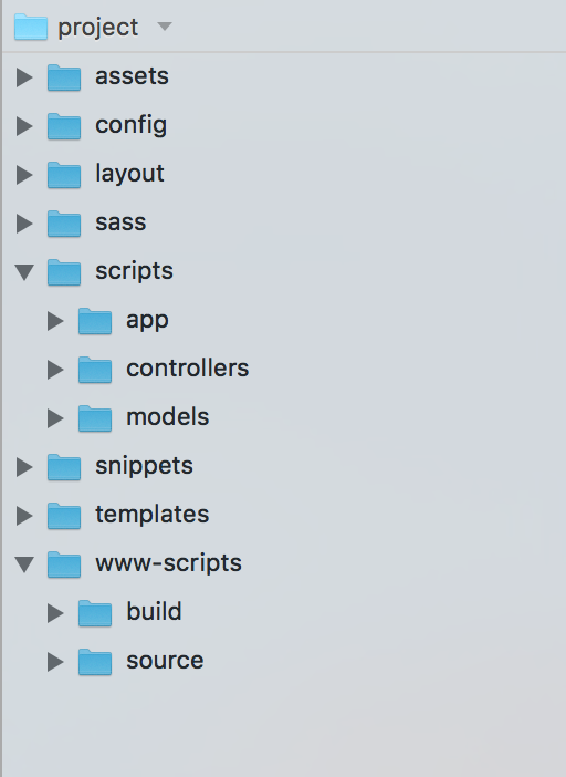
We use Compass to transfer these files to the assets directory if a file edited. Now, you could do this same thing working directly in the assets folder, but when you have 100+ separate files to work with, it would be very difficult to manage. But when RequireJS is set up, you can run their optimizer and bundle everything together into one minified file. This significantly cuts down on page load time. I would say this is the biggest key in writing a large amount of JavaScript within Shopify. We follow a similar pattern for writing Sass. Keeping organized is king.
What’s your favourite feature on the site?
The custom slider pages are pretty unique and engaging. We spent a fair amount of time building out the features for these pages, since they’re really the most popular on the site.

What did you learn from creating this site?
We went a lot places in terms of development with this site. We learned a lot about using Shopify as a platform to build something that can engage customers. Exploring the options was important to learning and building from the experience.
Since launching the new site, we’ve seen a fair amount of traction and growth in sales. As any project, we’re always comparing to see how things work and adjust as necessary. When we were using Magento, we didn’t have a good sense of building it up for the future, but with Shopify, we feel confident adding more features and improving the site. The key to projects like this is thinking ahead a bit and building a base from which you can build out more and more features, as well as improving current ones.
Read more
- Partner Spotlight: Jackpine Talks Designing the Perfect Doughnut Shop
- How We Built a Global Empire from a Small Island in the Pacific Ocean
- Developing Customer Centric Solutions: How Yoast scoped, built and launched their Shopify App
- How Verbal+Visual helped an international home decor brand get a 163% revenue boost
- On the Edge of Ecommerce: How Mote Found Success with Shopify
- Partner Spotlight: Jivaldi Builds American Sniper Store
You might also like: Partner Spotlight: How Skyrocket Created a Brand-Based UX for Enerex

